

Individuals making informed decisions about policies need clear summaries of the evidence for different options and their expected outcomes. This paper aims to support communicators who are trying to create balanced, accurate, and useful messages that inform decision-makers (O'Neill, Reference O'Neill2002). Due to the complexity of policy outcomes, evidence communication formats are particularly difficult to design for policy decisions (Brick et al., Reference Brick, Freeman and Wooding2018). Many organizations choose coverage over comprehensibility and end up with long technical documents that are rarely read or comprehended (e.g., a 67-page report on airport runway capacity options in southeast England; UK Department for Transport, 2017). However, organizations can empirically evaluate message effectiveness and inform their message design with findings from individual decision-making. Groups such as the UK What Works Centres, the medical evidence synthesis organization Cochrane and the US Institution of Education What Works Clearinghouse have all produced evidence toolkits made of tables and graphics. However, their effectiveness critically depends on whether the information is both relevant and well understood, and these are rarely tested (but see Dowding et al., Reference Dowding, Russell and Jonas2017). In this study, we investigated what information different audiences want when learning about policy options and how well currently used graphics are understood. An example of a policy toolkit communication in current use is shown in Figure 1.
An example of a What Works toolkit summarizing the cost, evidence quality (‘Evidence Strength’) and effectiveness (‘Impact’) of various educational interventions. For clarity, font sizes were increased and some text was removed. Copyright: Education Endowment Foundation (2020), used with permission.

The first stage of high-quality evidence communication is finding out what evidence is important for the target audience (Hieke & Taylor, Reference Hieke and Taylor2012; Fischhoff, Reference Fischhoff2014). However, very few studies have surveyed policymakers, likely because they are a difficult population to reach. We surveyed experts (including practitioners and policymakers) and the general population. The results reveal what types of evidence are most important to each group and what each group understands from current communication formats.
Extensive research has evaluated which communication contents and formats support comprehension for individual-level decisions (Trevena et al., Reference Brick, McDowell and Freeman2013; McInerny et al., Reference McInerny, Chen and Freeman2014; Brick et al., Reference Brick, McDowell and Freeman2020). However, there is a lack of systematic evaluations of how to communicate policy-level evidence (Brick et al., Reference Brick, Freeman and Wooding2018). Even in public service organizations seeking to inform rather than persuade, message design is sometimes optimized toward user engagement (e.g., website clicks). Unfortunately, the risk communication formats that most effectively inform are different from the formats that best engage or that change beliefs or behavior (Akl et al., Reference Akl, Oxman and Herrin2011). Designing communications that create the opportunity for informed decisions requires aligning key concepts with particular formats (e.g., icons) and then testing them systematically and iteratively in the target population(s).
High-quality summaries
Summary displays of policy options allow users to compare different interventions at a glance: their potential benefits (to different groups) and costs (financial and otherwise). To keep these summaries succinct and usable and to allow easy comparison between interventions, standardized scales with icons are used to communicate concepts such as effectiveness, evidence quality and cost (see Figure 1). Graphical and tabular summaries have shown promise for communicating health policy summaries (e.g., Glenton et al., Reference Glenton, Santesso and Rosenbaum2010) and climate change summaries (e.g., McMahon et al., Reference McMahon, Stauffacher and Knutti2015). When icons are designed to be understood, people can more easily locate and operate on the information they want (Gatsou et al., Reference Gatsou, Politis and Zevgolis2012). Icons not only replace text labels; they can also convey quantitative or rank information (e.g., in a 5/5 star rating).
The central goal of an icon is to convey the function it represents without additional text (Gatsou et al., Reference Gatsou, Politis and Zevgolis2012), and pictograms (or ‘human-recognizable objects’) are associated with high memorability and comprehension (Borkin et al., Reference Borkin, Bylinskii and Kim2016). Some of the existing advice about icon design is vague and therefore difficult to apply (e.g., that icons be simple, clear or understandable; Rotfeld, Reference Rotfeld2009). There are decades of work within the field of human–computer interaction on the fundamental aspects of icon design (see review in Forsythe, Reference Forsythe2011), such as their metaphorical clarity (e.g., Carroll et al., Reference Carroll, Mack, Kellogg and Helander1988; Richards et al., Reference Richards, Barker and Banerji1994). In sum, icons will be hardest to understand when it is unclear what they literally represent and what metaphor that literal representation is supposed to convey (iconicity). In contrast, understanding will be easier for icons whose shape is quickly and unambiguously interpreted to represent a familiar object and where that object's metaphorical meaning activates the intended concept in observers (Gaissmaier et al., Reference Gaissmaier, Wegwarth and Skopec2012). For example, a simple graphic of a waste paper basket is not only easily recognized as such, but also is easily understood to represent a virtual place in which to throw away computer files. Ease of understanding is improved by familiarity with the icon (even when not initially understood). In addition, some icons contain filled/unfilled shapes, numbers or symbols to indicate magnitude, which is a form of icon combination or layering (Zender, Reference Zender2006). We expected that effectiveness icons would be better understood when they were layered by including indications of direction and magnitude (e.g., symbols such as + and –). In addition, when icons contain numbers or percentage ratings, specifying what the number means and how it is constructed is typically necessary to comprehend the rating (see discussion of reference classes in Trevena et al., Reference Trevena, Zikmund-Fisher and Edwards2013).
Communicating uncertainties makes for more trustworthy and ethical sharing of information because it allows decision-makers to weigh evidence appropriately (O'Neill, Reference O'Neill2002). Fortunately, communicating uncertainties does not necessarily reduce trust from audiences (van der Bles et al., Reference van der Bles, van der Linden and Freeman2019). However, uncertainties are not suitable for all communication aims. For example, it is appropriate to downplay uncertainty in persuasive messaging designed to maximize behavior change, such as emergency evacuation messages that enable a swift behavioral response rather than optimizing for slower, more informed decisions (Mileti & Sorensen, Reference Mileti and Sorensen1990).
Based on the reports and toolkits of the UK's wide network of evidence communication centers, the two concepts most often communicated about interventions are effectiveness and evidence quality. Because of their ubiquity in reports and tables, these two concepts were the focus of our comprehension tests. Effectiveness refers to the impact of an intervention on desired outcomes and evidence quality represents the breadth, depth, relevance and rigor of scientific evidence. Evidence quality is often a summary of the uncertainty underlying the effectiveness rating. There are many uncertainties when forecasting future events, ranging from confidence intervals around effect size estimates to assumptions about social and political contexts. In the UK alone, organizations use a dizzying array of evidence quality scales, ranging from well-established (GRADE, Alonso-Coello et al., Reference Alonso-Coello, Schünemann and Moberg2016; EMMIE, Johnson et al., Reference Johnson, Tilley and Bowers2015) to ad hoc frameworks (Puttick, Reference Puttick2018). This diversity may increase user confusion, such as where the same evidence generates different ratings from multiple scales. Communicators can include uncertainties in a single display or use layered messages, requiring users to drill down to find out the certainty of the evidence.
What Works network
The current project used icons from the UK What Works network and sampled their users, so we describe the network here. The consortium is made up of non-governmental Centres with the aim of improving the creation, communication and use of evidence for decisions around public services (UK Cabinet Office, 2018). Their goal is to support more effective and efficient services across the public sector at the national and local levels, and the network likely informs policy decisions outside the UK because of the rarity of such a network. The What Works Centres are consistent with the US and UK Behavioural Insights Teams in terms of incorporating behavioral evidence into policy. Unlike those teams, however, these Centres do not use behavioral insights to increase public adherence to already-implemented policies (persuasion), but to inform policymakers considering future policies. The What Works Clearinghouse, part of the US Department of Education, has a similar mission.
In 2019, there were 10 UK What Works Centres on topics such as crime reduction, education, homelessness, etc., and affiliates such as the large UK National Institute for Health and Care Excellence (NICE). The Centres collate evidence, produce synthesis reports and systematic reviews, assess the effectiveness of policies and practices and communicate the findings. These policy areas receive public spending of over £200 billion (UK Cabinet Office, 2018), marking this area as a high priority for effective communications. The What Works findings currently drive major policy choices. For example, recent decisions using What Works evidence include new training for educational staff rolled out to 900 UK schools and 22,000 police officers in London being equipped with body cameras (UK Cabinet Office, 2018).
The What Works Centres use different toolkits, formats and icons to communicate evidence around the expected harms and benefits of policy interventions. Figure 1 shows an example evidence toolkit from the Education Endowment Foundation. Many of the toolkits and reports use a version similar to Figure 1, where interventions are listed in rows and filled and unfilled icons are shown in columns to represent expected outcomes. These icon choices emerged from a laborious and well-intentioned process including extensive internal and external review, professional design companies and sometimes qualitative testing, such as focus groups or one-on-one user experience trials. However, the formats and graphics have never been empirically evaluated in a large sample of either target users (practitioners and policymakers) or the general public (Brick et al., Reference Brick, Freeman and Wooding2018).
Study aims
We present the first objective test of the comprehension and usefulness of policy-level communication summary formats, and we include multiple domains and both regular users of the sites (below: ‘experts’) and those unfamiliar with the summaries (below: ‘public’). Participants also reported their preferences about what types of evidence were most important to them. The overall aim is to help develop evidence communication tools to inform policy decision-making by investigating ‘what works for What Works’.
Methods
Expert sample
At total of 452 users were recruited through the mailing lists of six UK What Works Centres and an affiliate evidence communication portal (Conservation Evidence): see the Supplementary Materials for the full list. Participants had the option to enter a raffle for one of five £100 gift cards to the retailer Marks & Spencer. The What Works mailing lists contain individuals interested in the evidence communication toolkits, reports and guidebooks published by the What Works Centres, and they represent diverse jobs such as practitioners and policymakers. Of these, n = 222 did not finish and provided partial data.
Response rate and attrition
The survey invitation was embedded within the individual newsletters of each Centre using diverse descriptions and prominence within newsletters. The total number of individuals who opened a newsletter from any Centre was estimated by multiplying the total newsletter membership by the respective open rates from each Centre (mean average of reporting Centres: 30%) and then summing the total. Comparing this sum (n ≈ 22,119) to all clicks on the survey (n = 480) leads to a lower-bound response rate estimate of 2.2%. However, some people would have opened a newsletter but not seen the invitation, meaning that this underestimates the true response rate.
Participation time was median = 15.5, M (SD) = 18.3 (16.7) minutes, and for finishers was median = 20.1, M (SD) = 24.5 (14.9) minutes, all excluding 26 (5.8%) of cases with improbable durations over 90 minutes (maximum = 26.5 hours). Attrition was relatively high in this sample; 50.9% of consenting participants completed the last question of the survey. High attrition was expected given the length and difficulty of the survey, the lack of study payment and the fact that the population is characterized by busy working professionals. See the Supplementary Materials for more detail on recruitment and sample populations.
Public sample
A total of 252 workers (UK residents at least 18 years of age) were recruited from the online survey company Prolific. These respondents were more diverse in age, gender, education and other categories than university students would have been. Previous research suggests that findings from online samples are consistent with established findings on judgment and decision-making (Goodman et al., Reference Goodman, Cryder and Cheema2013; see detailed discussion in the Supplementary Materials). We paid £2 per response and the survey completion time was median = 16.5, M (SD) = 18.6 (10.4) minutes, excluding one improbable duration of 119 minutes. A further 17 participants were excluded for not completing the survey, and this exclusion was preregistered.
Data, code and planned analyses
The survey instrument, cleaning and analysis R code and raw data are openly available at https://osf.io/t3s7p. This link also includes a preregistration of the cleaning and analysis plan for the public sample (filed after data collection but before analysis) and the planned confirmatory tests between the expert and public samples. All other inferential analyses (e.g., with p-values) are labeled as exploratory, all deviations from the preregistration are described and no studies or variables are omitted. Reanalysis and/or additional subgroup tests are welcome by other researchers.
Experimental condition (public sample only)
After the main outcome measures, participants were randomized to two conditions during one question about trade-offs between effectiveness and evidence quality. The manipulation was the position of the columns (left or right). Further information is provided in the ‘Trade-offs’ section below.
Measures
Participants reported what types of evidence they desired and in what detail. They also guessed the meaning of commonly used icons to reveal which graphical and numerical formats were best to communicate that information. These icons were selected through a review of how effectiveness, quality and other evidence characteristics were communicated across the What Works Centres. Duplicate graphics were removed and all remaining icons were included. Finally, participants made trade-off decisions between detail and simplicity and between effectiveness and evidence quality. These trade-offs were also presented in different formats between subjects to reveal content and framing effects on preferences. The items below are presented in approximately the same order as in the survey instrument.
Objective comprehension of existing graphical formats
Main icons (n = 9)
All participants were instructed that they would see icons used to communicate evidence about interventions. These nine icons were taken from representations in current What Works Centre or Conservation Evidence websites, toolkits or reports, and all unique icons were included and presented without context or labels. Unbeknownst to participants, these icons represented either the effectiveness of an intervention or the quality of the evidence behind an effectiveness rating. The icon order was randomized for each participant and they were asked to identify what the icon represented (see Table 1 for the response options of key measures). One additional icon was included that is not in current use: icons of microscopes in filled or unfilled squares (#6). This icon was designed by UK company Luna9 and is shared under its CC-BY free-use license. Pilot results from a workshop we ran suggested that icon #6 might be easily understood to indicate evidence quality. We label this comprehension measure ‘objective’ to contrast it with a subjective, self-reported assessment. Comprehension was scored correct when answers were consistent with the designer's intention.
Key measures and response options.

Secondary icons (n = 18)
Afterward, 18 more icons were shown in random order (all graphics are in the Supplementary Materials). These icons mostly represented more specific concepts within each of effectiveness and evidence quality. For example, a single effectiveness icon of a gray circle enclosing a negative sign was presented with response options based on how the different Centres each describe effectiveness. This tests the relationship between that icon and the specific wording of the intended concept. By using the exact language that the Centres used to label the icon's meaning, this provided a more specific test of the interpretation of the icon. Although not used by any Centre as of 2019, we included the widely used GRADE icons for evidence quality as a control (Alonso-Coello et al., Reference Alonso-Coello, Schünemann and Moberg2016). Originally, Hypothesis H2b also included a test comparing the GRADE icon. However, during write-up, it became clear that the GRADE icon should be excluded from H2b because it had a unique response scale and therefore could not be compared directly with the nine main icons. Excluding the GRADE icon from Hb2 is a deviation from the preregistration. The Supplementary Materials contains the response options and results for all icons.
Together, the main and secondary icons comprise 26 items in current use with objectively correct answers based on designer intention. These 26 were combined into a mean composite: each item was scored and then the average of those scored variables were computed for each participant. Rows were marked as missing when fewer than 13 items were answered (exclusions: public sample n = 11, expert sample n = 140). This composite construction deviates from the preregistration, which said that 3+ item composites would only be calculated if Cronbach's α > 0.5; these items had α = 0.38 across both samples. This deviation was made because it would have been arbitrary to justify which items to exclude and the aggregate measure was not central to the hypotheses. This composite should be interpreted with caution.
Combined icons
The What Works Centre for Crime Reduction uses icons that combine both effectiveness (shown with crosses and check marks) and evidence quality (shown with filled boxes below). This item tested for comprehension of this representation by contrasting two such double-icons and asking what it meant that one of them had more filled rectangles.
Evidence rating 1 (Early Impact Foundation)
The Early Impact Foundation (EIF) evidence rating scale was presented and participants were asked which rating was of the highest quality.
Evidence rating 2 (EIF)
The EIF evidence rating 4+ icon was presented alone and participants were asked what it meant.
‘Effectiveness’ percentage
The Conservation Evidence Centre uses a unique presentation that includes percentage values for effectiveness, certainty and harm. Participants were shown a graphical example. First, they indicated how easy the categories and ratings were to understand. Then, participants were asked to define what the effectiveness rating was intended to mean (see Figure 2). All of the measures until this point were included in the comprehension composite except for the microscope and GRADE icons, because those were not in current use by any What Works Centre.
Summary display of effectiveness for an intervention from Conservation Evidence. Copyright: Conservation Evidence (2020), used with permission.
Open-response drawing advice
Participants optionally gave suggestions about how effectiveness or quality might be graphically represented.
Communication preferences
Common currency
Participants read an explanation of why Centres might summarize different interventions by combining their outcomes into a combined effectiveness rating and the pros and cons of that approach, and they were shown a graphical example. They reported their preferences (see Table 1).
Subgroup (heterogeneous) effects
Participants read an explanation that interventions sometimes have different outcomes in different groups such as adults and children, were shown a graphical example and reported their preferences for combined or separated evidence summaries by subgroup (in this example, children compared to adults).
Subgroups of interest
Participants were asked for which major subgroups they were most interested to see separate results and optionally responded in three open-response text boxes. The expert responses were read by the lead author, who developed a set of nine categories such as ‘age’. Then each sample was coded by both authors separately, and agreement was high: in the expert sample, n = 303 responses, n = 126 participants, κ = 0.91, agreement = 92.7%; in the public sample, n = 202 responses, n = 88 participants, κ = 0.94, agreement = 95.0%. All disagreements were resolved through discussion.
Intervention label specificity
Participants saw a fictional example of a table with effectiveness and evidence quality icons comparing two interventions: physical therapy and hip replacement. Participants read a discussion about the difficulty of using brief labels like ‘hip replacement’ that could aggregate across diverse types of intervention differing by surgeries, technology, hospital, etc. Participants indicated their preference.
Trade-offs
Participants were shown a small table with ‘Intervention A’ and ‘Intervention B’ in rows and columns for ‘Evidence Quality’ and ‘Effectiveness’. Typical What Works icons were used to show that one intervention had higher effectiveness but lower evidence quality, and the other intervention the opposite pattern. Participants indicated their preference. The expert sample only saw the above question. The public sample was randomized to one of four conditions: the above question; a version with the columns swapped (effectiveness on the left); a version with effectiveness shown as filled circles on a closed scale (e.g., 3/5 filled circles rather than ‘+3’ with no maximum value shown); or a version with both of these changes. The public sample was also randomized to see another single trade-off question about choosing between drug interventions. This drug question was a pilot and its results are not presented here.
Evidence-type priorities
Participants were asked to indicate which types of evidence were most important to them when considering different interventions, and 13 options were shown in randomized order. Participants were asked to drag and drop to put the interventions in their order of importance.
Open-response drawing advice
Participants optionally gave suggestions about how effectiveness or quality might be graphically represented. This item was presented after the first 13 icons tested for objective comprehension.
Centre-specific questions (expert sample only)
Centre
Participants were all recruited by a specific Centre, and unique study URLs served to identify the Centre for each participant, of which 21 (only 2.9%) chose to change the Centre being focused on. The items and response options below were developed with input from the Centres.
Organization
Participants were asked if they were part of an organization that chooses or recommends policy changes or interventions.
Goals
Participants were asked about their main goals when visiting that Centre's website and marked all that applied.
Decisions influenced
Participants were asked how many policy or funding decisions have been influenced by that Centre in the past year.
The above three questions were shown at the beginning of the survey. Additional Centre-specific questions were asked at the end and prior to demographics. For example, participants from the organization NICE indicated which parts of that website they used the most, such as NICE Pathways or NICE Guidance. Participants from other Centres answered questions about those specific Centres; there were on average four such questions. See the expert questionnaire for all items.
Demographics
Participants reported their job type, age, gender, ethnicity and highest education level completed. The job item was shown before the objective comprehension section; the other items were shown in the final survey section.
Subjective numeracy
Participants completed the eight-item Subjective Numeracy Scale (Fagerlin et al., Reference Fagerlin, Zikmund-Fisher and Ubel2007) indicating their comfort with understanding and working with numbers, with most items responded to on a Likert-type scale from 1 (‘not at all good’) to 6 (‘extremely good’). Cronbach's alpha for the composites were 0.84 in each sample.
Objective numeracy (public sample only)
Objective numeracy provides an estimate of individual facility with numbers and calculations that does not have the measurement problems of self-report (e.g., lack of insight and/or social desirability). Participants were asked which of the following numbers represents the biggest risk of getting a disease: 1 in 100 risk of getting a disease; 1 in 1000 risk of getting a disease; 1 in 10 risk of getting a disease [correct] (validation by Wright et al., Reference Wright, Whitwell and Takeichi2009). This measure is laborious for participants and was left out of the uncompensated expert sample to ease their participation.
Hypotheses
The main aims of the study were descriptive rather than inferential. The below tests were preregistered and confirmatory.
H1: Overall comprehension will be higher in the expert than the public sample. This is expected because the experts have more experience with the What Works sites, icons and evidence communication concepts and are more familiar with thinking about intervention outcomes.
H2: The same graphics that are best understood by the experts will also be best understood by the public. H2a: The colored circles by Children's Social Care and the plus-and-minus circles by Homelessness will be the best understood (or tied for best) among the effectiveness graphics. H2b: The microscope graphic will be the best understood (or tied for best) among the evidence quality graphics. H2a, H2b and H3–H5 were based on the authors’ intuitions.
H3: The highest priorities for communicating interventions will be effectiveness and evidence quality, based on previous feedback from users to the What Works Centres.
H4: In the trade-off items, the order of presentation of the two columns (effectiveness and quality of evidence) will have no effect on relative preferences.
H5: In the trade-off items, the use of open-ended (ambiguous) symbols for quality of evidence/effectiveness will have no effect on relative preferences.
H6: In the trade-off items, quality of evidence will be preferred over effectiveness, based on preliminary results from other studies.
Results
Demographics
Table 2 shows survey participation by Centre. The Centres with highest participation were the UK NICE (n = 138) and the Education Endowment Foundation (n = 78). Exploratory subgroup analyses based on attrition showed uniform homogeneity in both demographics and main results between participants who finished and those who did not, so attrition is not included in the below analyses. See the ‘Methods’ section, ‘Discussion’ section and Supplementary Material regarding attrition and generalizability.
Survey participation and attrition by Centre (expert sample only).
Table 3 shows participant age, gender and education by sample. Both samples were predominantly female (both over 70%). The public sample was younger and less educated. In the public sample, 48.8% reported less than a bachelor's degree compared to only 8.3% of experts. In the expert sample, the most common occupation was Practitioner (38.9%), followed by Academic (21.6%; see Table 3). In the public sample, the most common occupation was Other (44.9%), followed by Parent (19.0%). The response categories were chosen in consultation with the What Works Centres, which is why they better fit the expert than the public sample. The occupation data allow for job comparison between the samples.
Demographics for both samples.
BA = bachelor's degree; MA = master's or other non-doctoral postgraduate degree; NA = not applicable.
Subjective numeracy
Subjective numeracy (comfort and ease manipulating numbers, self-report) was comparable between samples, expert M (SD) = 4.51 (0.92), public M (SD) = 4.38 (0.93) (measure range 1–6). An exploratory test showed that comprehension and subjective numeracy were weakly positively related across both samples, r(515) = 0.14, p = 0.002.
Objective numeracy (public sample only)
Of n = 251, 92.4% answered correctly. This is higher than published estimates (see citations in Wright et al., Reference Wright, Whitwell and Takeichi2009) and may indicate that this public sample was unusually numerate and/or was paying more attention or was more motivated than previous samples. There is a possible ceiling effect. An exploratory test showed that the comprehension composite and objective numeracy were weakly positively related, r(249) = 0.14, p = 0.02.
Comprehension
Table 4 shows the objective comprehension of the effectiveness and evidence quality icons displayed to users out of context and without labels. The two samples showed similar patterns. Overall comprehension was low (below 50%). Effectiveness icons were better understood than the evidence quality icons, which scored particularly low. The most common response for the lock-style icon #8 was ‘data security’ (incorrect). In contrast, the microscope icon #6 was interpreted by the majority to mean evidence quality. For the results of the other icons, some with different response options, and for identifying which icons came from which Centres, please see the Supplementary Material.
Icon comprehension: effectiveness and quality of evidence (main icons).
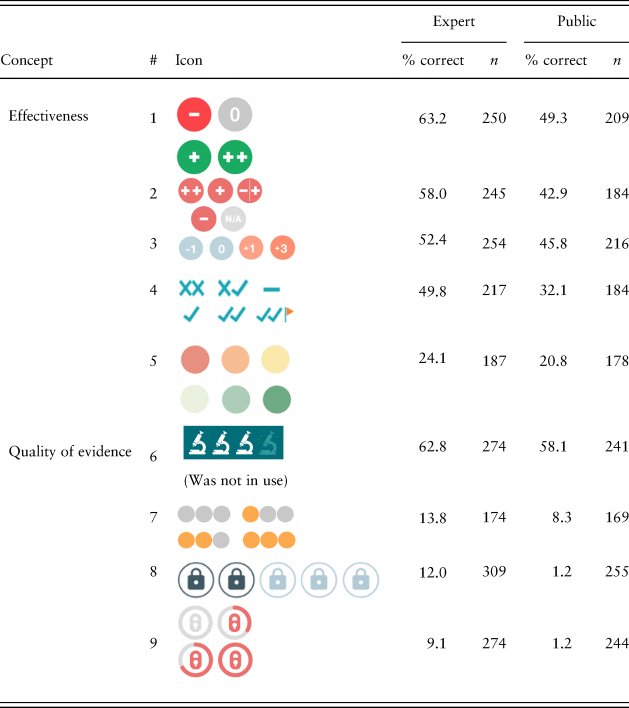
Note: Each item had the same 12 response options (e.g., effectiveness, evidence quality, etc.; see Table 1). Dichotomous variables yield Poisson distributions, so standard deviations are omitted. The microscope icon #6 was not in use by 2019; all other icons are from current What Works Centre toolkits and reports. Items have different n-values because of attrition during this effortful task. If drop-outs on a certain item were likely to get it wrong, the discrepancy between the best- and worst-performing items is underestimated here.
Testing comprehension within concepts
The comprehension results for the other icons with a correct answer are shown in Figure 3 and individually in the Supplementary Material. Unlike the nine icons above, most of the secondary icons had response options within a particular category. For example, effectiveness icons had response options that were mostly articulations of effectiveness taken from the current wording of the What Works Centres. Comprehension rates were still modest, which suggests that participants were also confused about what effectiveness and evidence quality meant conceptually (see Figure 2). This display was intended to convey that 67% referred to an expert-led combination of effectiveness, certainty and harms. Only 6.0% of the expert sample and 4.7% of the public sample chose this answer out of five options, which is considerably below chance (20%). The most common incorrect answer was ‘Out of 100 times, this intervention works 67 times’. Please see the Supplementary Material for more details and the results of other items with custom response scales.
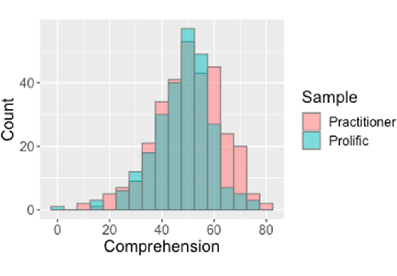
Both samples had similar overall comprehension, shown in overlaid histograms of objective comprehension percentage (25 items) for expert and non-expert users.
Preferences for information
Information priorities
Participants ranked different types of evidence to indicate what was most important to them. Results are shown here for each sample (Table 5). Participants from different Centres had similar priorities (Table S2). Effectiveness and evidence quality were ranked highest priority by both samples and also individuals who indicated that their job was either practitioner or policymaker within the expert sample (Table S3). Policymakers determine policy, which is then implemented by practitioners. While practitioners were concerned more with further details on evidence quality (the number and type of trials), for policymakers the next two most important items were financial cost and possible harms.
Evidence priority rank by sample (highest priority = 1).
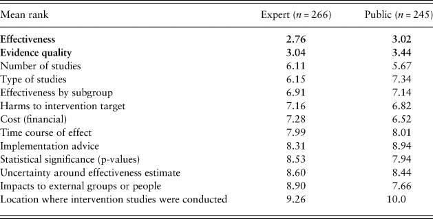
Note. Effectiveness and evidence quality were ranked the highest priorities and are shown in bold. Type of studies refers to, for example, randomized controlled trials or observation only. Impacts to external groups refers to, for example, environmental, health, financial impacts, etc. The Centre for Local Growth was excluded here for only having one respondent.
Common currency
Participants indicated their preference for multiple different outcomes (e.g., grades and school attendance) being combined into an aggregate score for intervention effectiveness. Higher values indicate more preference for an aggregate score (range 1–6), and participants strongly preferred seeing outcomes separately, M (SD) = 2.39 (1.53), n = 552 (Table S5).
Intervention label specificity
Participants were shown examples of evidence tables with related interventions labeled separately and one that aggregated related interventions into combined categories. Higher values indicate more preference for a single, aggregated label (range 1–6), and participants strongly preferred that the interventions be labeled separately, M (SD) = 2.09 (1.34), n = 541 (Table S6).
Subgroup (heterogeneous) effects
Participants were shown an example of an evidence table with overall ratings for an intervention compared to another example where separate ratings were given for different subgroups (in this case, children versus adults). Higher values indicate preferring the aggregate summary (range 1–6). The preference for separate subgroup results was overwhelming: M (SD) = 1.78 (1.28), n = 547 (Table S7). Currently, high-quality evidence for subgroups is rarely available.
Expert sample only
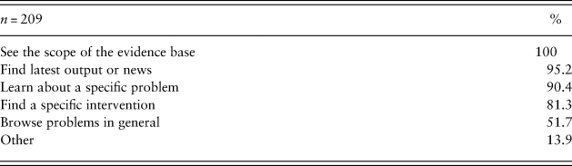
Table 6 shows the goals of the expert users when they visit the Centre websites. Participants could mark all options that applied. Participants were most likely to want to see the scope of the evidence base (100%), find the latest output or news (95.2%) or learn about a specific problem (90.4%).
User goals (expert sample only).
When applicable, participants from the expert sample also indicated the impact of the What Works Centre content on decisions within their organizations (Table S8). The median respondent said that one to two decisions were influenced by the What Works reports within the past year. This reinforces the immediate importance that the communications be understood.
Confirmatory hypotheses
Consistent with H1, expert comprehension M (SD) = 50.6% (12.6) was slightly higher than public comprehension, M (SD) = 48.0% (10.9), t(593) = 2.39, p = 0.009. See the ‘Methods’ section for the construction of the 25-item composite. Consistent with H2, the same graphics were best understood by both the expert and public samples; see Tables 4 and S2 for means by sample.
The tests in this paragraph are preregistered for the public sample only and are one-tailed. H2a involved a t-test comparing comprehension between the effectiveness icon #1 from Children's Social Care and their next best-performing icon #3 from the Education Endowment Foundation. There was no difference, t(188) = –0.83, p = 0.20. The #2 and #3 icons were also tested and there was again no difference, t(164) = –0.65, p = 0.26. H2a was partially supported: icons #1 and #3 were at least tied for best understood. H2b was tested by comparing comprehension between the microscope icon #6 and the next best-performing icon #7 from Children's Social Care. The microscope icon #6 was better understood, t(160) = –8.26, p < 0.0001.
Consistent with H3, the expert and public samples both ranked effectiveness and evidence quality as the highest-priority types of evidence. H3a was tested with a one-tailed t-test comparing effectiveness to the third-highest priority (number of studies), t(244) = –9.30, p < 0.0001, and H3b compared evidence quality to number of studies, t(244) = –8.33, p < 0.0001.
H4 was that the order of the columns would make no difference to the relative preference between effectiveness and quality of evidence information. Seeing effectiveness on the right led to changes in preference. H4 was examined with equivalence testing with the R package TOSTER (Lakens et al., Reference Lakens, Scheel and Isager2018) using α = 0.05 and upper and lower bounds of 0.3 as an estimate of the smallest effect size of interest. Inconsistent with H4, seeing the effectiveness column on the right, M (SD) = 3.08 (1.20), compared to left, M (SD) = 2.73 (1.16), led to a relative preference for effectiveness over evidence quality, Welch's t(236) = 2.29, p = 0.02.
H5 was that whether the icons were filled or unfilled would make no difference to the relative preference between effectiveness and quality of evidence information. There was no difference in relative preferences for effectiveness between filled, M (SD) = 2.92 (1.19), and unfilled icons, M (SD) = 2.90 (1.20), Welch's t(237) = –0.10, p = 0.92. H5 was tested with the same parameters and method as H4.
H6 was that evidence quality would be weighted over effectiveness in a trade-off situation. There was no relative preference for evidence quality. H6 was examined with a one-sample t-test comparing the composite of relative preference for effectiveness over evidence quality against the middle scale value (3; range 1–5). Inconsistent with H6, there was no relative preference for evidence quality, M (SD) = 2.91 (1.19), t(238) = –1.19, p = 0.12.
Discussion
This is the first objective evaluation of how widely used evidence communication icons are understood. Reports and toolkits with these icons are driving major policy decisions (UK Cabinet Office, 2018). Communicators can use these findings to design evidence-based messages that may be better understood. The full dataset is publicly available for reanalysis by specific icon types, occupations and Centres.
Users’ information priorities
Effectiveness and quality of evidence constituted the most important information for both expert and non-expert users learning about policy options. For policymakers, financial costs and potential harms were also important (Table S2). While financial costs are often communicated in existing toolkits, potential harms are currently rarely communicated, and this gap is important for researchers and communicators to address. Further work could explore whether users want a greater breakdown of the quality of evidence rating to show further details separately.
Trade-off between complexity and comprehensibility
Users consistently reported wanting more specificity in the displays: separate results by different outcomes, different intervention types and subgroups of the population (Tables S5–S7). Overall, these requests for more detail should be considered with caution. First, the current evidence base rarely contains these additional details. For example, many interventions in education lack reporting of impacts for gender subgroups. Researchers may wish to consider this aspect in their experimental designs.
A second reason for caution is that summaries with many heterogeneous outcomes and subgroups will be more difficult to understand. Users in this survey were not being asked to make a trade-off with comprehensibility, and they may not have recognized this tension when they requested more information. In evidence communication, there is a fundamental trade-off between presenting more complete or complex information and ensuring it is understood by readers who have finite time, attention and cognitive abilities (for a review, see Brick et al., Reference Brick, Freeman and Wooding2018). Communications need to describe the most important options and their potential outcomes, and ideally communicators will combine expert recommendations with requests from the target population. However, some requests will need to be declined or the display will become too complex or too confusing when navigating between layers.
Given that recipients want more information, future evidence toolkits should provide at-a-glance summaries that allow readers to seek more specific subgroup details (when available) without damaging comprehension. Online toolkits with layered communications are well suited to this challenge: for example, users could click a summary display to reveal subgroup differences. Such toolkit designs will need to be empirically tested to ensure sufficient comprehension.
Objective comprehension of existing graphical formats
Comprehension of icons out of context was in all cases below the International Organization for Standardization (ISO) required comprehension level of 66.7% (ISO, 2014). People do not always read labels or legends before interpreting a display because of limitations in motivation, time and capability (Rotfeld, Reference Rotfeld2009). As evidence summaries become more complex, individuals are more likely to make assumptions and miss details. If the labels had been presented in the survey (‘in-context’ testing), the comprehension rates would likely have been much higher.
Future icon design could be informed by these findings. When the shape of the icon represented a less ambiguous metaphor, like the microscope icon #6 to communicate evidence quality, comprehension was relatively high. When the icon shape resembled an object that did not invoke an unambiguous metaphor for the intended concept, comprehension was particularly low. For example, the lock-shaped icon #8 was intended to convey the security of the claims – evidence quality – but out of context was interpreted to mean data security because the metaphor of padlocks and security had become a widely used and well-understood digital meme. We suggest using icons that can be understood without a label (Gatsou et al., Reference Gatsou, Politis and Zevgolis2012), which means aligning the icon shape and content with the recipient's mental models and existing metaphorical understandings of icons. Future work can be informed by the rich open responses in this dataset on how icon design could help people understand better (Table S3). We encourage further user-centered design: focus groups can help elicit metaphors already latent in users’ minds (Marcus, Reference Marcus1993), and convergence on icons across sites can make icons more familiar through repeated use.
The overall pattern of comprehension also suggests that icons were better understood when they contained a numeric or symbolic representation of direction and magnitude (e.g., a circle with ‘+3’ or just ‘+’ inside; see icon #1). It is not clear from this survey how important it is to give a sense of the bounds of the quantification (i.e., ‘out of how many’). The range of the rating could be the focus of future studies.
It is also clear that users need to be helped to understand what the metrics actually mean. Units may help in some cases (e.g., financial costs, months of education advancement gained), but in others, such as the example of the percentage effectiveness in Conservation Evidence, further work is needed on wording that can support understanding. Showing how percentages are constructed – what they refer to and are compared to – is a well-known issue (Trevena et al., Reference Trevena, Zikmund-Fisher and Edwards2013). On a website, the existence of a tooltip or overlay info box may not be sufficient. Only a subset of users will hover over or click to learn about how these scores are constructed, and only a subset of those will understand the explanations and be able to apply them to form a correct interpretation of the original score. We also found evidence of confusion about what effectiveness and evidence quality mean conceptually to participants. See the ‘Results’ section and Supplementary Material for details on the low level of comprehension for the correct interpretation, even within categories such as effectiveness. Future research could investigate how different audiences understand key terms beyond just accurately applying them as labels.
Across all of the analyses, the two samples showed remarkably similar comprehension and preferences. This is encouraging because it suggests that further development of graphical representations can be tested in general population samples: their results may translate well to the intended user base of expert evidence users. However, evaluations in target populations remain highly valuable. Lastly, the layout of messages can affect their interpretation. The trade-off experiment suggests that further study is warranted on the display position of evidence types in tables.
Limitations
Omitting labels reduced the generalizability of the absolute comprehension rates. In addition, the response options for evidence types in the main results (here: effectiveness; evidence quality; 10 other options) were chosen for their comprehensiveness across all concepts that What Works Centres currently communicate with icons (e.g., location, implementation feasibility, etc.), as well as a few potential distractors chosen by the authors. A different selection could affect the absolute and relative comprehension rates. Similarly, this report was closely based on the current icons and expert population of the What Works Centres, and it is unknown how this network might differ from other (admittedly rare) examples of such networks worldwide.
Representativeness and generalizability are concerns. The expert sample was recruited by mass newsletter to take an effortful and unpaid survey. The response rate was low and attrition mid-survey was high for this rare sample. The public sample was intended as a general population control. Participants from online platforms such as Amazon Mechanical Turk (MTurk) and Prolific allow for relatively large samples to be recruited more cost-effectively (Buhrmester et al., Reference Buhrmester, Kwang and Gosling2011; Paolacci & Chandler, Reference Paolacci and Chandler2014). Online participants appear to attend to task instructions at least as well and sometimes better than participants from traditional university-based pools (Hauser & Schwarz, Reference Hauser and Schwarz2016; Ramsey et al., Reference Ramsey, Thompson and McKenzie2016), and Prolific may lead to higher-quality data than MTurk (Peer et al., Reference Peer, Brandimarte and Samat2017). Both samples were disproportionately female compared to the general population (combining both samples: 72.9% female). However, exploratory analyses revealed no major differences in the results between genders. In addition, the expert sample was 22% academic, which might reduce its representativeness of the intended users of the sites, but both samples showed similar preferences and performance. Further testing in other populations that use evidence summaries for policy decisions and testing in non-UK samples would be valuable to establish the limits of the generalizability of these results.
Given the differences in recruitment and demographics between the expert and public participants (e.g., see age and education in Table 3), it is striking how much the results align between the two samples. Comprehension was similar for similar icons, as was the overall spread of comprehension and the relative ranking of most icons. The different samples also indicated very similar preferences for the type and format of how evidence is communicated. This consistency provides converging evidence.
Conclusion
Testing the understanding of communications is critical to informed decision-making. Experts struggle to understand why others do not understand (Pinker, Reference Pinker2014). In risk and evidence communication, it is all too easy to imagine that audiences understand words, icons and charts as intended. Especially for major policy decisions, there is no substitute for objectively testing for comprehension, ideally in the target populations. The main comprehension result here is that current icons are not adequately understood without labels.
The results also suggest that further testing can be done in more easily accessed populations, as their preferences and capabilities appear similar to the target policymaker and practitioner audience. The findings on information preferences suggest that evidence summaries might need to contain more information on the effects in different population subgroups and potential harms in order to suit the needs of their audiences, when that evidence is available.
The data from both samples and well-documented code are openly available. Researchers or public service organizations are welcome to reanalyze it for reaction time data, subgroups based on demographics, occupation, etc., or to learn more about responses to particular types of evidence from the different Centres.
Supplementary material
To view supplementary material for this article, please visit https://doi.org/10.1017/bpp.2020.54.
Acknowledgments
We thank the UK Cabinet Office, seven UK What Works Centres and Conservation Evidence for their feedback on survey design and their help collecting the expert sample.
Author contributions
CB and ALJF designed the study and surveys, CB led the coordination with the partner organizations, the analyses and the writing and ALJF advised and edited.
Funding
Funding was provided by the Winton Centre for Risk and Evidence Communication through a donation by the David and Claudia Harding Foundation. The Foundation played no role in the design, execution, analysis, interpretation or writing of the study.
Conflicts of interest
The authors declare no professional or financial conflicts of interest.


 Open access