

1. Introduction
Although “the South” is broadly described as a single dialect region, the Southern United States exhibits diversity in its spoken language. Among many variably implemented features, it harbors pockets of r-lessness (Kurath & McDavid, Reference Kurath and Raven1961), differences in the phonological contexts that condition /aɪ/-monophthongization (Thomas, Reference Thomas2001; Thomas & Bailey, Reference Thomas and Bailey1998; Fridland, Reference Fridland2003), and locales where Southern features are rare or retreating (Dodsworth & Kohn, Reference Dodsworth and Kohn2012; Dodsworth & Benton, Reference Dodsworth and Benton2017). This paper explores spoken-language variation across eight Southern US states, by combining phonetic analysis with GIS mapping and spatial analysis. We examine how strongly individual speakers participate in Southern features identified by the Atlas of North American English (ANAE; Labov, Ash & Boberg, Reference Labov, Ash and Boberg2006), using acoustic data from the Digital Archive of Southern Speech (DASS; Kretzschmar et al., Reference Kretzschmar, Bounds, Hettel, Pederson, Juuso, Opas-Hänninen and Seppänen2013, Reference Kretzschmar, Renwick, Lipani, Olsen, Olsen, Shi and Stanley2019).
DASS is a subset of the Linguistic Atlas of the Gulf States (LAGS; Pederson, McDaniel & Adams, Reference Pederson, McDaniel and Adams1986), and thus follows the tradition of dialectology pioneered by Hans Kurath beginning in 1933, eventually with Raven McDavid alongside. In the introduction to ANAE, Labov and colleagues critique the sampling and analysis methods used in such earlier atlas surveys. The sampling methods were problematic in at least two ways: first, speaker selection followed a grid pattern, thus ignoring cities and their sociolinguistic influence. Second, the in-person interviews, conducted by fieldworkers, focused on the elicitation of a set of lexical items, without querying speakers’ phonological knowledge (i.e., whether two words were homophonous or not, indicating a potential merger). Analyses were typically descriptive and deliberately atheoretical in nature, and where pronunciations were concerned, fieldworkers listened for target lexical items, which they transcribed with fine phonetic detail. These transcriptions were destined to be plotted on dialect maps, as they had been for the Linguistic Atlas of New England (Kurath, Hansen, et al., Reference Kurath, Hansen, Bloch and Bloch1939; Kurath, Hanley, et al., Reference Kurath, Hanley, Bloch and Lowman1939). Acoustic data, which would have been very difficult to measure in quantity, were not available. By contrast, data in ANAE come from “urbanized areas”; elicitation methods asked specifically about phonological intuitions; and recorded interviews were mined for acoustic characteristics, focusing on stressed vowel quality (see Labov, Ash & Boberg, Reference Labov, Ash and Boberg2006: chap. 1 for discussion).
Although previous compilations of data from LAGS have focused only on targeted lexical items, the recent availability of fully transcribed interviews for DASS (Kretzschmar et al., Reference Kretzschmar, Renwick, Lipani, Olsen, Olsen, Shi and Stanley2019) makes it possible to study Southern speech features in all words where they may occur. Acoustic measurements are available for the entire 64-speaker corpus and are not limited to target lexical items. While we are not able to remedy all the supposed shortcomings of linguistic atlas work highlighted by Labov et al. (Reference Labov, Ash and Boberg2006), these improvements to DASS represent a large influx of relatively naturalistic phonetic and lexical material on Southern speech, which we can compare to ANAE and treat with modern mapping methods. We explore acoustic variation within this dataset, which samples rural and urban speakers from a wide range of socioeconomic backgrounds. We hypothesize that its speakers implement specific Southern features to varying degrees, but also that intraregional patterns of feature strength or weakness are present. Local spatial autocorrelation (LSA; Anselin, Reference Anselin1995) is used to detect clusters of speakers who behave similarly with respect to particular Southern features as well as those who are outliers compared to their nearest neighbors.
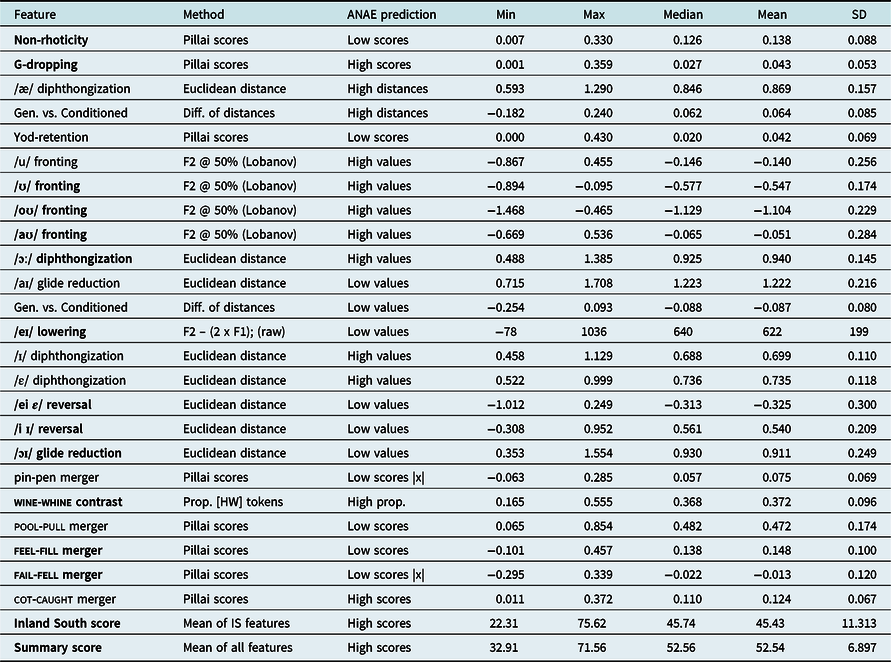
Within a broader analysis of features identified by ANAE, we have studied twenty-two vowel and consonant features. In this paper we specifically discuss thirteen features: /eɪ/ lowering, swapping of /eɪ ε/ and /i ɪ/, the feel-fill and fail-fell mergers, /ɔɪ/ monophthongization and /ɔː/ diphthongization; fronting of /ʊ/, /oʊ/, and /aʊ/; g-dropping, rhoticity, and the wine-whine distinction. We additionally compile feature values into two speaker-specific summary scores, testing how each speaker performs with respect to features aligned with the Inland South subregion and with all features identified with the South. We find little evidence for the Inland South region based on acoustics, and while some areas surveyed in DASS align well with the portrayal of Southern speech presented by ANAE, others do not.
We diverge from ANAE methods by analyzing all available vowels from the DASS interviews, not a limited set of lexical items. This means that our metrics reflect adherence to Southern features across a wide sample of words. If sound change is indeed regular, as argued by the Neogrammarian tradition (Labov, Reference Labov1981), then the injection of new lexical items should not alter individual speakers’ adherence to Southern features; however, evidence to the contrary could indicate widespread lexical variation or incomplete sound changes. In the remainder of this introduction, we situate the present study with respect to other efforts at linguistic mapping of speech in the Southern United States.
1.1. Background: Mapping speech in the South
The major mapping projects that have gathered spoken-language data from portions of the South studied in this paper include two data collection efforts by the Linguistic Atlas Project: LAGS (Pederson, McDaniel & Adams, Reference Pederson, McDaniel and Adams1986), and the Linguistic Atlas of the Middle and South Atlantic States (LAMSAS; McDavid & O’Cain, Reference McDavid and O’Cain1980; Kretzschmar et al., Reference Kretzschmar, McDavid, Lerud and Johnson1993; Kurath & McDavid, Reference Kurath and Raven1961; Kurath, Reference Kurath1949). Erik Thomas’ (Reference Thomas2001) thorough sociophonetic description, based on close phonetic analysis of 192 speakers of New World English, uses data from some Atlas interviewees, situating them geographically with respect to one another. The other major linguistic mapping project to include the South is the Telsur telephone survey project, whose data populate ANAE (Labov, Ash & Boberg, Reference Labov, Ash and Boberg2006).
The application of computer-based mapping techniques to spoken language variation is relatively recent. Within the Southern United States, the linguistic atlas data that exist have not yet been thoroughly analyzed from this perspective. Lee Pederson’s (Reference Pederson1986) proposal for a simple matrix map, plotting pronunciations in LAGS, is the earliest computer-based attempt, followed by an application of GIS to lexical LAMSAS data (Lee & Kretzschmar, Reference Lee and William1993). Limited work has been done to apply spatial analysis techniques to the perception of vowels, including features indicative of Southern speech, and with some participants hailing from the South (Kendall & Fridland, Reference Kendall, Fridland, Marie-Hélène, Remco and John2016).
We next turn to discussion of the South in the ANAE, which includes (portions of) thirteen US states, based on overlapping isoglosses, the most wide-ranging of which is speakers’ use of monophthongal /aɪ/. These cover Virginia, West Virginia, Kentucky, southern Missouri, Texas, Arkansas, Louisiana, Mississippi, Alabama, northern Florida, Georgia, noncoastal South Carolina, and North Carolina (Labov, Ash & Boberg, Reference Labov, Ash and Boberg2006, map 18.9). Each isogloss represents a stage of the Southern Shift, a set of characteristic vowel pronunciations including monophthongization (also known as glide deletion) of /aɪ/, a back upglide in /ɔː/, a “reversal” in the vowel space of /eɪ/ vs. /ε/, and of /i/ vs. /ɪ/. Not all isoglosses cover all states in the South: within the eastern South, states in Appalachia (northern Alabama and Georgia, eastern Tennessee and Kentucky, far-western West Virginia, Virginia, North Carolina) participate most strongly in this shift, forming the Inland South, while the Texas South (actually in north-central Texas) also exhibits most features. Alongside these core vowel features, which inform canonical descriptions of Southern speech within sociolinguistics, the ANAE describes a range of other characteristics affecting vowels and consonants, which are described in more detail in our Methods, alongside the implementations we applied to the DASS dataset.
The ANAE also discusses cities that are exceptional within the South, including Charleston, which lacks /aɪ/-monophthongization and exhibits a variety of non-Southern features; the City of New Orleans, where most notably /ɚ/ (e.g. third) is [əɪ]; and Atlanta, which despite its proximity to the Inland South only weakly exhibits Southern features including /aɪ/-monophthongization and front-vowel reversals. These islands are attributed to settlement patterns, and of course it is notable that the South excludes the Florida peninsula, whose settlement history is markedly different from other Southern states. Within the DASS dataset, all these “islands” are represented save Charleston, because South Carolina falls outside its purview.
Formant measurements from the Telsur survey have been used to illustrate methods of geospatial analysis, largely reproducing the ANAE’s dialect boundaries using multivariate spatial analysis (MSA) and geospatial autocorrelation techniques (Grieve, Reference Grieve2013; Grieve, Reference Grieve, Benedikt and Bernhard2014; Grieve, Speelman & Geeraerts, Reference Grieve, Speelman and Geeraerts2013). By using MSA on ANAE data to classify speakers, Grieve (Reference Grieve2013:83) found that its first factor not only accounted for 39% of variance in ANAE data, it identified the Southeast as different from the rest of the USA. An MSA applied to a separate lexical dataset (cf. Grieve, Speelman & Geeraerts, Reference Grieve, Speelman and Geeraerts2011) found that a factor accounting for 13% of variance in that dataset separated the Southeast, especially states east of the Mississippi, from other parts of the country (Grieve, Reference Grieve2013:87). An ordinary kriging analysis uniting the lexical and acoustic datasets shows that these two factors strongly correlated with one another (Grieve, Reference Grieve2013:101). Grieve et al. (Reference Grieve, Speelman and Geeraerts2013) also reanalyze ANAE data, using MSA on thirty-eight linguistic variables for pooled data from 236 US cities; they identify “variables exhibiting significant levels of spatial clustering” (Grieve, Speelman & Geeraerts, Reference Grieve, Speelman and Geeraerts2013:33) with global Moran’s I, and follow with an analysis of local spatial autocorrelation with Getis-Ord Gi. They carry out a factor analysis on all variables, reducing them to four factors whose loadings explain significant portions of the variance in ANAE vowel data. In the aggregate, their results approximately replicate dialect boundaries drawn within the ANAE, in which the Southeastern states constitute a distinct region.
Grieve’s modeling shows that the South is distinct both phonetically and lexically from the rest of the US, due to vowels involved in the Southern Shift, but does not explore variation within the South. With cluster mapping, Grieve shows that the “Southeast” includes Florida, Mississippi, Alabama, Georgia, South Carolina, North Carolina, Tennessee, and portions of West Virginia and Virginia. States including Texas, Louisiana, and Arkansas, which are part of DASS, instead pattern with the West (Grieve, Reference Grieve, Benedikt and Bernhard2014). While their work is methodologically instructive, Grieve and colleagues reuse the ANAE dataset and do not bring new phonetic data to bear on regional variation in the US. Within the Southern states covered by DASS, their analyses only include thirty-three points, all representing cities, not rural areas. By contrast, the number of unique locations (each representing one speaker) in DASS is nearly twice that, providing us with greater geographical coverage for a more detailed view of speech patterns.
1.2 The Digital Archive of Southern Speech
The Digital Archive of Southern Speech (Kretzschmar et al., Reference Kretzschmar, Bounds, Hettel, Pederson, Juuso, Opas-Hänninen and Seppänen2013; Kretzschmar et al., Reference Kretzschmar, Renwick, Lipani, Olsen, Olsen, Shi and Stanley2019) is a subset of the Linguistic Atlas of the Gulf States. LAGS was collected between 1968 and 1983, by fieldworkers who conducted conversational interviews with 1,121 speakers in eight “Gulf” states. Interviews were recorded onto reel-to-reel tapes, not all of which survive with their original recordings: since transcribers listened to the recordings only to capture target lexical items, some reels were reused. The remaining 5,300 hours (Montgomery & Nunnally, Reference Montgomery and Nunnally1998) of recordings have been digitized and are publicly available via the Linguistic Atlas Project (LAP) at the University of Georgia (Kretzschmar, Reference Kretzschmar2011). DASS itself was curated by Lee Pederson, who selected a sample of sixty-four speakers: thirty female (six Black) and thirty-four male (ten Black), born between 1886 and 1965. Pederson selected speakers from a range of backgrounds (social class, education level, rural versus urban, etc.) throughout the geographic range of the LAGS sample, which was also subdivided into sixteen sectors (Pederson, Reference Pederson1981: fig. 1 and table 1) and six land regions (Pederson, McDaniel & Adams, Reference Pederson, McDaniel and Adams1986: vol. 4: xxi, fig. 6). While sectors superimpose a grid onto the LAGS region, following political boundaries, the larger land regions are sensitive to characteristics of physical landscapes and historical settlement patterns. Speaker-specific data for DASS are available at the Intro page to our GIS maps (see Results). The approximately four hundred hours of DASS audio (Kretzschmar et al., Reference Kretzschmar, Bounds, Hettel, Pederson, Juuso, Opas-Hänninen and Seppänen2013) were made available via the Linguistic Data Consortium and the LAP’s website as mp3s with associated speaker metadata.
From 2016–2019, DASS was fully transcribed and has been acoustically analyzed at the University of Georgia. All speech (by interviewer, interviewee, and other speakers) was transcribed, and transcriptions were checked multiple times. Audio was force-aligned to its transcription using Dartmouth Linguistic Automation (DARLA; Reddy & Stanford, Reference Reddy and Stanford2015), which at time of processing used the ProsodyLab aligner (Gorman et al., Reference Gorman, Howell and Wagner2011). This study uses acoustic data extracted from forced alignments created by DARLA, and formant values (F1/F2) were extracted by DARLA from all DASS audio at five time points in every vowel token (20%, 35%, 50%, 65%, 80% of duration) using the Forced Alignment and Vowel Extraction (FAVE) suite (Rosenfelder et al., Reference Rosenfelder, Fruehwald, Evanini, Seyfarth, Gorman, Prichard and Yuan2014). This method also extracts other acoustic parameters, like duration and information about phonological context, but automatically excluded a variety of stop-words, as well as tokens that it deemed to have acoustically poor quality. The total number of vowel tokens in this dataset is 887,864. For further details on methods of corpus creation, see Olsen et al. (Reference Olsen, Olsen, Stanley, Renwick and William2017).
Subsequently DASS has been re-aligned with the Montreal Forced Aligner (MFA; McAuliffe et al., Reference McAuliffe, Socolof, Mihuc, Wagner and Sonderegger2017). Since the audio is not of archival quality, and since forced alignment is not a perfect technique, a subset of forced alignments has been hand-validated by listening to specific portions of audio to check whether they contain words corresponding to the TextGrid. By listening to approximately 10,000 tokens of individual words, we have verified that in at least 86% of cases, the portion of audio identified by the MFA forced aligner output did contain the expected word. Acoustic values were re-extracted with a local installation of FAVE. The acoustic data may be plotted and explored interactively in the Gazetteer of Southern Vowels (Stanley et al., Reference Stanley, Kretzschmar, Renwick, Olsen and Olsen2017). The resulting corpus of text files, Praat TextGrids (Boersma & Weenink, Reference Boersma and Weenink2017), xml files, and full audio files (.wav files, approximately five hundred MB each) is available via the Linguistic Atlas Project (Kretzschmar et al., Reference Kretzschmar, Renwick, Lipani, Olsen, Olsen, Shi and Stanley2019).
LAGS, and by extension DASS, has a different sampling method from ANAE. Therefore, as also discussed by Labov et al. (Reference Labov, Ash and Boberg2006: chap. 1), we may expect to see different trends from ANAE. Specifically, we hypothesize that our data will reveal more individual variation in the implementation of these features than is visible in the maps of ANAE. We also hypothesize that some features will be widespread across the South, while others may be strongest in regional pockets, detectable via GIS-based clustering analyses.
2. Methods
The goal of our analysis is to create maps that show, for individual features associated with Southern speech, the presence of clusters of similarity among DASS speakers. The maps consist of two layers: one layer for the specific set of acoustic data used to represent the dialect feature in question, and a second layer that visualizes clusters identified by local spatial autocorrelation. Our methods for calculating values for each acoustic feature broadly fall into three categories, each with similar processes, with a few features that are handled differently. The local spatial autocorrelation method, on the other hand, works the same on all our measures, so we detail it at the end of this section.
2.1 Acoustic methods
In this subsection we describe methods used to approximate the thirteen ANAE features presented in this paper. Alongside each, we discuss the directional hypotheses that apply. Among the twenty-two features we have analyzed, this subset was selected for presentation due to their salient demonstration of clustering with LSA, and as representatives of our acoustic methods. Maps for all twenty-two features are available online (see Results).
Unless otherwise indicated, calculations were applied to all vowel tokens labeled with the ARPABET symbol that corresponds to the ANAE’s symbol for each Southern speech feature. Unless otherwise indicated, stressed and unstressed vowels were analyzed, and no lexical filters were applied (with the exception of DARLA’s stop words).
2.1.1 Pillai scores
The first acoustic calculation, used for eight features in total, is the Pillai score (Hay, Warren & Drager, Reference Hay, Warren and Drager2006; Hall-Lew, Reference Hall-Lew2010), a statistic based on the output of a multivariate analysis of variance (MANOVA) that measures the overlap of two distributions with an arbitrary number of dimensions, on a scale from zero to one, with zero representing complete overlap and one representing complete distinction. Pillai scores have previously been used with LAGS data to evaluate the presence of diagnostic vowel shifts in speakers from Southeast Georgia (Renwick & Olsen, Reference Renwick and Olsen2017) and throughout the DASS region (Renwick & Stanley, Reference Renwick and Stanley2017). We use Pillai scores to test for phonetic distinctness between two sounds, or across contexts. All Pillai scores presented here are speaker-specific, meaning a separate MANOVA was run for each speaker’s acoustic data. A low Pillai score indicates a lesser distinction, so we chiefly use these to measure vowel mergers, but also some features which involve vowel-consonant interaction, such as g-dropping and rhoticity.
Vowel mergers were assessed on subsets of acoustic data. The feel-fill merger was calculated for tokens of /i/ and /ɪ/ in prelateral position. The fail-fell merger was calculated for prelateral /eɪ/ and /ε/. Pillai scores were calculated with raw first and second formant values measured at the vowel nucleus, plus vowel duration. In the front-vowel mergers discussed here, a phenomenon known as “swapping” is possible, where the vowels actually move past each other along the F1 dimension, rather than simply merging. This is detected by making the Pillai score negative if the average F1 value for the canonically lower vowel is actually less than that for the canonically higher vowel (cf., Hall-Lew, Reference Hall-Lew2010).
To quantify g-dropping, we compare the distributions of unstressed /ɪ/ before a canonical /n/ versus before a canonical /ŋ/. If g-dropping is widespread, /ŋ/ is expected to be realized as [n], leading to acoustically similar formant distributions in the vowels that precede the nasal, particularly in the vowel-nasal transition. Based on the findings of Yuan and Liberman (Reference Yuan and Liberman2011), we use the first, second, and third Lobanov-transformed formant values taken at 90% of the vowel duration as input for Pillai scoring.
To measure rhoticity, we compare the distributions of stressed /ɑː/ preceding /ɹ/, versus preceding a /t/, which is chosen as a clearly nonrhotic sound. Filters are applied to exclude tokens of intervocalic /ɹ/ and /t/ respectively, ensuring that all analyzed vowel tokens are in closed syllables. Prerhotic vowels in English are expected to exhibit a significant F3 drop in the first half of the duration, which remains low until the consonant onset (Olive, Greenwood & Coleman, Reference Kretzschmar, McDavid, Lerud and Johnson1993). To capture this, we calculate the difference between Lobanov-transformed third formant values taken at 20% and 80% of vowel duration; a positive (20%–80%) value is expected in rhotic speakers. This token-specific value is combined with vowel duration to calculate Pillai scores.
2.1.2 Euclidean distance
Several features of Southern speech are best quantified in terms of their formant dynamics, or lack thereof (see Renwick & Olsen, Reference Renwick and Olsen2017; Renwick & Stanley, Reference Renwick and Stanley2020 for relevant analyses of LAGS). Euclidean distance is often applied to compare F1/F2 coordinates between measurement points within a single vowel token; here, we calculate the distance between coordinates at 20% versus 80% of vowel duration, equivalent to Fox and Jacewicz’s (Reference Fox and Jacewicz2009) measurement of vector length (VL; see also Ferguson & Kewley-Port, Reference Ferguson and Kewley-Port2002; Hillenbrand et al., Reference Hillenbrand, Getty, Clark and Wheeler1995; and including Southern speech, Farrington, Kendall & Fridland, Reference Farrington, Kendall and Fridland2018). Distance is measured for each token, between coordinate pairs of the first and second Lobanov-transformed formant values, and averaged across each speaker’s tokens.
We use this method with DASS to quantify monophthongization, diphthongization, gliding features, and front-vowel reversals. Our specific hypotheses are as follows. First, for /ɔɪ/, which is described as monophthongizing (via loss of /ɪ/) in Southern speech, we expect to find lower Euclidean distances as an indicator of this phenomenon. Second, the typically monophthongal vowel /ɔː/ can diphthongize to /aʊ/; the latter would produce an increased Euclidean distance, due to movement both in F1 (a lower vowel to a higher glide) and F2.
A second application of Euclidean distance in this paper is to quantify the acoustic distance between pairs of tense and lax vowels, including /eɪ ε/, and /i ɪ/. Within the Southern Shift, the front tense vowels move back and lower in the vowel space, while their lax counterparts shift up and front (Labov, Ash & Boberg, Reference Labov, Ash and Boberg2006). This can lead to a quantifiable reversal in the pairs’ positions (e.g. in which the canonically-higher /eɪ/ has a higher F1, and lower position in the vowel space, than /ε/). Labov et al. (Reference Labov, Ash and Boberg2006) calculate /eɪ ε/ distance as an indicator of Stage 2 of the Southern Shift, using the formula (F2[eɪ] – F2[ε]) + (F1[eɪ] – F1[ε]), which emerges negative in case of reversal. We calculate distance using the formula given by Fox and Jacewicz (Reference Fox and Jacewicz2009, ex. [1]), which increases comparability to other studies of Southern speech. A low Euclidean distance between /eɪ ε/ in particular has been found to index participation in the Southern Shift (Fridland & Kendall, Reference Fridland and Kendall2012; Kendall & Fridland, Reference Kendall and Fridland2010, Reference Kendall and Fridland2012). A close distance and reversal of /i ɪ/ also indicate strong Southern shifting, all the way to Stage 3 according to Labov et al. (Reference Labov, Ash and Boberg2006). We detect reversals via a secondary calculation: Euclidean distances are multiplied by −1 if the vowel with a canonically lower F1 actually has a higher average F1 for the speaker. This is similar to including swapping effects in Pillai scores.
2.1.3 Other acoustic measures
The vowel /eɪ/ lowers and backs along the front vowel diagonal in Southern speech, resulting in a lower F2 but higher F1. This feature, and relatedly the distance from /eɪ/ to its lax counterpart /ε/, is argued to strongly index participation in the Southern Vowel Shift (Kendall & Fridland, Reference Kendall and Fridland2010; Fridland & Kendall, Reference Fridland and Kendall2012) and play a dialect-specific role in vowel perception (Kendall & Fridland, Reference Kendall and Fridland2012). We focus on the position of the tense vowel, using the calculation recommended by Labov, Rosenfelder, and Fruehwald (Reference Labov, Rosenfelder and Fruehwald2013): F2 – (2 * F1), by which speakers with lower, backer /eɪ/ vowels will exhibit lower values.
Our third main measure is simply the Lobanov-transformed (Lobanov, Reference Lobanov1971) F2 measurement at 50% of vowel duration. We use this to measure fronting features. When formant measurements are normalized using the Lobanov method without further adjustment, they are centered around a mean of (0,0), such that front vowels (that is, vowels fronter than the centroid) have a positive F2 value, and back vowels have a negative F2 value. Speakers with fronted /ʊ oʊ aʊ/, the features discussed in this paper, will exhibit a relatively higher normalized F2 for those vowels. Unlike ANAE (e.g., Labov, Ash & Boberg, Reference Labov, Ash and Boberg2006: map 18.8), we do not set formant-based thresholds for the detection of fronted vowels.
Turning to a final consonantal feature, we investigate whether speakers maintain a distinction between /w/ and /hw/ or /ʍ/, also known as the wine-whine distinction. Retention of the contrast is a feature, arguably now in decline, of Southern US English (Kurath & McDavid, Reference Kurath and Raven1961; Labov, Ash & Boberg, Reference Labov, Ash and Boberg2006; Bridwell, Reference Bridwell2019). This measurement uses the phonetic transcriptions generated by the Montreal Forced Aligner (McAuliffe et al., Reference McAuliffe, Socolof, Mihuc, Wagner and Sonderegger2017), which was also run on all DASS audio files as described in the Introduction. MFA transcribes <HH W> in ARPABET for /hw/ or /ʍ/, while DARLA (whose alignments were used for all other features in this paper) transcribes all tokens of <wh> as <W> in ARPABET. We rely on variants built into MFA’s lexicon and acoustic models, rather than retraining the acoustic models, a method that has been shown to detect some sociolinguistic variation (Yuan & Liberman, Reference Yuan and Liberman2011; Bailey, Reference Bailey2016). Our measurement of the /w ʍ/ distinction is thus the percentage of <wh> tokens that are transcribed as <HH W> by MFA for each speaker. A greater percentage is expected for speakers who maintain the voiceless /ʍ/ phoneme.
2.1.4 Summary scores
If the acoustic measures we apply to DASS data reflect trends in Southern speech reported by the ANAE (Labov, Ash & Boberg, Reference Labov, Ash and Boberg2006), then some speakers will exhibit more features—or stronger proportions of them. We assess this possibility in an unsophisticated fashion. Using all twenty-two features analyzed within this project, we transform each variable’s distribution to an equivalent distribution between zero and one hundred, such that for each variable a score closer to zero is unlike the ANAE’s description, and a score closer to one hundred reflects Southern speech as described by the ANAE. For each feature, the range was determined by the difference between the highest and lowest raw scores across all speakers. The values for each speaker are averaged together, to obtain a total unweighted measure of agreement with the claims in ANAE. We hypothesize that speakers who adhere more strongly to ANAE’s features will have a higher score. In particular, if the ANAE’s isoglosses hold, we expect to see the highest scores in the Inland South (northern Alabama, eastern Tennessee, and far northwestern Georgia) and in the Texas South (stretching west from Dallas to the New Mexico border, centered on Abilene).
To further investigate patterns specific to the Inland South, we include a second summary score map that uses only the scores for the features specified by ANAE’s Map 18.9 as being particular to the Inland South. These are /aɪ/ monophthongization, /ɔː/ diphthongization, and reversals of /eɪ/ versus /ε/ and /i/ versus /ɪ/.
We used the R programming language (R Core Team, 2000) in the RStudio integrated development environment together with the tidyverse package (Wickham, Reference Wickham2019) to summarize the full corpus of formant and duration observations by speaker using all of the acoustic measurements mentioned above. The sf package (Pebesma et al., Reference Pebesma, Bivand and Racine2020) was used to export the summarized data in geospatial format.
2.2 Spatial analysis methods
The spatial analysis program GeoDa was used to run local spatial autocorrelation (LSA) analysis on the feature-specific data for each speaker. A separate LSA was run for each feature. The method of LSA we used is the Local Moran’s I method, which requires a definition of neighboring relationships among the speakers. We defined neighboring speakers as the four nearest speakers to each speaker. The neighboring relationship is not symmetrical, meaning that for any two speakers, Speaker 1 may be among Speaker 2’s nearest neighbors, but the opposite may not be true. Additionally, some weighting is included based on the distance between neighbors. For our purposes, the arc distance in miles was used, and the triangular adaptive kernel function in GeoDa was chosen with maximum kernel nearest-neighbors distance as the bandwidth. Local Moran’s I requires a number of permutations to generate p-values for determining statistical significance of clusters, and 9,999 permutations were selected as opposed to the program’s default setting of 999. The seed for pseudorandom number generation in GeoDa was set to 757259796, itself generated by an atmospheric noise method freely available at https://random.org. We kept the default significance filter value of p < 0.05.
The Local Moran’s I method is described in more detail by Anselin (Reference Anselin1995), but we summarize it as pertains to our usage. Local Moran’s I is an extension of an earlier method, simply known as Moran’s I (Moran, Reference Moran1950; now Global Moran’s I in GeoDa), which measures spatial autocorrelation across a whole dataset and only indicates whether there is significant clustering or dispersal of similar values, not where the clustering or dispersal is. The local extension calculates a spatial autocorrelation statistic for each constituent of the dataset based on its own value and the values of its defined neighbors, as well as a p-value to determine the significance of this relationship. The method also compares the variable being examined for spatial autocorrelation to its spatially lagged counterpart, whose values are the weighted sums of the neighboring values. Consider the z-scores of these two variables plotted against each other on a scattergram (Figure 1). In the first quadrant, both are positive, and LSA with similarly high values is identified, while in the third quadrant, both are negative, and we instead find LSA with similarly low values. In the second and fourth quadrant, we find outliers, where a constituent of the dataset has higher or lower values than its neighbors. This analysis is combined with the p-value to determine the significance of these LSA relationships, and our result is a map of where similarly high or low values cluster together and/or where unusually high or low values occur. Clusters can be made up of one or more speakers, so for shorthand we refer to them as either “monopoint” or “multipoint” clusters.
Local Moran’s I Scatterplot example, with Summary Score on the x-axis (see Section 3.5) and its spatially-lagged version on the y-axis.

Finally, all of these components are combined for display using ArcGIS Online’s Map Series feature, with each map having one layer representing the acoustic data and the second representing the results of Local Moran’s I analysis. Each interactive map is accompanied by a short explanation of the measurements used and a description of which areas are of interest in the Local Moran’s I results, alongside speaker-specific metadata.
3. Results
Maps have been completed for twenty-two out of the twenty-four Southern features identified in ANAE, and two features (/æ/ diphthongization and /aɪ/ monophthongization) are examined in two maps each, making up a total of twenty-four maps. For the remaining two features, the horse-hoarse and mary -merry-marry mergers, analysis is not currently feasible with available data, as neither MFA/FAVE nor DARLA include lexical variants for vowels in these contexts. Additionally, “breaking of long front nuclei” as part of the ANAE’s list of Southern Vowel Shift features is replaced here with measures of front vowel reversals. All of the maps are available online at https://arcg.is/1WXHvv, and the results are also summarized in Table 1.Footnote 1 Interactive online maps are ordered to match the list given in ANAE (Labov, Ash & Boberg, Reference Labov, Ash and Boberg2006: 239–240). Here we discuss in-depth only thirteen of these twenty-two features as well as two summary score maps. These thirteen are g-dropping, rhoticity, feel-fill and fail-fell mergers, /eɪ/ lowering, reversals of /eɪ/ vs. /ε/ and /i/ vs. /ɪ/, /ɔɪ/ monophthongization, /ɔː/ diphthongization, fronting of /ʊ/ /oʊ/ /aʊ/, and the wine-whine distinction. We first discuss vowel features, in 3.1 – 3.3, followed by consonant features in 3.4, and summary scores in 3.5.
Southern speech features analyzed. Bold indicates a feature presented in this paper. Additional maps available at https://arcg.is/1WXHvv.
3.1 Front vowel shifts
The first feature we discuss is /eɪ/ lowering along the diagonal, nonperipheral track. While this feature is not as indicative of the Southern Shift as /aɪ/ monophthongization, it is crucial to the second stage of the shift, and foreshadows the occurrence of other mergers and reversals that /eɪ/ may undergo for individual speakers. We detect /eɪ/ lowering with a method established by Labov, Rosenfelder, and Fruehwald (Reference Labov, Rosenfelder and Fruehwald2013), namely F2 – (2 * F1); results are in Figure 2. Median values for the DASS speakers range between –78.3 and 1035.6, with a median of 640.1 and a mean of 622.2.Footnote 2 Lower values indicate greater retraction of /eɪ/, with a lower F2 and higher F1 value. LSA analysis shows a Low-Low cluster of three speakers from Dallas to Waco, Texas, all significant at p < 0.05. There is also one Low-Low speaker in western Tennessee (p < 0.05). Finally, there is a large High-High cluster of seven speakers in southern Louisiana and Mississippi, with a complementary Low-High speaker also in Mississippi. All are significant at p < 0.01, except for the Low-High speaker and one speaker in south-central Louisiana, both significant at p < 0.05.
/eɪ/ retraction results. Each point represents one speaker. Inner circle color indicates average location along front diagonal; outer circle color indicates LSA clustering.

We next discuss merger features, analyzed via Pillai score. Recall that the dimensions for Pillai scoring (input to a speaker-specific MANOVA) are the raw first and second formant values at the vowel nucleus, as well as the vowel duration. Here we showcase the feel-fill and fail-fell mergers, but our maps also cover the cot-caught, pin-pen, and pool-pull mergers. Since swapping is possible, truly merged speakers should have Pillai scores close to zero.
Pillai scores for the feel-fill merger (Figure 3) range between −0.101 and 0.457, with a median of 0.138 and a mean of 0.148. The minimum score shows that the effects of swapping on these vowels is relatively weak, as it is still close to zero, and in fact only three speakers have negative Pillai scores. The median and mean are also close to zero with positive values, though over 0.1, indicating most speakers had similar feel and fill vowels. Averages and maximum values above zero indicate that most speakers retained an unswapped arrangement of these vowels. Through LSA analysis, we find a High-High cluster throughout much of Louisiana with one complementary Low-High outlier point, all at p < 0.05. We also find one Low-Low speaker in Northwestern Tennessee, with a negative Pillai score (p < 0.05).
For the fail-fell merger, seen in Figure 4, the effects of swapping are far more prominent. Pillai scores range between –0.295 and 0.339, with a median of −0.022 and a mean of –0.013. The minimum and average values show that swapping is much more common, and indeed thirty-seven speakers have negative Pillai scores. Averages are very close to zero, however, indicating that these vowels were merged by most speakers. LSA analysis reveals a large High-High cluster in southern Louisiana, where the vowels are distinct, extending to two speakers in southern Mississippi (p < 0.01). There is one Low-Low speaker in southern Alabama with a complementary High-Low speaker, both significant at p < 0.05. Finally, there is a High-Low speaker in east-central Alabama (p < 0.05), which does not neighbor either of the aforementioned clusters.
The next two features are parts of the Southern Shift, respectively indicating its Stage 2, which is more widespread, and Stage 3. Both involve the retraction and lowering of a tense front vowel, alongside fronting and raising by its lax counterpart. The shifts of /eɪ/ and /ε/ (Stage 2; Figure 5) were measured using the Euclidean distance between each vowel’s formant-space centroid. As mentioned in the Methods, negative distances indicate the vowel with a canonically lower F1 actually has the higher average F1. In this case, /ε/ has a canonically higher F1, so negative distance indicates /eɪ/ has a higher average F1 than /ε/ for a speaker. DASS speakers’ Euclidean distances range from –1.012 to 0.249, with a median of –0.313 and a mean of –0.325. The vast majority of speakers, fifty-five out of sixty-four, had a negative distance, indicating the mid-vowel SVS reversal was in place for most speakers. LSA analysis finds a large High-High cluster across much of southern Louisiana with one speaker in southern Mississippi, four with p-values < 0.01 and one with p-value < 0.05. This cluster also has one complementary Low-High speaker in southern Mississippi, with p < 0.05. We also find a Low-Low cluster of two swapped speakers in western Tennessee, both with p < 0.01.
Feel-fill merger results. Each point represents one speaker. Inner circle color indicates Pillai score; outer circle color indicates LSA clustering.

Fail-fell merger results. Each point represents one speaker. Inner circle color indicates Pillai score; outer circle color indicates LSA clustering.

/eɪ/ vs. /ε/ Euclidean distance. Each point represents one speaker. Inner circle color indicates average distance; outer circle color indicates LSA clustering.

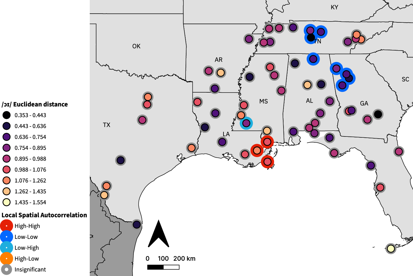
The Southern Shift’s final stage is indicated by /i/ and /ɪ/, which we quantify via speaker-specific Euclidean distances between each vowel’s F1/F2 centroid (Figure 6). Negative Euclidean distances indicate the average F1 for /ɪ/ is lower than for /i/. Distances range between –0.308 and 0.952, with a median of 0.561 and a mean of 0.540. In this case, only one speaker’s distance is negative. This may indicate a merger-like behavior rather than a true reversal, although other analyses of vowel formant trajectories in DASS show that all front vowels occupy different ranges of the F1/F2 space (Renwick & Stanley, Reference Renwick and Stanley2020). Through LSA analysis, we find a High-High cluster of four speakers in southwest Louisiana and East Texas (with large distances; p-values < 0.05), and a Low-Low cluster of two speakers in southwest Georgia with a complementary High-Low speaker in eastern Alabama (p-values < 0.05).
/i/ vs. /ɪ/ Euclidean distance. Each point represents one speaker. Inner circle color indicates average distance; outer circle color indicates LSA clustering.

3.2 Changes in vowel dynamics
Vowel features characterized by a change in formant dynamics are measured with Euclidean distance. A greater average distance indicates more formant change in the vowel space, and a lower value indicates less change, which correspond to either diphthongization/gliding or monophthongization.
The first relevant feature is /ɔɪ/ monophthongization, shown in Figure 7. Median Euclidean distances for DASS speakers range between 0.353 and 1.554, with a median of 0.930 and a mean of 0.911. Average and maximum distances near and over one indicate that most speakers’ /ɔɪ/ remained diphthongal, however we can still examine spatial patterning. LSA analysis finds a large Low-Low cluster of eight more monophthongal speakers covering the area between Nashville and Atlanta, significant at p < 0.01, aside from one speaker (p < 0.05). There is also a High-High cluster of three speakers in southeastern Louisiana and south Mississippi with a complementary Low-High speaker in southwestern Mississippi (p < 0.05).
/ɔɪ/ monophthongization results. Each point represents one speaker. Inner circle color indicates average Euclidean distance; outer circle color indicates LSA clustering.
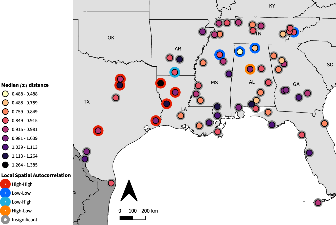
Next, the ANAE claims that /ɔː/ diphthongizes to become closer to /aʊ/. Median Euclidean distances for this vowel in DASS (Figure 8) range between 0.488 and 1.385, with a median of 0.925 and a mean of 0.940. Average and maximum distances near and over one suggest that /ɔː/ was diphthongized to some degree by the DASS speakers. LSA analysis identifies a large High-High cluster of seven diphthongizing speakers in Texas and northwestern Louisiana, six of whom are significant at p < 0.01, plus one speaker in San Antonio (p < 0.05). This cluster has a complementary Low-High speaker in southern Arkansas (p < 0.05). There is also a Low-Low cluster of three speakers (p < 0.01) in northern Mississippi and Alabama with a complementary High-Low speaker (p < 0.05). There is one other Low-Low speaker (p < 0.05) in eastern Tennessee, who does not neighbor either of the clusters.
/ɔː/ diphthongization results. Each point represents one speaker. Inner circle color indicates average Euclidean distance; outer circle color indicates LSA clustering.
3.3 Vowel fronting
Vowel fronting features are measured using the Lobanov-transformed second formant at 50% vowel duration. Higher values represent a more fronted vowel, while lower values represent a more backed vowel. Zero represents the center of the vowel space.
The first feature tested for fronting is the /ʊ/ vowel, whose values for DASS speakers (Figure 9) range between –0.894 and –0.095, with a median of –0.577 and a mean of –0.547. The whole range is negative, indicating that the effects of fronting on this vowel are not strong enough to move it past the center of the vowel space. Additionally, the range almost reaches zero on one end and –1 on the other, indicating that some speakers retained a back /ʊ/ vowel while others had a near-central /ʊ/ vowel; however, averages near –0.5 indicate that most speakers had a back-central /ʊ/ vowel. Through LSA analysis we find a Low-Low cluster of five speakers with backed /ʊ/, around Atlanta and in northern Alabama (p < 0.05). We find two other non-neighboring Low-Low speakers, one each in southern Louisiana and Mississippi (p < 0.05). There are also two non-neighboring High-High speakers, one in southern Alabama and one in southeast Georgia (p < 0.05). Finally, there is one Low-High speaker in Waco, Texas who does not neighbor any clusters (p < 0.05).
/ʊ/ fronting results. Each point represents one speaker. Inner circle color indicates average Lobanov-normalized F2; outer circle color indicates LSA clustering.

Our next fronting feature is /oʊ/, where values for the Lobanov-transformed second formant at 50% range between –1.468 and −0.465 with a median of –1.129 and a mean of –1.104. As shown in Figure 10, all values are negative, so the effects of fronting are not strong enough to bring the vowel forward of the center of the vowel space. Additionally, the maximum is just over –0.5, indicating it is less fronted than /ʊ/. Thus, we can characterize the /oʊ/ vowel as remaining fairly back among DASS speakers. LSA analysis reveals a Low-Low cluster of five speakers, with backed /oʊ/, four in the Atlanta area and one in east-central Alabama (all p < 0.05). This cluster is complemented by a High-Low speaker east of Birmingham (p < 0.01). Additionally there is a High-High cluster of five speakers all along the Florida Gulf Coast (p < 0.05), with a complementary Low-High speaker in St. Augustine (p < 0.01).
Our last fronting feature is the /aʊ/ vowel, shown in Figure 11, where values range between –0.669 and 0.536, with a median of –0.065 and a mean of –0.051. As the distribution is nearly centered on zero, with a maximum above 0.5, fronting is more extreme for this vowel. Thirty speakers have positive formant values, while the other thirty-four speakers retain a vowel in the back half of the vowel space. Overall, we can characterize this vowel as central or back-central in most DASS speakers, given averages close to zero and a majority of speakers having negative formant values. With LSA analysis, we find a Low-Low cluster of five speakers with backer /aʊ/ in southern Louisiana and Mississippi, four of which are significant at p < 0.01 and the fifth, in south-central Louisiana, significant at p < 0.05. There is a second Low-Low cluster of two speakers in South Texas (p < 0.05). High-High clusters are found in southern Alabama (two speakers at p < 0.05), and one High-High speaker in western Tennessee (p < 0.05).
/oʊ/ fronting results. Each point represents one speaker. Inner circle color indicates average Lobanov-normalized F2; outer circle color indicates LSA clustering.

/aʊ/ fronting results. Each point represents one speaker. Inner circle color indicates average Lobanov-normalized F2; outer circle color indicates LSA clustering.

3.4 Consonant features
We next present results from the three consonant features analyzed here using DASS data. The first is g-dropping, which we detect using Pillai scores (Figure 12). These range between 0.001 and 0.359, with a median of 0.027 and a mean of 0.046. With a minimum, mean, and median close to zero, indicating acoustic similarity between canonical /n/ and /ŋ/, it is likely that DASS speakers have high rates of g-dropping. Furthermore, LSA analysis finds a Low-Low cluster of three speakers (p < 0.01) in eastern Tennessee, as well as two other isolated Low-Low speakers in Alabama, one at p < 0.01, and the second at p < 0.05. One High-High speaker is also identified (p < 0.01) in Vicksburg, Mississippi, with a complementary Low-High speaker in northern Mississippi (p < 0.05).
g-dropping results. Each point represents one speaker. Inner circle color indicates Pillai score comparing /n/ and /ŋ/; outer circle color indicates LSA clustering.

Pillai scores were also used to evaluate rhoticity, which may not be present for Southern speakers. Their range, shown in Figure 13, is between 0.007 and 0.330, with a median of 0.126 and a mean of 0.138. The maximum stays fairly low, under 0.5, possibly due to overall similarity between the vowels overriding much of the change in the third formant in rhotic speakers. In any case, we cannot make a claim as to whether or not the DASS speakers were broadly rhotic or nonrhotic. However, we can look at the spatial patterns using LSA analysis. It identifies a High-High cluster of four rhotic speakers in Mississippi (p < 0.05), and a Low-Low cluster of three speakers along the Gulf Coast of Florida (p < 0.05) with a complementary High-Low speaker in St. Augustine (p < 0.05).
Rhoticity results. Each point represents one speaker. Inner circle color indicates Pillai score for Euclidean distances of /ɑɹ/ vs. /ɑt/; outer circle color indicates LSA clustering.

Our final consonant feature is the wine-whine distinction, which we measure based on the phonetic transcription of all tokens of words that orthographically begin with <wh>. The number of <HH W> tokens is divided by the total number of <wh> tokens to obtain a proportion, where a higher number indicates the speaker used /hw/ or /ʍ/ more often. Proportions for the DASS speakers, shown in Figure 14, range between 0.165 and 0.555, with a median of 0.367 and a mean of 0.372. Only eight speakers return proportions above 0.5, even though the Southern dialect is stereotypically likely to distinguish /w/ and /ʍ/, so this may point to some inaccuracies in the variant selection algorithms. Even so, we can look at spatial variation with LSA analysis, which reveals a High-High cluster of five speakers with a high proportion of /ʍ/ in southern Alabama and the Florida Panhandle (p < 0.01), with two complementary Low-High speakers: one in Alabama and one on the Gulf Coast of Florida (p < 0.01). One speaker in Georgia is identified as High-High, at p < 0.05. A Low-Low cluster of two speakers on the Gulf Coast of Florida is also identified (p < 0.05). Finally, there is one Low-Low speaker in southern Louisiana (p < 0.01).
Whine-wine results. Each point represents one speaker. Inner circle color indicates proportion of <wh> tokens transcribed as <HH W> vs. <W>; outer circle color indicates LSA clustering.

3.5 Summary score results
The Inland South feature score (Figure 15) considers the four features also used by the ANAE’s Map 18.9 to identify the Inland South region: /aɪ/ monophthongization, /ɔː/ diphthongization, and reversals of /eɪ/ versus /ε/ and /i/ versus /ɪ/. DASS speakers’ summary scores for this subset of features range between 22.31 and 75.62, with a median of 45.74 and a mean of 45.43. LSA analysis finds one High-High cluster of two speakers with strong Inland South realizations in western Tennessee (p < 0.05) and a Low-Low cluster of five speakers in southern Louisiana and Mississippi (three speakers at p < 0.01, two at p < 0.05). The locations of these clusters conceptually mirror a divide between Inland and Coastal South, however the Tennessee cluster does not actually lie within the isogloss drawn in the ANAE’s Map 18.9. The ANAE also includes North Texas as an exclave of the Inland South, but it does not show up in our analysis, likely due to the lack of geographic coverage of that area by DASS.
Inland South feature score results. Each point represents one speaker. Inner circle color indicates Inland South feature score (out of 100); outer circle color indicates LSA clustering. Dashed lines show ANAE’s isoglosses of the Inland South and Texas South.

The ANAE summary score combines the ranges of all twenty-two features together, to obtain a composite relative score of “agreement” with the ANAE features for each speaker. Then we use LSA analysis to reveal (somewhat bluntly) what areas may adhere more or less to Southern speech patterns. As shown in Figure 16, out of a possible range of 0–100, scores for DASS speakers lie between 32.91 and 71.56, with a median of 52.56 and a mean of 52.54. Maximum and average scores over fifty suggest most speakers had high agreement in some features, but no speaker has a perfect score of one hundred, which would indicate perfect adherence to all features. LSA analysis reveals a Low-Low cluster of five speakers in southern Louisiana and Mississippi (p < 0.01). This cluster contains the lowest-scoring speaker, whose native language was French. We also find two High-High clusters, one speaker in southern Alabama and two speakers in the Florida Panhandle (all p < 0.05). Despite their proximity, these clusters do not neighbor each other, though they share three neighbors. Lastly, there is a monopoint High-High cluster south of Dallas (p < 0.01) with a complementary Low-High speaker in Dallas proper (p < 0.05).
ANAE summary score results. Each point represents one speaker. Inner circle color indicates ANAE summary score (out of 100), calculated across 22 features (in 24 maps); outer circle color indicates LSA clustering.

4. Discussion
The results of LSA analysis challenge the idea of a monolithic Southern dialect, by identifying areas which have significantly strong or weak effects of various Southern dialect features. We illustrate subregional trends in this Discussion, by reference to the sixteen geographic sectors into which LAGS is divided (Pederson, Reference Pederson1981). The assignment of individual DASS speakers to sectors, as well as land regions, appears in Figure 17. Table 2 identifies the number of times, across all twenty-four maps created for this project, that each of the sixteen sectors is represented in a High-High or Low-Low cluster. Table 3 by contrast does the same as Table 2, but for the physiographic land regions identified by LAGS, since that division of the South is argued to explain some linguistic patterns (Pederson, McDaniel & Adams, Reference Pederson, McDaniel and Adams1986). However, we find that summarizing our results by sectors gives an appropriately fine-grained view of subregional patterns, which are obscured by land-region divisions.
Assignment of DASS speakers to LAGS sectors and land regions. Speaker color and numerals indicate sector; underlying shading indicates land region.

Summary of cluster assignments, sorted by LAGS sector number. High or low agreement is relative to ANAE predictions.

Summary of cluster assignments, sorted by LAGS land region. High or low agreement is relative to ANAE predictions.

Table 2 shows that all sectors participate in at least one cluster, but a handful of sectors frequently manifest clusters corresponding to high or low agreement with ANAE. The sectors best represented with high agreement clusters are, in decreasing order of frequency, West Florida/Gulf Alabama, Lower Alabama, Upper Alabama, Middle Tennessee, and Upper Texas. All other sectors have three or fewer high agreement clusters. Low agreement clusters are more restricted: the sector with the most low agreement clusters is Gulf Mississippi/East Louisiana, followed by West Louisiana and Lower Mississippi; these all have nine or more low agreement clusters. They have comparatively few (0–2) high agreement clusters. All other sectors have three or fewer low agreement clusters, though none has zero.
Focusing for a moment on the Land Regions in Table 3, we note that the Piney Woods, Highlands, and Plains are best represented among the high agreement clusters, while the Delta and Piney Woods are most frequent among the low agreement clusters. The Piney Woods region, which stretches across parts of lower Georgia, Alabama, Mississippi and Louisiana, thus appears linguistically divided.
The patterns shown in Table 2 corroborate our ANAE summary scores (Fig. 16) and Inland South analysis (Fig. 15), which draw attention to the Mississippi River Delta, chiefly in LAGS sector 12 but also in the adjacent sectors 11 and 14, as an area that largely does not adhere to these features. The other area identified in Fig. 16 is between southern Alabama and the Florida Panhandle, represented chiefly by LAGS sector 8 and adjacent sector 7. Sector 8 is identified in ten maps (8 high agreement), with five showing multipoint clustering, while sector 7 is identified in eight maps (7 high agreement) with five showing multipoint clustering.
Some other areas of particular interest that recur in clustering analysis include Tennessee, Georgia, the Florida Gulf Coast, and Texas. Tennessee, split across three sectors, consistently contains more high agreement than low agreement clusters, indicating a relatively stronger expression of Southern speech features. Georgia is divided into two LAGS sectors, sectors 2 and 3, representing Upper Georgia and Lower Georgia, respectively. Sector 2 has one high agreement and two low agreement clusters, while sector 3 has three high agreement and two low agreement clusters (see Table 2). The fact that sector 3 (Lower Georgia) participates in more high agreement clusters helps characterize the state as being divided starkly along the Fall Line (Fenneman, Reference Fenneman1938; Shankman & Hart, Reference Shankman and Hart2007), which separates Georgia’s Piedmont from the Coastal Plain. The Lower Georgia speakers are more often in agreement with the ANAE. This is exemplified by the /ʊ/ fronting map (Fig. 9), where all four Upper Georgia speakers cluster together with low values. Meanwhile, all four Lower Georgia speakers have higher values, and a monopoint High-High cluster is identified. Though the state does not show up in the clustering analysis of summary scores, it is notable that all of its scores are in the 50–60 range (relatively high).
Florida, composed of Sector 4 and parts of previously discussed Sector 8, appears in clustering analysis for four maps, only one of which shows monopoint clustering. Though LAGS sectors and land regions both divide the state into only two regions, a Northeast/South division is visible through our LSA analysis. DASS only has one speaker in Northeast Florida, but in three maps they have a significant LSA value that is in disagreement with the rest of the sector (see, for example, Fig. 10, Fig. 13). In contrast, the Gulf speakers, spread across sectors 4 and 8, are less consistent, as they all participate in a high agreement cluster for /oʊ/ fronting (Fig. 10), but the north coast clusters for high agreement with Gulf Alabama speakers in Fig. 14, while the south coast speakers show low agreement clustering. Additionally, one north coast speaker in sector 8 is a low-high outlier, suggesting they patterned more with the sector 4 speakers.
LSA analysis also reveals a regional split within Texas. Texas is composed of LAGS sectors 15 and 16, representing Upper and Lower Texas, respectively. Sector 15 is identified in six feature maps (four multipoint), four of high agreement and two of low agreement, and sector 16 is identified in four feature maps (all multipoint), one of high agreement and three of low agreement. This characterizes the state as being divided linguistically from North to South, as the sector 15 speakers show more usage of Southern features and often pattern together with West and Northwest Louisiana speakers, while sector 16 speakers show lower agreement with ANAE features and even have some internal disagreement, as the /ɪ/ and /ε/ diphthongization maps both find the same speaker as a High-Low outlier.
5. Conclusion
This paper has applied local-spatial analysis to a large-scale acoustic dataset representing sixty-four speakers across the US South. Our intent was to compare the content of our dataset with the phonetic characterizations of Southern features identified by the Atlas of North American English (Labov, Ash & Boberg, Reference Labov, Ash and Boberg2006). Rather than summarizing many acoustic results into a single distance score or similarity metric (Grieve, Speelman & Geeraerts, Reference Grieve, Speelman and Geeraerts2011; Grieve, Speelman & Geeraerts, Reference Grieve, Speelman and Geeraerts2013), we have created maps for individual features. These illustrate the range of subregional variation in Southern phonetic features, which is large. Our application of a clustering algorithm to each map highlights groups of speakers who pattern together by realizing a particular feature either more strongly than others around them, or more weakly. Although these clusters emerge across all eight states within DASS, certain areas participate more frequently in clusters, particularly along the Gulf Coast. Southern Alabama and western Florida show many strongly-Southern features, while southern Mississippi and Louisiana appear to participate least in those speech patterns.
The DASS dataset contains more tokens, in a much wider variety of phonological contexts, than the ANAE’s Telsur survey, and of course their speaker populations were selected differently; we acknowledge these as likely sources of divergence from ANAE results. Nevertheless, our findings do not support a uniform linguistic view of the South, nor does the Digital Archive of Southern Speech support the subregional isoglosses proposed by ANAE. For example, although speakers across eastern Tennessee, northern Georgia, and northern Alabama participate strongly in several features, there is little evidence in our dataset for the central isogloss identified by ANAE as the Inland South.
We hope that our contribution spurs renewed interest in geographically conditioned language variation within the US South. The differences between ANAE and DASS may partially result from methodological choices made by the researchers who designed and collected these treasure-troves of phonetic data. What that means is that future large-scale, collaborative efforts and data sharing are needed to accurately predict where Southerners may or may not sound alike. For instance, DASS data could be pooled with results from large corpora of speech from Central Texas (Hinrichs, Bohmann & Gorman, Reference Hinrichs, Bohmann and Gorman2013), North Carolina (Kendall, Reference Kendall2007; Dodsworth & Kohn, Reference Dodsworth and Kohn2012), and including African Americans from the South (Kendall & Farrington, Reference Kendall and Farrington2020). Our priority is to transcribe a larger portion of available LAGS recordings, which will increase geographic coverage in the states represented here, beginning with speakers from Southeast Georgia (cf., Renwick & Olsen, Reference Renwick and Olsen2016; Renwick & Olsen, Reference Renwick and Olsen2017). Increasing geographic coverage will allow a more detailed view of feature-specific variation. Clustering analysis accuracy can increase, first by increasing the geographic density of speakers, thereby decreasing the distance from each speaker to their nearest neighbors, and then by increasing the number of nearest-neighbors considered for each speaker. This could reveal, for instance, that there is evidence for the Inland South after all, or for a Texas South exclave in the west, which seems possible based on current data. In the meantime, readers are invited to explore the details of our analysis via an enlarged set of online maps.
Acknowledgments
The authors dedicate this work to the memory of Jon “Paul” Jones, 1967–2021. The authors thank the Editor and Associate Editor for their support of the manuscript. The analysis benefited from helpful discussion with colleagues at the University of Georgia and with audiences at the 2020 Annual Meeting of the American Dialect Society and the Sixth Annual Linguistics Conference at UGA. This research was supported by NSF BCS Grant No. 1625680 and by UGA’s Center for Undergraduate Research Opportunities. DASS is provided by the Linguistic Atlas Project at the University of Georgia.


 Open access