





Non-technical Summary
The notion of the “Big Five” mass extinctions in Earth history is deeply embedded in the scientific literature, and many now speak of an anthropogenically driven “sixth mass extinction.” Despite this, the distinctions between mass extinction and normal “background” extinction remain unclear, and this lack of clarity impedes understanding of the processes that drive extinction at all scales, magnitudes, and rates. Here, we use a new approach to interrogate relationships between background, severe, and mass extinction at high resolution, using data from the entire life span of a major, global, Paleozoic zooplankton group, the graptoloids.
We find that almost two-thirds of all graptoloid extinctions fall within times classified as background extinction, 30% lie within severe extinction events, and just 7% occur within the Late Ordovician Mass Extinction (LOME). Extinction rate magnitudes occupy a continuum: mass and/or severe extinction events do not define a discrete class of rate magnitude that is separate from background rate. Extinction is pulsed at all scales and at high frequency, and we see no evidence for significant periods of approximately constant extinction rate. Pulses of high extinction rate are not more extreme during severe or mass extinction events than during background times. Instead, the pulses are more frequent and prolonged during the extinction events, and the LOME seems to reflect a protracted interval with multiple pulses and little opportunity for faunal recovery.
Overall, our results are consistent with the notion that, whereas a mass or severe extinction may have an exceptional initial trigger, the effects of that trigger then drive extinction of species at the planetary scale via a complex web of processes that are common to many extinction episodes and may take significant time. The ultimate impact of the modern extinction pulse will depend significantly on the persistence time of anthropogenic disruption to the Earth system.
Introduction
Extinction of organisms is an important topic of research today as humanity grapples with accelerating, anthropogenically forced biodiversity loss and, arguably, the “sixth mass extinction” (e.g., Cowie et al. Reference Cowie, Bouchet and Fontaine2022; Urban Reference Urban2024; but see Wiens and Saban Reference Wiens and Saban2025). Although undoubtedly predictable in some respects, extinction is also subject to fickle and surprising outcomes. Who would have anticipated the rapid extinction of the spectacularly abundant passenger pigeon in nineteenth-century North America ( Ecopistes migratorius ; see Schorger Reference Schorger1955)—likely the most abundant bird on Earth at the time? In contrast, how and why has the tuatara in New Zealand (Rhynchocephalia, Sphenodon punctatus ) persisted for 60 or more million years as a tiny relict of a group that was abundant and globally distributed during the Mesozoic (e.g., Herrera-Flores et al. Reference Herrera-Flores, Stubbs and Benton2017)? These examples reflect an unfortunate reality of extinction: species extinction can only be fully comprehended a posteriori. Furthermore, at higher taxonomic levels, a recent analysis suggests that the major part of a clade’s diversity history—perhaps almost three-quarters on average—may be explained by fluctuations in extinction dynamics, with variations in speciation controlling only the first quarter (Quintero et al. Reference Quintero, Andréoletti, Silvestro and Morlon2025). In the context of these inferences and observations, the fossil record provides an immense dataset of “natural experiments” in extinction that can inform our understanding of the phenomenon (e.g., Smits and Finnegan Reference Smits and Finnegan2019; Finnegan et al. Reference Finnegan, Harnik, Lockwood, Lotze, McClenachan and Kahanamoku2024; Jablonski and Edie Reference Jablonski and Edie2025). With this motivation, the present contribution is focused on relationships between “background” and elevated or mass extinction in the fossil record of an extinct, ecologically important zooplankton clade, the graptoloids.
Are mass extinctions qualitatively and/or quantitatively distinct from times of background extinction, or do these phenomena occupy different parts of a continuous spectrum? If there are distinct classes or modes of extinction, what attributes distinguish those classes, how many classes are there, what processes generate the classes and discontinuities between them, and how is the total extinction load distributed across the different modes? Questions on this general theme have been persistent in paleobiological research and literature and have defied simple resolution. Some authors have argued for discontinuity in magnitude between background and mass extinctions (e.g., Raup and Sepkoski Reference Raup and Sepkoski1982 [but see Quinn Reference Quinn1983]; Bambach et al. Reference Bambach, Knoll and Wang2004; Bambach Reference Bambach2006) or qualitative differences in selectivity (e.g., Jablonski Reference Jablonski1986). Others have argued for continuity in extinction magnitude and, in some cases, selectivity (e.g., Raup Reference Raup1986, Reference Raup1991; Wang Reference Wang2003; Alroy Reference Alroy2008; Wiens and Slaton Reference Wiens and Slaton2012; Bush et al. Reference Bush, Wang, Payne and Heim2020).
Most of the studies cited have been based at genus- or higher-level taxonomic rank. Here, we revisit these questions using a new approach applied to an extremely high-resolution chronology of Ordovician and Silurian graptoloid species origination and extinction to examine the spectrum of extinction magnitudes over the period 485–420 Ma. This time span includes one of the “Big Five” mass extinctions (Raup and Sepkoski Reference Raup and Sepkoski1982) and several second-order, severe extinction events (see later). It also spans the Great Ordovician Biodiversification Event and associated, profound changes in the biosphere and wider Earth system, the Hirnantian glaciation, and a time of global tectonic and paleogeographic reorganization (e.g., Algeo et al. Reference Algeo, Marenco and Saltzman2016; Cocks and Torsvik Reference Cocks and Torsvik2021). Our target clade, the graptoloids, were a diverse, abundant, and ecologically important clade of zooplankton during the early Paleozoic (Cooper et al. Reference Cooper, Rigby, Loydell and Bates2012), and they can reveal much about the workings of extinction in the oceanic realm. Importantly, because of their biostratigraphic utility, many specialists have focused on consistency in taxonomic practice across the graptoloid clade.
Previous studies of extinction magnitude have averaged extinction rates within stages of the geological timescale or arbitrary windows of fixed duration, the time bins of macroevolutionary currency. Although these studies have revealed a great richness of information about the history of life and macroevolutionary processes, the signal has inevitably been somewhat degraded by the averaging process (e.g., Raup Reference Raup1985). Others have alluded to this problem (Raup Reference Raup1986; Bush et al. Reference Bush, Wang, Payne and Heim2020; Hatfield et al. Reference Hatfield, Allen, Carroll, Dean, Deng, Gordon and Guillerme2025) and noted that normalizing extinction rate by time-bin duration makes the tacit assumption that extinction has been continuous in time and ignores the possibility that instantaneous rates were much higher during short-lived events. Even when analyses have explicitly accommodated pulsed turnover (Foote Reference Foote2005), the pulses have by necessity been constrained to lie entirely at time-bin boundaries and have not resolved rate variations within the bins.
In response to these issues, we take a different approach. Here, instead of a priori imposing a set of time bins on the extinction data, we use the slopes of cohort survivorship curves in two ways to derive extinction rates. First, we measure slopes between all adjacent points on the survivorship curves; effectively, these are species-by-species, “instantaneous” extinction rates. Second, to derive a less “noisy” set of rates, we locate breakpoints in the survivorship curves and fit piecewise regressions between those points. The breakpoints divide the curves into blocks of more or less uniform slope that, importantly, represent the “natural” time bins to use for analysis, so that the fitted regression segments do not span clearly different extinction regimes; this point is explained in more detail in “Methods.”
Using what we believe to be the most highly resolved and refined extinction rates available to date, we tackle the following specific questions:
-
• Is the distribution of extinction rate magnitudes unimodal, bimodal, or polymodal? In other words, are there objective discontinuities in the extinction rate spectrum that separate times of so-called background from severe or mass extinction?
-
• Are extinction events of differing overall impact discriminated by magnitude of extinction rate, duration of elevated extinction pulses, or both?
-
• What is the shape of the so-called background extinction spectrum, and how is background extinction distributed across time?
Data
The CONOP Composite Dataset
The analyses presented here are based on the age-calibrated, composite timeline of graptoloid species evolution and extinction that was constructed using the “CONstrained OPtimization” (CONOP) quantitative biostratigraphic approach, as described in detail in Kemple et al. (Reference Kemple, Sadler and Strauss1995), Sadler et al. (Reference Sadler, Cooper and Melchin2009, Reference Sadler, Cooper and Melchin2011), and Cooper et al. (Reference Cooper, Sadler, Munnecke and Crampton2014). Henceforth, this is referred to as the “CONOP composite sequence,” or simply the “composite.” This composite is global in scope, spans the entire history of the graptoloid clade from 491 to 411 Ma, and was constructed using >18,000 local records of the relative positions of 2045 carefully vetted, inferred species-level taxa in 518 published stratigraphic sections. Briefly, it combines all local taxon ranges into a sequence of range-end events that takes account of all local taxon ranges with the least net range extension, and it honors all local evidence of pairwise species coexistence. Age calibration of the composite employed 22 vetted radiometric ages. For other details regarding construction and properties of the composite, the reader should refer to the papers cited early in this paragraph. The composite used here is the same as that employed by Crampton et al. (Reference Crampton, Cooper, Sadler and Foote2016, Reference Crampton, Meyers, Cooper, Sadler, Foote and Harte2018, Reference Crampton, Cooper, Foote and Sadler2020) and Foote et al. (Reference Foote, Cooper, Crampton and Sadler2018, Reference Foote, Sadler, Cooper and Crampton2019), and an update of the composite used in Cooper et al. (Reference Cooper, Sadler, Munnecke and Crampton2014).
Modeling suggests that the composite has captured ~75% of species living within the geographic span of the samples (Foote et al. Reference Foote, Sadler, Cooper and Crampton2019). The compositing process is not vulnerable to artificial clustering of species first and last appearances (FAs and LAs, respectively) at local section terminations (e.g., Kemple et al. Reference Kemple, Sadler and Strauss1995) and is expected to mitigate the effects of spurious clustering of species LAs at sequence stratigraphic boundaries (e.g., Holland and Patzkowsky Reference Holland and Patzkowsky2015; Mitchell et al. Reference Mitchell, Sheets, Melchin and Holmden2025). Sequence stratigraphic effects should be, in any case, weakly expressed in the graptoloid data that are based to a significant extent on records from deep basinal facies (Sadler et al. Reference Sadler, Cooper and Melchin2011). Previous analyses have suggested that the graptoloid composite captures ~85% of the original durations of species known from more than a single record (Foote et al. Reference Foote, Sadler, Cooper and Crampton2019) and that key patterns of extinction rate are unlikely to be artifacts of underestimation of species durations and consequent misplacement of species last occurrences (Crampton et al. Reference Crampton, Cooper, Foote and Sadler2020).
Later in this study we describe sensitivity analyses that test for impacts on our key findings of taxonomic practices and evolutionary interpretations that are implicit within the data compilation. It is sufficient to note here that the elevation of selected, nominal subspecies to species rank and the acceptance or not of published taxonomic opinions were guided by the CONOP compositing process. For instance, initial CONOP iterations revealed that some putative species ranges have biostratigraphic discontinuities that are linked to different authors’ species or subspecies concepts, and thus support taxonomic separation in the dataset.
Our analyses go some way to addressing the suggestion of Bambach (Reference Bambach2006), who argued that in order to understand the relationship between putative “background” and “mass” extinction, we must resolve “timing at a scale previously only dealt with in describing single sections …. The data must be amenable to the most sophisticated and precise correlation techniques available. To fix patterns firmly in a tight temporal framework, data on fixed points like marker beds, magnetic reversals, and geochemical anomalies, as well as fossil occurrences, must be put into correlation systems like Sadler’s CONOP 9” (p. 147).
Other details concerning the CONOP composite dataset are given in the Supplementary Material.
Extinction Events
The graptoloid composite spans one of the so-called Big Five mass extinctions of Raup and Sepkoski (Reference Raup and Sepkoski1982), the event now generally known as the Late Ordovician Mass Extinction (LOME). Despite many studies of this event, details of its relative magnitude, causes, impact, timing, and duration remain unclear or contentious. For example, some analyses have concluded that the LOME is, in terms of total magnitude, within the top two or three major extinctions of the Phanerozoic (ignoring the very high per capita rates of the Cambrian to Early Ordovician: e.g., Hubbard and Gilinsky Reference Hubbard and Gilinsky1992; Bambach et al. Reference Bambach, Knoll and Wang2004; Foote Reference Foote2007; Algeo et al. Reference Algeo, Marenco and Saltzman2016; Stanley Reference Stanley2016; Kocsis et al. Reference Kocsis, Reddin, Alroy and Kiessling2019; Dal Corso et al. Reference Dal Corso, Song, Callegaro, Chu, Sun, Hilton, Grasby, Joachimski and Wignall2022; Rasmussen et al. Reference Rasmussen, Vandenbroucke, Nogues-Bravo and Finnegan2023; Finnegan et al. Reference Finnegan, Harnik, Lockwood, Lotze, McClenachan and Kahanamoku2024; Harper Reference Harper2024). In contrast, others have suggested that it is subordinate (Alroy Reference Alroy2008; McGhee et al. Reference McGhee, Sheehan, Bottjer and Droser2012 [based on consideration of ecological rather than taxonomic impact]; Deng et al. Reference Deng, Fan, Zhang, Fang, Chen, Shi and Wang2021). Likewise, some authors have argued that the event should be considered as a single pulse in the latest Katian (Wang et al. Reference Wang, Zhan and Percival2019), whereas most have viewed the event as a two-pulse event (e.g., Bambach Reference Bambach2006; Harper et al. Reference Harper, Hammarlund and Rasmussen2014; Deng et al. Reference Deng, Fan, Zhang, Fang, Chen, Shi and Wang2021; Harper Reference Harper2024 and references therein; Brett and Zambito Reference Brett and Zambito2026). Still other studies have proposed that it comprised three phases (Mitchell et al. Reference Mitchell, Sheets, Melchin and Holmden2025) or was a multi-pulse, extended episode of biodiversity loss starting in the early Katian and lasting perhaps 9 Myr (Rasmussen et al. Reference Rasmussen, Vandenbroucke, Nogues-Bravo and Finnegan2023; and see general discussion of this issue in Wang and Zhong Reference Wang and Zhong2018). Similar debates surround the causes and impacts of the LOME, although it seems clear that extinction was related in some way to the Hirnantian glaciation (e.g., Bambach Reference Bambach2006; Finnegan et al. Reference Finnegan, Heim, Peters and Fischer2012; Hammarlund et al. Reference Hammarlund, Dahl, Harper, Bond, Nielsen, Bjerrum and Schovsbo2012; Christie et al. Reference Christie, Holland and Bush2013; Harper et al. Reference Harper, Hammarlund and Rasmussen2014; Liu et al. Reference Liu, Chen, Jiang, Stockey, Aseal, Zhang, Liu, Yang, Yan and Planavsky2022; Jia et al. Reference Jia, Du, Zhao and Ma2023; Rasmussen et al. Reference Rasmussen, Vandenbroucke, Nogues-Bravo and Finnegan2023; Harper Reference Harper2024; Maletz Reference Maletz2024; and see details relating to the graptoloids in Mitchell et al. Reference Mitchell, Sheets, Melchin and Holmden2025). This is not the place for a full review of the large literature on the topic of the LOME; instead, it is sufficient to acknowledge simply that the LOME represents one of the largest mass extinction events in the Phanerozoic history of life. Our working definition of a two-pulse LOME is given later.
The graptoloid composite spans several other severe extinction events that have been identified in various ways by previous authors, using data for many different clades (e.g., Barnes et al. Reference Barnes, Fortey, Williams and Walliser1996; Kaljo et al. Reference Kaljo, Boucot, Corfield, Le Herisse, Koren, Kriz, Männik and Walliser1996; Bambach et al. Reference Bambach, Knoll and Wang2004; Maletz Reference Maletz2024; Brett and Zambito Reference Brett and Zambito2026). Here, we employ the extinction episodes identified by Crampton et al. (Reference Crampton, Cooper, Sadler and Foote2016) in the graptoloid composite (Table 1). Events (including pulses of the LOME) were defined as such if they exceed the 75th percentile of magnitude on an extinction rate time series, generated as a conventional lineage-million-year rate (Raup Reference Raup1985; Foote and Miller Reference Foote and Miller2007) calculated for a moving 0.25 Myr window centered at fixed 0.125 Myr steps. The 75th percentile was computed separately for older and younger parts of the time series, with the boundary at a visually estimated but pronounced, stepwise increase in baseline extinction rate lying between the Bolindian and Hirnantian extinction events (446.7 Ma; see Crampton et al. Reference Crampton, Cooper, Sadler and Foote2016: fig. 2B; and see later). This protocol follows the recommendation of Bambach et al. (Reference Bambach, Knoll and Wang2004), who noted the importance of considering any extinction pulse within the context of its immediately enclosing time intervals. We acknowledge that extinction events recognized here do not, and are not necessarily expected to, match precisely extinction events recognized in other clades of marine organisms (e.g., see review in Rasmussen et al. Reference Rasmussen, Vandenbroucke, Nogues-Bravo and Finnegan2023).
Extinction events recognized herein (modified slightly from Crampton et al. Reference Crampton, Cooper, Sadler and Foote2016). The Late Ordovician Mass Extinction (LOME), as defined here, comprises the Hirnantian and Bolindian extinction events (see text for explanation). “pK-Ordovician” denotes the Floian to mid-Katian time interval and “K-Silurian” denotes the late Katian to end-Silurian time interval (see text)

Table 1. Long description
The table is organized into eight columns: Period, Extinction regime, Extinction event, Number, Label, Age base M a, and Age top M a.
Under the Silurian period and K-Silurian regime, events include:
- 17: Pridolian (Pri), 421.625 to 420.625 M a.
- 16: Ludfordian late (Lu 2), 423.5 to 422.625 M a.
- 15: Ludfordian early (Lu 1), 425.125 to 424.625 M a.
- 14: Homerian (Hom), 430.25 to 429.375 M a.
- 13: Sheinwoodian (Sh), 433.25 to 432.5 M a.
- 12: Telychian (Tel), 437.875 to 437.5 M a.
- 11: Aeronian (Aer), 441.0 to 439.625 M a.
- 10: Rhuddanian (Rhu), 443.75 to 442.875 M a.
Under the Ordovician period, the K-Silurian regime continues with the L O M E (Late Ordovician Mass Extinction) events:
- 9: Hirnantian (Hi), 446.52 to 445.25 M a.
- 8: Bolindian (Bo), 447.5 to 446.875 M a.
The p K-Ordovician regime follows with:
- 7: Eastonian 2 (E a 2), 451.125 to 450.25 M a.
- 6: Sandbian 1 (Sa 1), 457.0 to 456.625 M a.
- 5: Darriwilian 4 (Da 4), 460.75 to 460.125 M a.
- 4: Darriwilian 3 (Da 3), 462.0 to 461.25 M a.
- 3: Darriwilian 2 (Da 2), 465.5 to 465.125 M a.
- 2: Floian 1 (Fl 1), 475.875 to 475.375 M a.
- 1: Lancefieldian 2 (La 2), 481.25 to 480.0 M a.
As expressed within our graptoloid data, the LOME is best interpreted as a two-pulse episode, comprising the distinct Bolindian and Hirnantian extinction events (Table 1; “Bo+Hi” on some of our figures). Our data do not support the inclusion of an early Katian extinction pulse (here, Eastonian 2 extinction event: Table 1) within a protracted LOME interval (cf. Rasmussen et al. Reference Rasmussen, Vandenbroucke, Nogues-Bravo and Finnegan2023 and references therein), because graptoloid total diversity recovered and actually increased during the ~2.75 Myr between the Eastonian 2 and Bolindian extinction events (Crampton et al. Reference Crampton, Cooper, Sadler and Foote2016: fig. 2). Again, we stress that this working definition of the LOME is based on characteristics of our dataset and does not necessarily follow other workers and studies, which vary according to methods employed, temporal resolution achieved, biogeographic scope, and likely true differences between particular study clades (e.g., Harper et al. Reference Harper, Hammarlund and Rasmussen2014; Stanley Reference Stanley2016; Deng et al. Reference Deng, Fan, Zhang, Fang, Chen, Shi and Wang2021).
As noted earlier, the LOME marks a fundamental and persistent increase in baseline extinction rate (e.g., Cooper et al. Reference Cooper, Sadler, Munnecke and Crampton2014; Crampton et al. Reference Crampton, Cooper, Sadler and Foote2016: fig. 2). Following Crampton et al. (Reference Crampton, Cooper, Sadler and Foote2016), we divide the graptoloid composite into two intervals of differing macroevolutionary dynamics and extinction regime, the “pK-Ordovician” (Floian to mid-Katian) and the “K-Silurian” (late Katian to end-Silurian); for convenience, we place the boundary between these at the base of the LOME, in the late Katian, at 447.5 Ma (Fig. 1; Table 1).
Examples of graptoloid species survivorship (A) and prenascence (B) curves for 1 Myr birth and death cohorts, respectively. Curves are shown for cohorts with a minimum of 20 species. Also shown are the extinction events recognized here (gray bars; see Table 1 for explanation of labels) and major time divisions, where “pK-Ordovician” corresponds to the Floian to mid-Katian and the “K-Silurian” corresponds to the late Katian to end-Silurian (see text). Colors have no significance but serve simply to discriminate overlapping curves. These curves are derived from run 1 (Table 2). Parts of the curves below 10% survivorship/accrual are ignored during subsequent analyses (threshold indicated with a dotted line; see main and Supplementary Material text).

Figure 1. Long description
Two stacked line graphs share a horizontal X axis representing time in M a from 480 to 420.
Panel A, titled Survivorship curves, has a vertical Y axis labeled Survivorship percent on a logarithmic scale from 1 to 100. A horizontal dotted line marks the 10 percent threshold. Multiple colored step-like lines begin at 100 percent and descend toward the right, representing different birth cohorts.
Panel B, titled Prenascence curves, has a vertical Y axis labeled Accrual percent on a logarithmic scale from 1 to 100. A horizontal dotted line marks the 10 percent threshold. Multiple colored step-like lines ascend from the bottom toward 100 percent, representing death cohorts.
Vertical gray bars span both panels to indicate extinction events. These are labeled at the bottom as L a 2, F l 1, D a 2, D a 3, D a 4, S a 1, E a 2, B o, H i, R h u, A e r, T e l, S h, H o m, L u 1, L u 2, and P r i. A bracket labeled L O M E groups B o and H i.
Below the labels are two horizontal bars. The top bar divides the timeline into p K dash Ordovician and K dash Silurian. The bottom bar divides the timeline into the Ordovician and Silurian periods.
We acknowledge the seeming circularity of reasoning in using the graptoloid data to define extinction events and to separate these from times of so-called background extinction, and then to use the same data to interrogate the differences between severe and background extinction. In response, we argue that the previous classification of extinction magnitude used different methods from those employed here, and it simply provides a convenient and established framework to partition our new measurements and to test the questions posed in the “Introduction.” As will become clear, any classification and partitioning of extinction rate magnitudes is essentially arbitrary.
Methods
All analyses were undertaken in the R environment for statistical computing (v. 4.3.1; R Core Team 2023). Specific packages and functions are noted at relevant places in the Supplementary Material, and key scripts used in the analyses are provided with the Supplementary Material. Definitions of key terms used through this study are also explained in the Supplementary Material.
Construction of Cohorts, Survivorship Curves, and Prenascence Curves
Using the composite, we assemble birth cohorts as employed previously in the study of Crampton et al. (Reference Crampton, Cooper, Sadler and Foote2016; and see definitions given in the Supplementary Material). Here, our key analyses are based on 1-, 2-, and 5-Myr, fixed-duration birth cohorts, although we experiment also with cohorts of fixed size (i.e., fixed number of originating species; see “Other Sensitivity Analyses” reported in the Supplementary Material). For each cohort duration, we duplicate the analysis, offsetting the starting point by half the cohort duration, so as to avoid basing conclusions on idiosyncratic results that reflect a specific placement of cohort bin boundaries (see Table 2).
Details of runtime settings used for the results presented here, and key diagnostics. All rows relate to survivorship analyses unless indicated with the suffix “p” (prenascence analysis) in the “Run no.” column. “No. of cohorts retained” is the number of birth/death cohorts that meet the threshold of 20 or more species and yield survivorship/prenascence curves used for subsequent analysis. “Mean/med./min./max. no. of species” is the average, median, minimum, and maximum number of originating/extinguishing species in the cohorts. Runs 7–10 relate to sensitivity analyses explained in the Supplementary Material; no. = number; var. = variable

Table 2. Long description
The table contains 8 columns: Run no., Birth cohort duration, Analysis, Base of oldest cohort in M a, No. of cohorts retained, Mean/med./min./max. no. of species, No. of incremental slopes, and No. of segmented slopes.
Key analyses (Runs 1 to 6p):
- Run 1: 1 M y r duration, 485.0 M a base, 37 cohorts, 37/33/21/65 species, 5754 incremental and 415 segmented slopes.
- Run 1p: 1 M y r duration, 485.0 M a base, 40 cohorts, 36/32/21/76 species, 6014 incremental slopes.
- Run 2: 1 M y r duration, 485.5 M a base, 42 cohorts, 35/34/20/65 species, 6418 incremental and 464 segmented slopes.
- Run 2p: 1 M y r duration, 485.5 M a base, 41 cohorts, 36/31/20/76 species, 6702 incremental slopes.
- Run 3: 2 M y r duration, 485.0 M a base, 30 cohorts, 57/49/23/110 species, 4982 incremental and 358 segmented slopes.
- Run 3p: 2 M y r duration, 485.0 M a base, 29 cohorts, 58/59/21/123 species, 4804 incremental slopes.
- Run 4: 2 M y r duration, 486.0 M a base, 31 cohorts, 57/53/23/108 species, 5088 incremental and 331 segmented slopes.
- Run 4p: 2 M y r duration, 486.0 M a base, 29 cohorts, 58/57/23/111 species, 4626 incremental slopes.
- Run 5: 5 M y r duration, 485.0 M a base, 13 cohorts, 133/132/53/247 species, 2878 incremental and 145 segmented slopes.
- Run 5p: 5 M y r duration, 485.0 M a base, 13 cohorts, 134/127/36/226 species, 2734 incremental slopes.
- Run 6: 5 M y r duration, 482.5 M a base, 14 cohorts, 133/129/44/256 species, 2774 incremental and 152 segmented slopes.
- Run 6p: 5 M y r duration, 482.5 M a base, 15 cohorts, 118/127/21/264 species, 2913 incremental slopes.
Fixed no. of taxa cohorts (Runs 7 to 8):
- Run 7: Variable duration, 485.0 M a base, 53 cohorts, 33/33/28/36 species, 8033 incremental slopes.
- Run 8: Variable duration, 485.5 M a base, 53 cohorts, 33/33/25/40 species, 7930 incremental slopes.
Phyletic sensitivity (Runs 9 to 10):
- Run 9: 1 M y r duration, 485.0 M a base, 30 cohorts, 32/29/20/52 species, 4862 incremental slopes.
- Run 10: 1 M y r duration, 485.5 M a base, 30 cohorts, 33/32/20/52 species, 5008 incremental slopes.
For a given birth cohort, we generate a survivorship curve, plotting each LA at the calibrated age of its level in the composite. For this, we assume that taxa are present at their levels of FA and LA, that is, that these levels record presence at the limits of the range rather than the first absences outside the range, an approach that is conservative inasmuch as it assumes that ranges will have been undersampled (Foote et al. Reference Foote, Sadler, Cooper and Crampton2019; and see Crampton et al. Reference Crampton, Cooper, Sadler and Foote2016).
Cohorts constructed in this way combine the advantages of binning, to yield robust and independent samples, with those of high-resolution FA and LA events in continuous time. To ensure that survivorship curves are constrained by reasonable sample sizes, we limit our analyses to cohorts with a minimum of 20 species. For the same reason, we ignore sections of the curves below 10% survival (cf. Hoffman and Kitchell Reference Hoffman and Kitchell1984). A set of survivorship curves for a single run are shown in Figure 1A; the general increase in survivorship slopes after ca. 447 Ma is visible.
Importantly, during construction of survivorship curves, we retain points for any levels in the CONOP composite at which there is no extinction event recorded for a given cohort. This protocol reflects the fact that we regard records of non-extinction as data: members of the cohort survived these points in time without extinction. Inclusion of these points creates horizontal steps in the survivorship curves and provides significant constraint on the shapes and, crucially, the slopes of the curves (Fig. 2, inset B).
Example of a survivorship curve based on a 1 Myr birth cohort; the cohort contains 42 species. The piecewise segmented regression is shown, with inset (A), a sample of point-to-point increments. Inset (B) shows the effect of including points for composite levels at which no extinction was recorded (solid vs. dashed blue lines). Two extinction events are indicated (see Table 1); regression segments that overlap either of these extinction events by at least one-third are shown as heavy lines. Also shown is the average slope for an arbitrary 1 Myr time bin; clearly, this fails to record much of the detail preserved in the increments or segments. Note that points are plotted as semi-transparent so that multiple overlapping points appear darker. Increments and segments are not recorded below 10% survivorship.

Figure 2. Long description
A legend at the top defines seven elements. A solid teal line for Increments. A dashed teal line for Increments excluding levels with zero extinction. A thin orange line for Segmented regressions. A thick orange line for Segmented regressions assigned to extinction events with 33 percent overlap. A thick dashed black line for Average slope over arbitrary time span 447 to 446 M a. Solid gray blocks for Extinction events B o Bolindian and H i Hirnantian. A diagonal hatched block for Birth cohort span.
The main graph has a horizontal x-axis labeled M a ranging from 449.0 on the left to 445.5 on the right. The vertical y-axis is labeled Survivorship percent on a logarithmic scale from 10 to 100. Semi-transparent gray dots representing species data points follow a downward trend from top-left to bottom-right.
From left to right.
- The Birth cohort span covers 449.0 to 448.0 M a.
- Inset A is located in the lower-left quadrant, showing a magnified view of point-to-point teal increments.
- The B o extinction event is a gray vertical band between 447.5 and 446.8 M a. A thick orange regression line passes through this zone.
- Inset B is located in the upper-right quadrant, showing the difference between solid teal increments and a dashed teal line that skips zero-extinction points.
- The H i extinction event is a gray vertical band between 446.5 and 446.0 M a, also marked by a thick orange regression line.
- A thick dashed black line connects the survivorship level at 447.0 M a to the level at 446.0 M a, illustrating a generalized slope that misses the finer segmented details.
Prenascence curves are analogous to survivorship curves but record the accumulation by origination of species going forward in time (see definitions given in the Supplementary Material). They are constructed with 1 Myr death cohorts—the assemblage of species that became extinct during a discrete interval of time—using the same protocols as employed for survivorship curves, following FAs in continuous time and binning LAs. A set of prenascence curves for a single run are shown in Figure 1B.
Generation of Slope Data
The slope of a survivorship curve, plotted in semi-log space, is the per capita extinction rate, per lineage million years, for that cohort (e.g., Raup Reference Raup1985; Foote Reference Foote, Jackson, Lidgard and McKinney2001; Foote and Miller Reference Foote and Miller2007). When constructed in the way described earlier, the shape of a survivorship curve is dependent only on the extinction rate and is independent of origination rate. The opposite is true for a prenascence curve, which is determined only by the rate of accumulation by origination—the accrual rate—of species (Foote Reference Foote, Jackson, Lidgard and McKinney2001; and see definitions given in the Supplementary Material).
It is important to note that, for a given instant of time, the slope of a particular survivorship curve does not provide a complete description of extinction rate for the graptoloids, because that instant is likely to be spanned by several cohort curves, each with a different slope (e.g., overlapping survivorship curves in Fig. 1). Instead, our slopes provide extinction rate estimates for independent subsets of the data; we are answering the question “What is the spectrum of extinction rates for independent partitions of our data?” Although highly granular, this approach is not conceptually different from any analysis of extinction rate based on fossils that, inevitably, focuses on some subset of once-living organisms—whether that subset be a birth cohort of graptoloids, or the graptoloids in sum, or shelly marine invertebrates, or some other subset.
The key data used in the remainder of this study are the slopes of survivorship (and prenascence) curves. Henceforth and depending on context, we use the terms “slope,” “gradient,” and “cohort rate” interchangeably in the context of survivorship and prenascence curves to refer to the per capita, lineage-million-year rates for the cohorts in question. We use “rate” in a more general way to refer to the aggregate property of extinction (or origination) within the clade.
We employ two sets of slopes:
-
1. The point-to-point gradients calculated for every pair of adjacent points on the survivorship or prenascence curves, henceforth referred to as the “incremental slopes” (Fig. 2, inset A). These slopes relate to the intervals between successive levels in the composite.
-
2. The gradients of segments of piecewise regressions fit to each survivorship curve—the “segmented slopes” (Fig. 2)—explained in the following paragraph.
Examination of the survivorship plots suggests that they can be approximated by a series of straight-line segments connected at breakpoints (also known as changepoints; e.g., Muggeo Reference Muggeo2003). Thus it is useful to calculate the gradients of the segments of piecewise, broken-line, linear regression models—our segmented slopes. These piecewise regressions represent simplified interpretations of the survivorship curves that, hopefully, capture important changes in extinction rate through time but avoid some of the stochastic noise inherent in the incremental slopes. The construction of segmented regressions is explained in the Supplementary Material.
In our main analyses, slope increments or segments are assigned to a given extinction event if they overlap that event by one-third or more. This overlap was chosen following visual inspection of the cohort-by-cohort plots (e.g., Fig. 2 and Supplementary Data File 1) and aims to ensure capture of any segments of elevated slope that are potentially associated with extinction events. As explained in the “Other Sensitivity Analyses” reported in the Supplementary Material, our key conclusions do not change if we vary this protocol.
Figure 2 illustrates relationships between the incremental and segmented slope measurements and an averaged rate (slope) based on an arbitrary time bin, as used in most previous analyses of extinction rates. The averaged slope for an arbitrary 1 Myr time bin smooths out much of the rate variation that is captured by the incremental and segmented slopes; the same applies whether the time bin is based on ages or epochs of the timescale or on bins of uniform duration. For reference, similar plots for all cohorts of one entire run are given in Supplementary Data File 1.
We use linear interpolation to estimate the number of species at the start or end of slope segments and, for both increments and segments, to estimate the number of species at the boundaries of extinction events and at the 10% lower survival/accrual threshold; this procedure results in some fractional species counts.
Assessment of Unimodality
We wish to determine whether the distribution of extinction magnitude forms a continuum between background and mass extinctions, or whether there are two or more distinct modes in the distribution, each of which might relate to a particular process or set of processes. The question of how to demonstrate the presence of distinct modes is nontrivial. For instance, the appearance of multiple modes in a histogram can be enhanced or masked depending on the subjective choice of aggregating bin size (e.g., Wang Reference Wang2003 and references therein). Here, the identification of modes is further complicated by the general shape of the extinction magnitude distribution, which is left-truncated at zero, dominated by low values, and strongly skewed with a long and heavy right tail, meaning that it includes an “excess” of relatively high values.
To assess the reality and significance of multimodality in our data, we use the nonparametric critical bandwidth test of Silverman (Reference Silverman1981) that was applied previously to extinction magnitudes by Wang (Reference Wang2003) and Bambach et al. (Reference Bambach, Knoll and Wang2004); we adapt this in order to capture uncertainties related to variability in our data. Details of the analysis are explained in the Supplementary Material.
Generation of a Null Model
It is useful to ascertain what the distribution of survivorship slopes might look like if extinction rate was stochastically uniform through time. To test this, we use an empirically scaled, randomized null model that assumes a Markovian extinction process lacking memory; this distribution represents one viable null model for some of the questions being tested here. Details of the randomization process are explained in the Supplementary Material.
We compute separate randomization experiments that relate to three windows of interest: the entire graptoloid time series (not discussed further here), the pK-Ordovician, and the K-Silurian. For each window of interest, the experiment is primed, assessed, and calibrated using the number of species that extinguish within the window, the distribution of durations of those species, the number of composite levels within the window, and the distribution of FA and LA events across those levels (i.e., the numbers of levels with a single event vs. two, three, four, or more events). The resulting randomizations closely approximate key attributes of the observed data for each window of interest, while having stochastically uniform extinction rates through time (Supplementary Figs. 1, 2). In our results, we focus on the pK-Ordovician and K-Silurian windows separately, because these two intervals seem to represent such different baseline extinction regimes. For each of the randomizations, we compute incremental slopes, as described previously.
Comparison of Distributions Using Q-Q Plots
To compare different distributions of slopes (e.g., slopes derived from the observed vs. randomized data), we use empirical quantile-quantile plots, or Q-Q plots (Wilk and Gnanadesikan Reference Wilk and Gnanadesikan1968). These convenient graphical representations pair the corresponding quantile values for two distributions. If the two distributions are identical, then the points lie along the bisecting x = y line. If the distributions are similar, but one is offset from the other by some additive shift, then the Q-Q points will lie on a line that is parallel to but offset from the bisecting line (Supplementary Fig. 3A). If the two distributions are related in a multiplicative way, then the Q-Q points will lie on a line that is at an angle to the bisecting line (Supplementary Fig. 3B). Obviously, some combination of additive and multiplicative relationships may be expected and, if one distribution is skewed relative to the other, then the points lie along a curved line (Supplementary Fig. 3D). Using the approach of Switzer (Reference Switzer1976), it is possible to generate a confidence interval on the Q-Q data: if this interval excludes the bisecting line, then the null hypothesis that both samples come from the same distribution can be rejected at the given level of confidence.
Here, we focus in particular on multiplicative relationships between particular partitions of our data. We stress that the multiplicative factor describes the overall, “average” relationship between a pair of slope populations. A multiplicative relationship of 2, say, between y and x does not indicate that the maximum value of x is twice the maximum in y; it merely means that across the entire distribution, values in x are twice those in y. This point is important when considering the steepest slopes, and maximum extinction rates, in different partitions of the data.
Details relating to the generation of Q-Q plots and the calculation of multiplicative factors are given in the Supplementary Material.
Calculation of Cumulative Extinction and Origination Probabilities
Using the slopes of survivorship curves, we examine time-varying rates of extinction, cohort by cohort. It is also useful to determine the cumulative impact of any given extinction event across all cohorts for the full duration of an extinction event: for a given magnitude of extinction rate, a 2 Myr–long extinction event will have greater impact on the fauna than a 1 Myr–long event. Cumulative extinction probability is calculated as the weighted mean cumulative extinction probability for all cohorts that intersect an extinction event (see Supplementary Material for computational details) and expresses the overall probability of extinction across the event. Likewise, cumulative origination probability expresses the overall probability of origination across the event.
Results
Based on simple counts of LA events in our data, 63% of all graptoloid extinctions occur within intervals we classify as background, and 37% occur within one of the severe extinction events (including the LOME); only 7% occur within the LOME itself. These figures exclude 247 taxa that are restricted to a single level in the composite (explained in the Supplementary Material); if single-level taxa are included, then the proportions barely change (62% within the background and 6% within the LOME).
We present incremental and segmented slopes for survivorship curves based on 1, 2, and 5 Myr birth cohorts and, for each of these, analyses repeated with cohort boundaries offset by half the bin duration; these are the different “runs” of our key analyses. In total there are six sets of results (Table 2). (Prenascence curves based on death cohorts are used only in the calculation of cumulative origination probabilities, reported later.) By way of example, the full set of survivorship curves for run 1, and their fitted segmented regressions, are given in Supplementary Data File 1.
Many of the results presented later are based on data aggregated across all runs. Although this protocol risks mixing signals from runs with somewhat different properties, in fact, key patterns of interest here—such as comparisons and relative differences between background slopes and extinction event slopes—are more or less conserved between runs (explained in more detail later). Given this, and the fact that that there is no a priori reason to prefer one cohort construction protocol over another, it is convenient and useful to interpret the aggregated results. That said, where relevant, we also detail selected results from individual runs or subsets of runs.
Using the data generated here, we have three different views of extinction in the graptoloids: (1) the “instantaneous” rates represented by slope increments or segments; (2) the multiplicative relationships between populations of rates/slopes, a measure of the overall difference between particular subsets of the data; and (3) cumulative extinction probabilities that sum the total impact of extinction across the extinction events. We present results for each of these views below.
Histograms of incremental and segmented slopes, aggregated across runs 1–6, are shown in Figure 3; the equivalent plots run by run are shown in Supplementary Figure 4. In all these plots, slopes are partitioned according to whether they lie within the LOME, within one of the other severe extinction events, or within a time of background extinction.
Histograms of incremental (A) and segmented (B) survivorship slopes, aggregated across runs 1–6 (see Table 2). Colored bars indicate proportions assigned to intervals of background extinction, the extinction events, and the Late Ordovician Mass Extinction (LOME). Here, increments or segments are assigned to an extinction event if they overlap that event by one-third or more (see text). The numbers of observations in each category are given in the legends. Boxes along the x-axis indicate grouping bins of the histograms.

Figure 3. Long description
Two vertically stacked bar charts labeled A and B. Both charts use a logarithmic y-axis for Proportion and a linear x-axis with grouping bins.
Panel A, Incremental slopes. The x-axis ranges from 0 to 350. The y-axis ranges from 0.0001 to 1. The legend at the top right identifies three categories. Teal bars represent Background with n equals 19856. Yellow bars represent Extinction events with n equals 6490. Red bars represent L O M E with n equals 1548. All three categories show a steep decline from a proportion of 1 at the first bin near 0. Background extinction bars are consistently lower in proportion than Extinction events and L O M E across higher slope values, with L O M E showing the highest proportions in the 100 to 300 range.
Panel B, Segmented slopes. The x-axis ranges from 0 to 250. The y-axis ranges from 0.0005 to 1. The legend at the top right uses the same color coding. Teal n equals 1295. Yellow n equals 467. Red n equals 103. Similar to panel A, all categories peak at the first bin. The distribution is sparser than panel A. Red bars for L O M E are the only data points present in the 130 to 160 range, while teal background bars appear in isolation at the far right near 230.
Segmented slopes are consistently lower than the corresponding incremental slopes (Fig. 3, Supplementary Fig. 4), and contrasts between particular data partitions tend to be relatively muted in the segmented data. This likely reflects the widely observed negative relationship between interval length and rate (see discussion of this issue in the Supplementary Material). That said, general patterns are similar between the incremental and segmented data (see later), and key conclusions are not dependent on choice of dataset. Because of this, and the relatively small size of the segmented datasets (and consequently larger uncertainties and “noisy” behaviors on the Q-Q plots), we focus on the incremental slopes but provide results for the segmented data in the Supplementary Material.
The first thing to note about the slope histograms is that the great majority of slopes are zero or close to zero: for most of the time increments that we can resolve, there is zero extinction in a given cohort. The preponderance of zero slopes is simply a consequence of the fact that we allow all levels in the graptoloid composite to constrain the shape of survivorship curves, irrespective of whether extinction occurred within a given cohort at a given level.
Second, the slopes are conspicuously not log-normally distributed, unlike extinction rate distributions reported elsewhere (e.g., Alroy [Reference Alroy2008] for marine genera; Quinn [Reference Quinn1983] for marine families), and they are very strongly right-skewed and leptokurtic, with the mode at zero. If we consider just the nonzero slopes aggregated across runs 1–6, and use the Shapiro-Wilk test on the log-transformed data, then the null hypothesis of log-normality is rejected at a high level of significance (W = 0.998, p = 1.8 × 10⁻⁶, and W = 0.661, p = 2.2 × 10⁻¹⁶, for the incremental and segmented slopes, respectively). If we plot the extinction rate distributions in a manner analogous to Raup’s (Reference Raup1991: fig. 1) “kill curve,” we also find a sigmoidal relationship between log extinction rate (slope) and cumulative proportion (Supplementary Fig. 5). These curves are simple empirical tabulations, that is, we have not fit distributions with an assumed sigmoidal shape.
Are “Instantaneous” Rates Based on Incremental and Segmented Slopes Uni- or Bimodal?
Visual inspection of the histograms of Figure 3 and Supplementary Figure 4 suggests that, in terms of overall shape, there is only weak evidence for any more than a single mode in slope. This conclusion is apparently supported by the results of the critical bandwidth test for the distribution of all slopes: in most cases, the null hypothesis of unimodality cannot be rejected (Table 3). Note that, for the purposes of this test, slopes are not partitioned into background, extinction events, or the LOME (unlike the histograms shown in Fig. 3 and Supplementary Fig. 4).
Results of the critical bandwidth test based on survivorship slopes. This tests the null hypothesis that the overall distribution of slopes is unimodal. The “Observed h crit” denotes the critical bandwidth at which the kernel density estimate for the observed distribution transitions from unimodal to bimodal. The associated “Probability of H 0” estimates the probability that the observed h crit is within the range expected for a distribution that is truly unimodal. Bold and underlined values indicate results that are statistically significant at the 5% level of confidence—distributions that may be bi- or multimodal. Abbreviations: Aggr. = data aggregated across runs 1–6; Boot. = bootstrapped data; Incr. = incremental slopes; No boot. = non-bootstrapped data; Segm. = segmented slopes. In some cases, particular critical bandwidth tests are repeated with conspicuous outlier points removed, indicated in the “Comments” column (“x” denotes a single slope measurement). Note that, for all these tests, data are not partitioned into background, extinction events, and the Late Ordovician Mass Extinction (LOME). See text for further explanation and see Table 2 for details of the different runs

Table 3. Long description
The table contains seven columns: Row, Run, Data, Method, Observed h sub crit, Probability of H sub 0, and Comments.
Key statistically significant results (bold and underlined) where Probability of H sub 0 is less than 0.05 include:
* Row 14: Run 3, Segm. Data, Boot. Method, h sub crit 49.82, Probability 0.018.
* Row 17: Run 3, Segm. Data, No boot. Method, h sub crit 49.82, Probability 0.034.
* Row 23: Run 5, Incr. Data, Boot. Method, h sub crit 20.42, Probability 0.019.
* Row 24: Run 5, Segm. Data, Boot. Method, h sub crit 27.46, Probability 0.020.
* Row 25: Run 5, Segm. Data, Boot. Method, h sub crit 7.50, Probability 0.030 (Outlier at x equals 118 removed).
* Row 26: Run 5, Incr. Data, No boot. Method, h sub crit 20.42, Probability 0.013.
* Row 27: Run 5, Segm. Data, No boot. Method, h sub crit 27.46, Probability 0.035.
* Row 30: Run 6, Segm. Data, Boot. Method, h sub crit 12.44, Probability 0.022.
* Row 33: Run 6, Segm. Data, No boot. Method, h sub crit 12.44, Probability 0.036.
Other rows show non-significant results with probabilities ranging from 0.073 to 0.626. Comments indicate specific outlier removals for Runs 3, 5, and 6.
That said, for some of the individual runs, the null hypothesis of unimodality is rejected at the 5% level of confidence (Table 3). In reality, we do not consider that these particular instances provide reliable evidence for distinct modes in the slope data, for three reasons. First, sensitivity analyses indicate that the critical bandwidth test is highly influenced by the presence of outliers in the data. Thus, for example, for the bootstrapped, segmented slopes of run 3, the probability of accepting the null hypothesis changes from 0.018 to 0.467, depending on inclusion or not of a single outlier slope of 223 (Table 3, cf. rows 14 and 15, and see Supplementary Fig. 4F). Similar effects are seen for other analyses in runs 3, 5, and 6. The only analysis for which statistical significance persists after elimination of a single outlier is the bootstrapped result for segmented slopes in run 5 (Table 3, rows 24 and 25).
Second, it is clear that the perception of uni- or bimodality is influenced by idiosyncrasies of birth cohort construction. Thus, runs 5 and 6 are based on 5 Myr birth cohorts that are simply offset by half a bin width, but they suggest rather different conclusions with regard to the critical bandwidth test (Table 3).
Third, the data do not support the presence of distinct modes in slope, because the three data partitions—into times of background extinction regime, extinction events, and the LOME—all span the full spectrum of slope magnitudes; they do not occupy distinct regions of the overall distribution (Fig. 3). This result is not a particular feature of the aggregated data or an idiosyncratic result for a particular cohort construction, but is observed across all runs (e.g., Supplementary Fig. 4). If times of elevated or mass extinction represented a distinct mode of extinction rate, then they should dominate right-hand parts of the frequency histograms. Instead, intervals of so-called background extinction commonly include short-lived episodes of high extinction rate and, conversely, extinction events and the LOME are in fact dominated by low extinction rates. This is illustrated in Figure 4: different cohorts spanning the Bolindian extinction event, for example, display a wide spectrum of slopes, even though, on average, these slopes are steeper than those prevailing during intervals of background extinction (explored in more detail in “Overall Differences between Background Extinction, Extinction Events, and the LOME”). Likewise, the interval of background extinction before the Bolindian event includes steep slopes for some cohorts. More generally, the presence of numerous, short-lived spikes in cohort extinction rate during times classified as background are visible in Figure 5.
Survivorship curves spanning the Late Ordovician Mass Extinction (LOME; comprising the Bolindian and Hirnantian extinction events, labeled “Bo” and “Hi” respectively). Colors are used simply to discriminate overlapping curves and have no other significance, although corresponding curves in the different panels have matching colors. A, All survivorship curves from runs 1–6, based on 1, 2, and 5 Myr cohorts (Table 2). B, Segmented regressions for the survivorship curves shown in A. Note that a few segments have slightly negative slopes, a condition that is prohibited for survivorship curves and results from approximations in the regression-fitting procedure. During calculation of slopes, such segments are assigned a slope of zero (see Supplementary Material). C, Survivorship curves from run 1 (points) and the corresponding segmented regressions (lines). Although overall distributions of survivorship slopes through the extinction events are higher than for background intervals, the rates are not uniformly higher for all cohorts, with some cohorts showing only modest slopes (e.g., compare moderate gradient curves labeled “i” and steep curves labeled “ii”). Conversely, times of background extinction and generally modest slopes also include locally steep slopes for some cohorts (e.g., curve labeled “iii”). These idiosyncratic behaviors explain the mixed patterns observed in the slope histograms (Fig. 3, Supplementary Fig. 4).

Figure 4. Long description
A vertical stack of three line graphs labeled A, B, and C. All panels share a horizontal axis representing time in M a, ranging from 449.5 on the left to 444.5 on the right. The vertical axis for all panels is Survivorship in percent on a logarithmic scale from 10 to 100. Two vertical gray shaded regions represent the Bolindian (B o) and Hirnantian (H i) extinction events.
* Panel A, titled Survivorship curves runs 1 through 6, displays numerous multi-colored step-like lines that generally trend downward from left to right. The lines show steeper drops within the two gray shaded regions.
* Panel B, titled Segmented regressions runs 1 through 6, shows the same data as Panel A but simplified into straight-line segments. The segments show distinct inflection points where the slope becomes significantly more negative during the B o and H i intervals.
* Panel C, titled Segmented regressions run 1, focuses on a subset of the data. It includes both data points (open circles) and regression lines. Three specific areas are circled and labeled with Roman numerals. Label i points to a moderate gradient curve within the B o interval. Label ii points to a steep curve within the B o interval. Label iii points to a steep curve occurring during a background interval around 449 M a, before the first shaded region.
Plots of all survivorship slope measurements against geological time, colored according to cohort duration (i.e., runs 1 + 2, 3 + 4, 5 + 6; see Table 2). A, B, Incremental slopes on linear and log scale. C, D, Segmented slopes on linear and log scale. In all plots, slopes ≤0.1 are plotted at 0.1, except in B where, for clarity, slopes ≤1 are plotted at 1. In C and D, segment slopes are plotted as lines parallel to the x-axis if their durations are longer than 0.2 Myr; segments with shorter durations are shown as points. The expected inverse relationship between slope and duration is clearly visible: line segments indicating durations >0.2 Myr are concentrated in the lower part of the plot. Gray bars indicate the extinction events (see Table 1 for an explanation of event abbreviations).

Figure 5. Long description
A four-panel scatter plot arrangement. The x-axis for all panels represents geological time in M a, ranging from 480 on the left to 420 on the right. Vertical gray bars indicate extinction events labeled at the bottom: La 2, Fl 1, Da 2, Da 3, Da 4, Sa 1, Ea 2, L O M E (comprising Bo and Hi), Rhu, Aer, Tel, Sh, Hom, Lu 1, Lu 2, and Pri.
Panel A: Incremental slopes on a linear y-axis from 0 to 350. Data points are dense near the baseline with occasional high-value spikes.
Panel B: Incremental slopes on a logarithmic y-axis from 1 to 200. This view reveals a high density of data points across the entire time range, with values concentrated between 1 and 20.
Panel C: Segmented slopes on a linear y-axis from 0 to 250. Most data points are clustered near zero, with very few outliers above 50.
Panel D: Segmented slopes on a logarithmic y-axis from 0.1 to 100. Data is represented by points for short durations and horizontal line segments for durations longer than 0.2 M y r. The segments are primarily concentrated in the lower portion of the plot between 0.1 and 1.
Color coding across all panels: blue dots represent 1 M y r cohorts, yellow dots represent 2 M y r cohorts, and red dots represent 5 M y r cohorts. A legend in panel B indicates sample sizes: n equals 12172 for 1 M y r, n equals 10070 for 2 M y r, and n equals 5652 for 5 M y r. Panel D includes a similar legend with smaller sample sizes: n equals 879, 689, and 297 respectively.
Overall, for the arguments developed earlier and for the graptoloid data, we see no evidence to suggest the presence of distinct modes of extinction rate during severe or mass extinctions. Comparatively low cohort extinction rates completely dominate graptoloid macroevolutionary history. Short-lived pulses of elevated extinction rate occur throughout that history, although such pulses are certainly unevenly distributed in time. Given the sensitivity of the critical bandwidth test to outliers and cohort construction, we would regard any results from this particular test with caution.
Comparisons with the Null Model
Unsurprisingly, Q-Q plots reveal that the distributions of observed incremental slopes include steeper gradients than expected under the null model of stochastically uniform extinction (Fig. 6). (Note that segmented slopes were not generated for the randomized null models.) For background extinction, the observed slopes are ~1.5–2 times the corresponding null model slopes (for the pK-Ordovician and K-Silurian, respectively), differences that are statistically significant (Fig. 6A,B, Table 4, rows 1, 4). For the extinction events and the LOME, the differences between observed and null model slopes are much more pronounced, ranging from ~2.7 to 6.7 (Fig. 6C–F, Table 4, rows 2–3, 5–6).
Main panels: quantile-quantile (Q-Q) plots for the sample distributions of observed survivorship incremental slopes vs. the slopes generated by the randomized null models. Because the randomized data are based on 1 Myr cohorts, the comparisons shown here use observed data from those runs that employ 1 Myr cohorts—i.e., runs 1 and 2 aggregated. The analyses are partitioned into the “pK-Ordovician” (Floian to mid-Katian) (A, C, E) and “K-Silurian” (late Katian to end-Silurian) (B, D, F) time intervals and, for each of these, into background extinction (A, B), extinction events (C, D), and the Late Ordovician Mass Extinction (LOME) (E, F). Note that randomizations were calibrated separately for the pK-Ordovician and K-Silurian. For each plot, the bisecting line of y = x and representative quantiles are shown in red. Gray polygons are the 95% confidence regions; if these intervals exclude the bisecting line, then the null hypothesis that both samples come from the same distribution can be rejected at this level of confidence. See main text and Supplementary Fig. 3 for additional explanation of Q-Q plots; in particular, Fig. 6B is reproduced with additional explanation in Supplementary Fig. 3J,K. The main plots are based on slopes aggregated across all one hundred 50 Myr–long synthetic, randomized composite sequences. Inset histograms summarize the distributions of multiplicative scaling factors that relate the randomized and observed incremental slopes for each of the 100 randomized composites taken individually. These histograms reveal that interpretations based on the aggregated data are entirely consistent with interpretations based on individual randomized composites; in no case is the multiplicative factor equal to 1 (dashed lines), which would indicate that distributions of observed and randomized slopes are approximately the same (the smallest value for A is 1.23). Given that there are 100 estimates of the multiplicative factor in each panel, then in all cases, except perhaps A, we can say that the observed slopes are >1 with a probability <<0.01.

Figure 6. Long description
A grid of six Q Q plots arranged in two columns and three rows. The left column (A, C, E) is labeled p K Ordovician and the right column (B, D, F) is labeled K Silurian. The rows represent different extinction types: Background extinction slopes (A, B), Extinction event slopes (C, D), and L O M E slopes (E, F).
Each main plot features an x-axis for Randomized data slopes and a y-axis for observed slopes. A red diagonal bisecting line represents y equals x. Black dots representing the sample distributions curve upward away from the red line in all panels. Gray polygons representing 95 percent confidence regions surround the data points but exclude the red bisecting line in every case. Specific quantiles are marked with red dots and labeled with values such as 0.9, 0.95, 0.98, and 0.99.
In the top-left panel A, randomized slopes n equals 538242 and observed slopes n equals 5911. In the bottom-right panel F, randomized slopes n equals 648522 and observed slopes n equals 721.
Each panel contains an inset histogram in the lower-right quadrant. The histograms show the frequency of multiplicative scaling factors on the y-axis against the multiplicative factor on the x-axis ranging from 0 to 8. A vertical dashed line is positioned at the value of 1. In all six panels, the entire distribution of the histogram is located to the right of the dashed line, indicating that observed slopes are consistently greater than randomized slopes. The multiplicative factors peak around 1.5 to 2 in panels A and B, and shift further right to between 3 and 7 in panels C through F.
Multiplicative and additive factors relating different distributions of survivorship slope measurements (see main text and Supplementary Fig. 3 for explanation). In all cases, the factors describe the transformations that, when applied to Dataset 1, will make its distribution resemble that of Dataset 2. In corresponding quantile-quantile (Q-Q) plots cited in the “Key figure(s)” column, Dataset 1 is shown on the x-axis and Dataset 2 is shown on the y-axis. Abbreviations and acronyms: Aggr. = data aggregated across runs 1–6; Incr. = incremental slopes; K-Silurian = late Katian to end-Silurian time interval; LOME = Late Ordovician Mass Extinction; pK-Ordovician = Floian to mid-Katian time interval; Segm. = segmented slopes. For details of the different runs, see Table 2

Table 4. Long description
A table with 10 columns: Row, Time interval, Slope type, Runs, Dataset 1, Dataset 2, Multiplicative factor, S E (mult. factor), Additive factor, and Key figure(s).
Key data points include:
* Row 1: p K-Ordovician, Incr. slope, Runs 1 plus 2, Randomized data to Background, Multiplicative factor 1.47, Additive factor minus 0.77.
* Row 3: p K-Ordovician, Incr. slope, Runs 1 plus 2, Randomized data to L O M E, Multiplicative factor 6.71, Additive factor 2.49.
* Row 6: K-Silurian, Incr. slope, Runs 1 plus 2, Randomized data to L O M E, Multiplicative factor 4.1, Additive factor minus 1.47.
* Row 7: Entire time series, Incr. slope, Aggr. runs, p K-Ordovician to K-Silurian, Multiplicative factor 2.68, Additive factor 1.54.
* Row 18: p K-Ordovician, Incr. slope, Aggr. runs, Background to L O M E, Multiplicative factor 4.32, Additive factor 2.12.
* Row 26: K-Silurian, Incr. slope, Aggr. runs, Extinction events to L O M E, Multiplicative factor 0.73, Additive factor minus 0.46.
* Row 30: Entire time series, Incr. slope, 1 plus 2 vs. 5 plus 6, 1 Myr cohorts to 5 Myr cohorts, Multiplicative factor 0.58, Additive factor 1.06.
* Row 51: K-Silurian, Incr. slope, Runs 5 plus 6, Extinction events to L O M E, Multiplicative factor 0.72, Additive factor minus 0.12.
Abbreviations: Aggr. means aggregated; Incr. means incremental; K-Silurian means late Katian to end-Silurian; L O M E means Late Ordovician Mass Extinction; p K-Ordovician means Floian to mid-Katian; Segm. means segmented.
Overall Differences between pK-Ordovician and K-Silurian Slopes
Our results confirm findings from earlier studies (e.g., Cooper et al. Reference Cooper, Sadler, Munnecke and Crampton2014; Crampton et al. Reference Crampton, Cooper, Sadler and Foote2016): K-Silurian extinction rates are substantially higher than those of the pK-Ordovician (Fig. 7, Supplementary Fig. 6). For the incremental data, K-Silurian slopes are ~2.7 times the pK-Ordovician slopes; this multiplier is ~2 for the segmented data (Table 4, rows 7, 8). These patterns do not change in any substantive way if one examines data based on different cohort durations (Table 4, rows 9–11, Fig. 8A).
Quantile-quantile (Q-Q) plots for the sample distributions of observed survivorship incremental slopes for the “pK-Ordovician” (Floian to mid-Katian) vs. the “K-Silurian” (late Katian to end-Silurian) time intervals. A, All data. B, Plot for the lowest quartile of nonzero slopes. C, Plot for the highest quartile of nonzero slopes. Other features of the Q-Q plots are explained in the caption to Fig. 6 (and see Supplementary Fig. 3). Note that, in B and C, the quantiles indicated in red do not relate to the complete distributions shown in A, but only to the relevant quartile of nonzero data.

Figure 7. Long description
A three panel set of Q Q plots labeled A, B, and C. All plots feature p K Ordovician incremental slopes on the x axis and K Silurian incremental slopes on the y axis, with a diagonal 1 to 1 reference line in light orange.
Panel A, titled All slopes, shows a black dotted data line that curves steeply upward away from the reference line, indicating higher values in the K Silurian period. A grey shaded confidence interval surrounds the data. Red dots mark specific quantiles at 0.9, 0.95, 0.98, and 0.99. Text notes p K Ordovician slopes n equals 16583 and K Silurian slopes n equals 11330. Arrows point to extreme values at 357 on the y axis and 288 on the x axis.
Panel B, titled Lowest 25 percent of non zero slopes, shows data closely following the reference line with a slight upward deviation. Red dots mark quantiles from 0.2 to 1.0 in increments of 0.2. Sample sizes are n equals 824 for p K Ordovician and n equals 902 for K Silurian.
Panel C, titled Highest 25 percent of non zero slopes, shows the data line initially following the reference line before curving upward. Red dots mark quantiles at 0.5, 0.8, 0.9, 0.95, 0.98, and 0.99. The grey shaded area widens significantly at higher values. Sample sizes are n equals 824 for p K Ordovician and n equals 902 for K Silurian. Similar to panel A, arrows indicate extreme values at 357 and 288.
Plots of multiplicative factors relating different partitions of survivorship slopes for different treatments of the data and sensitivity analyses (as explained in the main text and Supplementary Material). “pK-Ordovician” denotes the Floian to mid-Katian time interval and “K-Silurian” denotes late Katian to end-Silurian time interval. The plots reveal that, for the most part, multiplicative relationships are approximately the same for data based on different cohort sizes and different data treatments. In other words, key scaling relationships revealed by this study are robust to different methods of cohort assembly and for models of widespread, undetected phyletic evolution and pseudo-extinction. Modest differences mostly involve Late Ordovician Mass Extinction (LOME) slopes for the 5 Myr cohorts and the pK-Ordovician and segmented slopes. These differences reflect, in part, small sample sizes involved, but also the lower rates and somewhat muted signals measured for longer cohort bins and over longer intervals. Multiplicative factors are listed in Table 4 and Supplementary Table 2. Dashed lines indicate the multiplicative factor of 1, which indicates that two distributions are approximately the same. The log y-axis means that factors greater and less than 1 can be compared visually. Note that standard error bars are typically smaller than the symbol size and are not shown. A, Multiplicative factors relating pK-Ordovician and K-Silurian slopes. B–G, Extinction partitions for each of the pK-Ordovician and K-Silurian against its associated randomized null models (ext. = extinction; Rand. = randomized). The null models were calibrated separately for each of the two time periods and for the phyletic model (see text). H–M, Multiplicative factors relating extinction partitions for each of the pK-Ordovician and K-Silurian. Explanation of x-axis labels: Aggregated = runs 1–6 aggregated; 1 Myr = 1 Myr cohorts (runs 1 + 2); 2 Myr = 2 Myr cohorts (runs 3 + 4); 5 Myr = 5 Myr cohorts (runs 5 + 6); 33 sp. = cohorts of varying duration, constructed to capture 33 originating species (≈ median value for runs 1 + 2; runs 7 + 8); Phyletic = data modified to model the effects of widespread phyletic evolution (runs 9 + 10; see Supplementary Material text for further explanation).

Figure 8. Long description
A multi-panel set of scatter plots labeled A through M. All plots share a common y-axis titled Multiplicative factor on a log scale ranging from 0.5 to 5, with a horizontal dashed line at 1 indicating parity. A legend at the top left indicates that circles represent data based on incremental slopes and triangles represent data based on segmented slopes.
Panel A is centered at the top, titled p K-Ordovician vs K-Silurian. It shows seven data points ranging between factors of 2 and 4. The x-axis labels are Aggregated, 1 M y r, 2 M y r, 5 M y r, 33 s p dot, Phyletic, and Aggregated for the segmented slope.
Panels B through G are arranged in two rows of three small plots on the left. The top row (B, C, D) is labeled p K-Ordovician and the bottom row (E, F, G) is labeled K-Silurian. The columns are titled Rand dot vs background, Rand dot vs ext dot events, and Rand dot vs L O M E. These plots use a three-point x-axis: 1 M y r, 33 s p dot, and Phyletic. Most points are clustered between 1 and 5.
Panels H through M are arranged in two rows of three larger plots on the right. The top row (H, I, J) corresponds to p K-Ordovician and the bottom row (K, L, M) to K-Silurian. The columns are titled Background vs extinction events, Background vs L O M E, and Extinction events vs L O M E. These plots use the same seven-point x-axis as Panel A.
Data trends show that most multiplicative factors remain relatively stable across different cohort sizes and treatments, generally staying above the dashed line of 1, except for panel M where points fall slightly below 1. The 5 M y r data points often show slight deviations from the 1 M y r and 2 M y r trends.
This difference is not simply a result of the higher number of extinction events in the Silurian, but is evident in the lowest parts of the extinction rate spectrum (Fig. 7B, Table 4, rows 12, 13). (Note that it is not appropriate here to directly compare our background partitions as used elsewhere, because the threshold used to discriminate background extinction is defined locally and separately for the pK-Ordovician and K-Silurian.) In other words, the entire spectrum of extinction rates in the K-Silurian, from the lowest extinction states upward, is elevated relative to the pK-Ordovician.
Overall Differences between Background Extinction, Extinction Events, and the LOME
Using Q-Q plots, we further interrogate differences between slopes during times of background extinction, the extinction events, and the LOME, partitioned into the pK-Ordovician and the K-Silurian. Again, general patterns revealed for the incremental and segmented slopes are consistent, although patterns are relatively muted, and the signal-to-noise ratio is lower for the segmented data (compare plots in Fig. 9 and Supplementary Fig. 6). As summarized in Table 4 (rows 16–21), for the pK-Ordovician, overall populations of extinction event slopes are ~2 times the background slopes, and the LOME slopes are ~1.5–2 times greater again. For the K-Silurian, extinction event slopes are 2.3–2.5 times the background slopes (Table 4, rows 22, 23). In contrast, K-Silurian extinction events, on average, have greater slopes than the LOME (Table 4, rows 26, 27, Fig. 9D, Supplementary Fig. 6E). We remind the reader that these multiplicative factors relate the overall populations of slopes and do not pertain to the absolute magnitude of individual slope measurements; as explained previously, the steepest slopes and highest “instantaneous” cohort extinction rates are not confined to the extinction events or LOME, but are distributed throughout times of putative background and elevated extinction rates.
Quantile-quantile (Q-Q) plots for the sample distributions of observed survivorship incremental slopes for background extinction vs. extinction events (A, B), and extinction events vs. the LOME (C, D), partitioned into the “pK-Ordovician” (Floian to mid-Katian) (A, C) and “K-Silurian” (late Katian to end-Silurian) (B, D) time intervals. Note that, although the LOME falls within the K-Silurian interval, it is also shown in C for comparison against the pK-Ordovician extinction events. Other features of the Q-Q plots are explained in the caption to Fig. 6 (and see Supplementary Fig. 3).

Figure 9. Long description
A four-panel set of Q Q plots labeled A through D. Each plot features an x-axis and y-axis scaled from 0 to 100, a diagonal orange reference line representing a 1 to 1 ratio, and a gray shaded region representing the null distribution envelope.
* Panel A, p K Ordovician. The x-axis is Background extinction slopes n equals 13703 and the y-axis is Extinction events slopes n equals 2861. Black data points curve sharply upward away from the diagonal line, indicating higher values in the extinction event sample. Red dots mark quantiles at 0.9, 0.95, 0.98, and 0.99.
* Panel B, K Silurian. The x-axis is Background extinction slopes n equals 6153 and the y-axis is Extinction events slopes n equals 3629. The data points follow a similar upward curve above the diagonal, with red quantile markers reaching 0.99 near the y-axis value of 100.
* Panel C, p K Ordovician comparison. The x-axis is Extinction event slopes n equals 2861 and the y-axis is L O M E slopes n equals 1548. The data points deviate above the diagonal line but stay closer to the gray envelope than in panels A and B.
* Panel D, K Silurian comparison. The x-axis is Extinction event slopes n equals 3629 and the y-axis is L O M E slopes n equals 1548. The data points closely track the diagonal orange line, staying mostly within the gray shaded envelope, indicating similar distributions.
Small arrows with numerical values like 223, 287, 288, and 357 are positioned near the axes in each panel to indicate data points falling outside the displayed plot range.
It is useful to determine whether pulses of elevated extinction are sustained for longer periods during the extinction events compared with the background intervals. To test this, we examine segment durations of the piecewise regressions, which represent “natural” units of distinct extinction regime (explained in the “Introduction”). There is an expected and observed inverse relationship between slope and duration, because all else being equal, the steeper a segment is, the shorter will be its duration on a bivariate survivorship plot (this inverse relationship is visible on Fig. 5D). Thus, on average, the population of segments during extinction events will have shorter duration than the population of segments during times of background extinction. This overall expectation, however, may not apply to similar magnitude pulses of elevated extinction that are present within both background intervals and extinction events. In order to test this, we examine the durations of just the highest quartiles of slopes, determined for each of the pK-Ordovician and the K-Silurian separately, and compare their durations for times of background extinction and the extinction events. For the purposes of this analysis, we include extinction events of the LOME in both the pK-Ordovician and K-Silurian comparisons; results barely change if we exclude the LOME from either comparison. We find that in fact, for both time intervals, the steepest quartile of slope segments have longer durations during the extinction events than those during background times: one-tailed Wilcoxon rank-sum tests, W = 8849, p = 0.0001 and W = 3958, p = 0.0051, respectively (and see Supplementary Fig. 7A,B). Clearly, this result could be an artifact of the piecewise regression fitting, but there is no reason to think that the fitting process would differentiate between our a priori categories of extinction events and background.
In a separate test, we want to determine whether short-lived extinction pulses embedded within the LOME are longer than equivalent pulses within the other extinction events. For this test, we examine the durations of the upper quartiles of segmented slopes, partitioned into pK-Ordovician and K-Silurian and including the LOME within each. We find that the mean durations of the upper quartile slope segments within the LOME are longer than segments within the other extinction events for both the pK-Ordovician or the K-Silurian, but the differences are not statistically significant: one-tailed Wilcoxon rank-sum tests, W = 673, p = 0.35 and W = 753, p = 0.40, respectively (and see Supplementary Fig. 7C,D). In the case of the pK-Ordovician, lack of statistical significance may reflect the relatively small number and wide scatter of LOME segment durations, but for the K-Silurian, the difference between the two sets of durations is probably negligible.
Cumulative Extinction and Origination Probabilities across the Extinction Events
As explained in the Supplementary Material, we limit our discussion to cumulative probabilities based on the incremental slopes. Cumulative extinction and origination probabilities are very similar between runs and here, for simplicity, we base our conclusions on probabilities averaged across all six runs (see explanation in Supplementary Material; results given in Table 5).
Cumulative extinction and origination probabilities for the extinction events, averaged across runs 1–6. For additional details on the extinction events, see Table 1. Extinction probability is shown for both incremental and segmented slopes, whereas origination probability is given for incremental slopes only (see main text). Probabilities are shown both separately and in combination for the Hirnantian and Bolindian extinction events that are closely spaced in time and, together, comprise the Late Ordovician Mass Extinction (LOME). For comparison, we show separate and combined results for the Darriwilian 3 and Darriwilian 4 events that are similarly closely spaced in time

Table 5. Long description
The table contains five columns: Extinction event, Extinction event label, Average cumulative extinction probability (incremental slopes), Average cumulative extinction probability (segmented slopes), and Average cumulative origination probability (incremental slopes).
Data rows include:
* Pridolian (Pri): Extinction 0.616 (incremental), 0.630 (segmented); Origination 0.289.
* Ludfordian late (Lu 2): Extinction 0.576 (incremental), 0.529 (segmented); Origination 0.441.
* Ludfordian early (Lu 1): Extinction 0.371 (incremental), 0.356 (segmented); Origination 0.215.
* Homerian (Hom): Extinction 0.605 (incremental), 0.601 (segmented); Origination 0.453.
* Sheinwoodian (Sh): Extinction 0.617 (incremental), 0.618 (segmented); Origination 0.294.
* Telychian (Tel): Extinction 0.373 (incremental), 0.359 (segmented); Origination 0.207.
* Aeronian (Aer): Extinction 0.635 (incremental), 0.631 (segmented); Origination 0.539.
* Rhuddanian (Rhu): Extinction 0.490 (incremental), 0.491 (segmented); Origination 0.419.
* Hirnantian (Hi): Extinction 0.590 (incremental), 0.576 (segmented); Origination 0.477.
* Bolindian (Bo): Extinction 0.381 (incremental), 0.374 (segmented); Origination 0.143.
* L O M E (Bo dash Hi): Extinction 0.700 (incremental), 0.696 (segmented); Origination 0.523.
* Eastonian 2 (Ea 2): Extinction 0.428 (incremental), 0.428 (segmented); Origination 0.302.
* Sandbian 1 (Sa 1): Extinction 0.095 (incremental), 0.112 (segmented); Origination 0.100.
* Darriwilian 4 (Da 4): Extinction 0.377 (incremental), 0.383 (segmented); Origination 0.122.
* Darriwilian 3 (Da 3): Extinction 0.335 (incremental), 0.330 (segmented); Origination 0.230.
* Darriwilian 3 dash 4 (Da 3 dash 4): Extinction 0.611 (incremental), 0.601 (segmented); Origination 0.326.
* Darriwilian 2 (Da 2): Extinction 0.211 (incremental), 0.214 (segmented); Origination 0.031.
* Floian 1 (Fl 1): Extinction 0.208 (incremental), 0.198 (segmented); Origination 0.176.
* Lancefieldian 2 (La 2): Extinction 0.503 (incremental), 0.503 (segmented); Origination 0.486.
In general and unsurprisingly, we find that the cumulative extinction and origination probabilities across an extinction event are both correlated with the time span of the event and with each other (Fig. 10). In other words, the overall duration of a putative extinction event is a key determinant of the total impact of that event in terms of species extinction and species origination: on average, >50% of the variation in extinction or origination probability is simply explained by the duration of the extinction event. Origination probabilities are for the most part lower than the extinction probabilities (Fig. 10C): through the course of an extinction event, origination continued, but typically not at the same rate as extinction. Exceptions are the Sandbian, Floian, and Lancefieldian 2 extinction events, for which origination kept pace with extinction and net diversity loss was consequently negligible (for a standing diversity curve, see Crampton et al. Reference Crampton, Cooper, Sadler and Foote2016: fig. 2).
Cumulative extinction (A) and origination probabilities (B) for all extinction events recognized here (see Table 1 for explanation of event codes). These probabilities are averaged for all incremental slopes across runs 1–6. The two events that define the Late Ordovician Mass Extinction (LOME), the Bolindian (Bo) and Hirnantian (Hi), are shown both separately and as a single event. For comparison, we also show the summed values for two other events that are closely spaced in time, the Darriwilian 3 and 4 events (Da3, Da4); in combination, these two events approach the LOME in terms of extinction probability and duration. C, Scatter plot of extinction vs. origination probabilities. For any extinction event, the relative impact of elevated extinction compared with origination failure is indicated by the degree to which points lie below the line of y = x. Pearson correlation coefficients, r, are given for each plot. See text for further discussion.

Figure 10. Long description
A three-panel scatter plot series labeled A, B, and C.
Panel A: Cumulative extinction probability versus extinction event E E duration. The x-axis ranges from 0.0 to 2.5, and the y-axis ranges from 0.0 to 0.8. Data points are labeled with event codes. Sa1 is at the bottom left. Bo-Hi is at the top right with the highest duration and probability. A boxed label Bo Da4 points with a curved arrow to a cluster near 0.6 duration. The Pearson correlation coefficient r equals 0.758.
Panel B: Origination probability versus extinction event E E duration. The axes scales are identical to Panel A. Most events cluster at lower origination probabilities compared to extinction. Bo-Hi remains at the far right. Two boxed labels, Hom Lu2 Rhu and Hi La2, point to specific clusters with curved arrows. The Pearson correlation coefficient r equals 0.734.
Panel C: Origination probability versus extinction probability. Both axes range from 0.0 to 0.7. A diagonal line y equals x bisects the plot. Most data points, including Bo-Hi, Aer, Hi, and Da3-4, lie below the diagonal line, indicating higher extinction than origination. Boxed labels Lu1 Tel and Pri Sh point to their respective data clusters with curved arrows. The Pearson correlation coefficient r equals 0.826.
Other Sensitivity Analyses
In the Supplementary Material, we detail additional sensitivity analyses that concern (1) the interrelated effects of cohort duration and size, (2) the overlap threshold used to assign slope increments/segments to an extinction event, and (3) the effects of taxonomic practice and postulated widespread phyletic evolution (and pseudo-extinction) within the graptoloids (runs 7–10 in Table 2).
In summary, we find that multiplicative relationships between partitions of our observed slopes and between the observed slopes and our randomized null models are robust to the influence of cohort size, to changes in taxonomic assignments, and to the effects of modeled, widespread phyletic evolution (Fig. 8, Supplementary Table 2). Likewise, we find that the interpretation of unimodality of slope distributions does not change in any of these sensitivity analyses (Supplementary Table 3).
Discussion and Conclusions
Overall, almost two-thirds of graptoloid extinctions occur during times classified as background extinction regime, and only 7% occur during the LOME. Fifteen other severe but secondary extinction events account for 30% of total extinction in the clade. These values for the graptoloids are consistent with the findings of Raup (Reference Raup1991), who suggested that “only a few percent of all extinctions” of Phanerozoic marine species were produced by events that we might call mass extinctions (i.e., the LOME).
Based on incremental or segmented slopes of highly resolved survivorship curves, we are able to compile distributions of extinction rate measurements for the graptoloid clade at greater fidelity than possible in previous studies, and our approach avoids inevitable smoothing of the data that results from typical time-binning protocols. The new method allows us to quantify scaling relationships (i.e., multiplicative factors) between slopes in different subsets of the data. We find that, although absolute slopes depend on extinction metric and cohort duration, key patterns of extinction discussed here are not sensitive to (1) the slope metric used (incremental or segmented), (2) birth cohort duration or assembly protocol, (3) the overlap threshold used to partition slope segments to times of background extinction or extinction events, or (4) the presence of modeled, widespread phyletic evolution in the clade and/or differences in taxonomic assignment in the data (Fig. 8).
We find no evidence to support the presence of distinct modes of extinction rate—in terms of cohort extinction rate magnitude, there is seemingly a continuum between times of so-called background extinction and times of severe or mass extinction (Fig. 3, Supplementary Fig. 4). Furthermore, cohort extinction rate variations are finely granular—times of background extinction include short-lived episodes of high extinction rate, and times of putative severe or mass extinction span the complete spectrum of rates from negligible to high (Figs. 4, 5). In some of our analytical runs, the highest rates are in fact observed during times classified as background. Considering only cohort extinction rate magnitude, therefore, the distinction between background and mass extinctions appears to be a false dichotomy in our data: extinction rates simply vary at high frequency between very low and very high.
Our measured background extinction rates scale at approximately 1.5–2 times those expected under our empirical null models of stochastically uniform extinction (Fig. 8B,E), which reflects the comparatively high frequency of extinction rate peaks in the observed data. Background extinction in the graptoloids, therefore, is not stochastically uniform under a Markovian extinction process that lacks memory. This evidence suggests that, to describe these extinction data, we require more sophisticated, stochastic or deterministic process models that incorporate memory and intermittency (i.e., the “spiky,” pulsed nature of extinction dynamics; e.g., the compound multifractal Poisson model of Lovejoy et al. [Reference Lovejoy, Spiridonov, Davies, Hebert and Lambert2025]).
Background rate also varies by orders of magnitude on short timescales (Fig. 5). We do not observe protracted intervals of zero or near-zero extinction, even though zero slopes dominate our survivorship data. Relatively short intervals of apparently uniform zero extinction rate seen in our results simply correspond to parts of the time series with too few data to generate survivorship curves (e.g., around 478 Ma and 432 Ma, visible on Fig. 5, and compare with Fig. 1A). Although this finding seemingly contradicts previous studies that inferred multi-million-year intervals of near-zero extinction in the Ordovician (Foote Reference Foote2007; Kocsis et al. Reference Kocsis, Reddin, Alroy and Kiessling2019; and discussion in Marshall Reference Marshall2023), in fact, the contradiction probably reflects nothing more than the increased resolving power of our data compared with the earlier studies, and the species- versus genus-level taxonomic rank of different studies.
Background extinction rates are higher in the K-Silurian than the pK-Ordovician. This result mirrors the previously reported difference between these two time intervals (Crampton et al. Reference Crampton, Cooper, Sadler and Foote2016), but our results indicate that the difference reflects more than an increase in the frequency and magnitude of just the severe extinction events—the difference affects the entire extinction spectrum (Fig. 7). Compared with the pK-Ordovician, it seems that the K-Silurian may have been a time of continuous and sustained macroevolutionary “challenge” for the graptoloids, so that even during intervals of background extinction, rates of species loss were elevated. An alternative possibility, noted by Crampton et al. (Reference Crampton, Cooper, Sadler and Foote2016), is that the elevated background extinction rate reflects intrinsic properties of the particular graptoloid clades that dominated the K-Silurian (and see Mitchell et al. Reference Mitchell, Sheets, Melchin and Holmden2025).
It is a truism that the extinction events, defined in earlier studies using binned and averaged rates, must comprise intervals of either (1) high absolute magnitude of extinction rate (Fig. 11A) and/or (2) relatively sustained and/or numerous pulses of high extinction (Fig. 11B). As reported previously, although overall populations of slopes for the extinction events have a 2–2.5 times multiplicative relationship with slopes from background intervals, in fact, absolute magnitudes of cohort rates during extinction events do not exceed the magnitudes of background extinction pulses. Thus, we can discount condition 1. Instead, our data reveal that condition 2 is satisfied: short-lived extinction pulses last longer during the extinction events than similar-magnitude pulses during times of background extinction (Supplementary Fig. 7). The extinction events, therefore, reflect sustained duration of elevated extinction pulses, but not increased magnitude of extinction rate (Fig. 11B).
Hypothetical cartoons illustrating end-member possibilities for the relationships between background extinction, extinction events, and mass extinction. Shaded areas under the curves represent cumulative extinction load—extinction probability—above some arbitrary threshold. A, Extinction events and mass extinction are a consequence of increased absolute magnitude of extinction rate. B, Extinction events and mass extinction reflect sustained duration of elevated extinction or numerous pulses of elevated extinction that are closely spaced in time. Obviously, these two end-members are not mutually exclusive. Our results support the model shown in B.

Compared with all other extinction events and in terms of cumulative extinction probability, the LOME does have the highest cumulative extinction impact, though only by a relatively small amount (Fig. 10). In keeping with this, overall distributions of incremental and segmented slopes for the LOME are significantly higher than those for pK-Ordovician extinction events (Fig. 9C). In contrast and perhaps surprisingly, however, slopes for the LOME are actually lower overall than those of other K-Silurian extinction events (Figs. 8M, 9D Supplementary Fig. 6E). The durations of high-slope segments are, furthermore, not significantly longer in the LOME than during other K-Silurian extinction events (Supplementary Fig. 7D). This raises the question: For the case of the graptoloids, if absolute extinction rate magnitude and segment duration do not distinguish the LOME from other extinction events in the K-Silurian, then what does, and what might explain its inclusion within the Big Five mass extinctions? The answer seems to lie simply in the close spacing and combined duration of the Bolindian and Hirnantian extinction events that define the LOME and, together, represent a protracted interval with multiple extinction pulses and little time for full faunal recovery.
For the graptoloids and in terms of extinction rate magnitude, therefore, the LOME is unremarkable when compared with other extinction events in the Ordovician and Silurian. This conclusion is agnostic with respect to differences in macroevolutionary regime or taxonomic composition before and after the LOME (Cooper et al. Reference Cooper, Sadler, Munnecke and Crampton2014), or differences in extinction cause, ecological signature, or selectivity between extinction events (e.g., differing interpretations in Christie et al. Reference Christie, Holland and Bush2013; Crampton et al. Reference Crampton, Cooper, Sadler and Foote2016; Payne et al. Reference Payne, Bush, Chang, Heim, Knope and Pruss2016; Muscente et al. Reference Muscente, Prabhu, Zhong, Eleish, Meyer, Fox, Hazen and Knoll2018; Bush et al. Reference Bush, Wang, Payne and Heim2020). That said, previous analysis of these graptoloid data has revealed a unique pattern of extinction selectivity during the LOME, with selection against long-lived species (Crampton et al. Reference Crampton, Cooper, Sadler and Foote2016). This unique selectivity need not point to operation of a unique extinction mechanism during the LOME, however. Instead, it plausibly could be a consequence of event duration: the LOME is long enough for the evolution of a significant proportion of disaster-adapted taxa that had selective advantage over preexisting, long-lived forms that were adapted for pre-extinction conditions. The cumulative origination probability confirms that speciation was indeed ongoing through the span of the LOME (Fig. 10C; and see Deng et al. Reference Deng, Fan, Zhang, Fang, Chen, Shi and Wang2021; Mitchell et al. Reference Mitchell, Sheets, Melchin and Holmden2025).
Taken together, our findings support the notion of pulsed extinction and turnover in the marine realm (e.g., Yule Reference Yule1925; Raup Reference Raup1986; Foote Reference Foote2005; Melott and Bambach Reference Melott and Bambach2016), with pulses being more frequent and/or severe during the K-Silurian than during the pK-Ordovician. Our results appear to validate Yule’s (Reference Yule1925) assertion that extinction was caused by “agencies which act less continuously than spasmodically” (p. 23). We note that pulsed extinction is not inconsistent with the fact that rate metrics also depend on interval length (Foote Reference Foote1994). Importantly, the highly granular nature of rate variations suggests that pulsing occurred on a timescale much finer than the standard age divisions of the Ordovician and Silurian periods and finer than recorded in previous studies based on genus- and stage-level data (Foote Reference Foote2005; Melott and Bambach Reference Melott and Bambach2016). In terms of magnitude, the pulses define a continuous spectrum from very small, to very large. This conclusion tallies with previously described patterns of synchronous, high-frequency fluctuations in extinction and origination in the graptoloid clade (Crampton et al. Reference Crampton, Cooper, Foote and Sadler2020; Mitchell et al. Reference Mitchell, Sheets, Melchin and Holmden2025). The present analyses also confirm patterns observed in time series of extinction rates generated previously for these data using more conventional rate metrics (e.g., Cooper et al. Reference Cooper, Sadler, Munnecke and Crampton2014; Crampton et al. Reference Crampton, Cooper, Sadler and Foote2016; and see a less conventional approach in Crampton et al. Reference Crampton, Meyers, Cooper, Sadler, Foote and Harte2018), but the new results yield, we believe, the most refined spectrum of extinction rate estimates available to date. We stress that, importantly, the rate metrics presented here have not been subject to any significant smoothing at the maximum resolution of the data available.
One can imagine extreme models of temporal variation in extinction risk wherein nearly all extinctions would occur during a few large events. Nonetheless, some existing, empirically scaled models (e.g., Raup Reference Raup1991; Foote Reference Foote1994: eq. 2, 2005, 2007) suggest that pulsed turnover and the concentration of extinctions during minor episodes are closely connected, as they are in graptoloid species.
We find several scaling relationships between interval length and extinction rate or probability. First, as has been well documented, rates measured over longer intervals are generally lower—for example, higher incremental rates versus segmented rates. Second, during periods of mass extinction, there is a positive relationship between interval length and aggregate extinction probability, because longer intervals incorporate a greater number of intense extinction pulses (Figs. 10, 11). Finally, longer cohort intervals yield lower average rates. Again, however, we emphasize that our key findings do not hinge on the use of incremental versus segmented slopes or the use of fixed duration versus fixed size cohort assembly protocols (Fig. 8).
We have to consider the possibility that pulses of extinction may be artifacts of the CONOP compositing process and reflect limited indications of relative age between two or more closely spaced LA events. We believe that any such problem is unlikely to have biased our conclusions, for several reasons. First, because the null models are calibrated to honor the observed distributions of events per level (Supplementary Figs. 1B, 2B), any “artificial” LA clusters are accounted for in these models that, nonetheless, have significantly lower slopes and fewer pulses than the observed incremental slope data (e.g., Fig. 6, Table 4, rows 1–6). Second, because time is incorporated into the calculation of slopes and the shape of each cohort survivorship curve is constrained by many more composite levels than there are LA events, separation of multiple LA events at closely spaced levels or their clustering at a single level has limited impact on the measured incremental slopes (consider Fig. 2). Third and for the same reasons, an artificial cluster of a few events is unlikely to have significant impact on the slope of a fitted regression segment that is based on many survivorship data points. Fourth, many artificial clusters of LA events, even if present, will be broken apart into different cohorts, thereby reducing their impact on slope distributions.
Our results bear on debates surrounding the slippery concept of background extinction and the distinction between that and mass extinction (e.g., Wang Reference Wang2003; Wiens and Worsley Reference Wiens and Worsley2016; Congreve et al. Reference Congreve, Falk and Lamsdell2018). The graptoloid data support the notion that there is little quantitative difference, in terms of extinction rate magnitude, between background, severe, and mass extinctions. As stressed previously, this does not deny the reality or significance of differences in selective regime or other macroevolutionary or macroecological attributes of particular extinction episodes. Our findings are, however, consistent with the idea that extinction is the final step in what is likely to have been a lengthy, multistage cascade of environmental and ecological cause and effect. Whereas the initial trigger of extinction may have been an exceptional or singular event (the ultimate driver—e.g., Algeo and Shen Reference Algeo and Shen2024), the effects then propagate out through ecosystems, communities, and populations via a complex web of processes that are likely to be common to many extinction episodes and may take significant time (some of these processes will end up being the “proximate” drivers of extinction or “kill mechanisms”—e.g., Bond and Grasby Reference Bond and Grasby2017; Sudakow et al. Reference Sudakow, Myers, Petrovskii, Sumrall and Witts2022; Dunhill et al. Reference Dunhill, Zarzyczny, Shaw, Atkinson, Little and Beckerman2024). Because of the complexities of the translation from ultimate to proximate drivers and thence to actual extinctions, extinction magnitudes are “smeared out” to produce the continuum we observe. During this translation, particular selective regimes may be imposed by varying balances between different processes and/or by the durations over which those processes operate (e.g., Sudakow et al. Reference Sudakow, Myers, Petrovskii, Sumrall and Witts2022). For example, prolonged ocean acidification is likely to exert very different selective pressures from short-lived collapse of primary productivity due to impact winter, say. From the foregoing discussion and as noted by many others (see “Introduction”), distinction of mass and background extinctions requires an essentially arbitrary subdivision of the extinction magnitude spectrum based on some quantitative threshold.
Finally, what are the implications of our findings for the modern, so-called sixth mass extinction mentioned in the “Introduction”? Comparisons of extinction rates measured from the fossil record and those measured in the modern biota remain fraught, because the populations of taxa are not strictly comparable (see Plotnick et al. Reference Plotnick, Smith and Lyons2016), and timescales for modern extinctions are not constrained. Our results suggest, however, that most extinctions throughout history have occurred in pulses, which seems to be a fundamental feature of the extinction process, and it is the duration of the pulses and/or their frequency that controls the overall impact of any particular extinction event or episode. This relatively simple observation reinforces the importance of mitigating anthropogenic stressors as quickly as possible in order to minimize the duration of the modern extinction pulse.
Acknowledgments
We acknowledge discussions with C. Clowes and R. Arnold (Victoria University of Wellington). We are also very grateful for the detailed, thoughtful and constructive comments by A. Spiridonov and an anonymous reviewer. J.S.C. acknowledges support from L. Harper (Cambridge University, U.K.) during a research residency in 2024.
Author Contribution
J.S.C.: design of study, most analyses, interpretation of results, writing of manuscript. M.F.: design of cumulative probability analysis and advice on other analyses and interpretations, editing of manuscript. P.M.S.: generation and interpretation of CONOP composite data, editing of manuscript. R.A.C.: generation and interpretation of CONOP composite data.
Competing Interests
The authors declare no competing interests.
Data Availability Statement
Additional explanations and figures are provided in the Supplementary Material, available at https://doi.org/10.5281/zenodo.20350920. Cohort-by-cohort plots for run 1 are given in Supplementary Data File 1, available at the same location. R scripts used for key analyses, the data files required to run those scripts, and explanatory notes about running the scripts are available at https://doi.org/10.5061/dryad.vx0k6dk71.


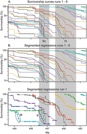


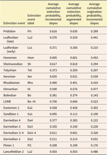
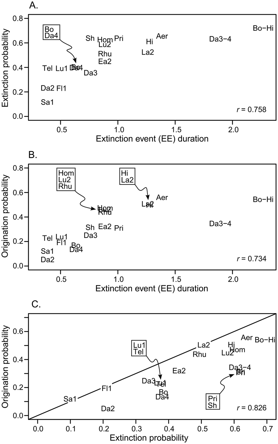
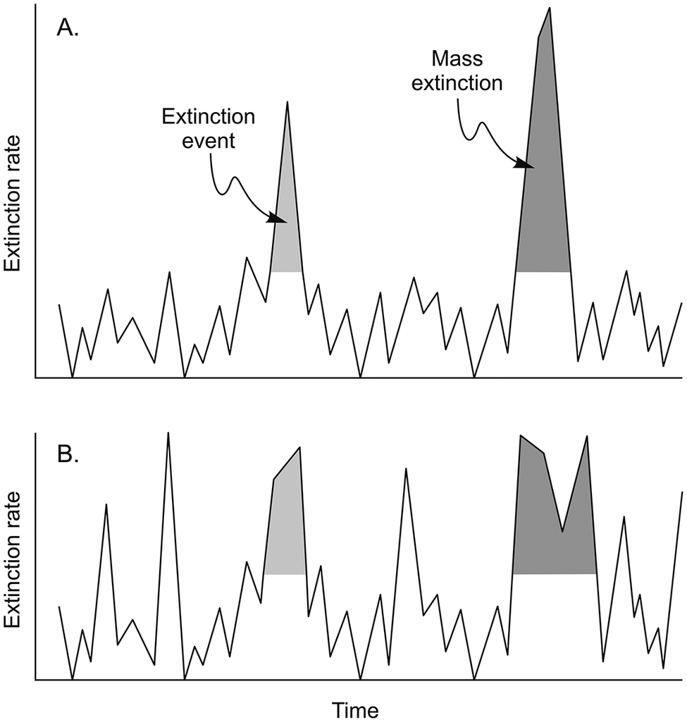

 Open access