
9.1 Introduction
Most of us type at a keyboard; that is, we produce texts in type. With the advent of desktop computers and word-processing, software selection of fonts was in our hands, and I venture that many played around a bit, trying to figure out which font best suited their words. Some, like the current writer, eventually adopted a default font (mine is Times New Roman), but others proved flexible, selecting fonts to suit their immediate purposes. Throughout the pre-digital print phase of publishing, we – mere readers – weren’t in control of fonts or any other aspect of page design. We left that to the experts, editors and printers, and took typography for granted.
Alfred A. Knopf, the distinguished American publisher, decided to include a colophon to all his books that would explain “key elements of the book’s making: where it was printed, the paper used, the designer, and particularly the name, origin, and brief characteristics of the type used to print its text.” William A. Dwiggins, Knopf’s lead book designer when Knopf came up with the idea “gently scoffed at his friend’s colophonic habit”: readers, he insisted, “don’t care to know and they don’t need to know [emphasis original]. Just make your book so it will read handily and let it go at that” (Reference Gutjahr, Benton, Gutjahr and BentonGutjahr and Benton 2001, 1). Can’t the same be said for the relationship between dictionary typography and dictionary readers? Surely, everyone wants a dictionary that can be read handily.
Although dictionary users may read right past dictionary typography, it’s important for at least three reasons. First, type anchors dictionaries, indeed all printed books, in the modern era – very early modern, it’s true, but modern, nonetheless. Print dictionaries, then, participate in the conditions of modern culture, as argued and illustrated amply in several chapters of this handbook. Second, dictionary entries organize and convey different but related sorts of information: spelling, pronunciation, lexical categories, levels of usage, definitions, examples, etymologies, for example, and typography can help to make the differences and relationships visible to readers. Third, typography is expressive – which is why we experiment to find the font that best represents us – so constitutes some of the aesthetic appeal of dictionaries as books, as material objects, whether print or digital (see Russell, Chapter 13, this volume; see also Reference Gutjahr, Benton, Gutjahr and BentonGutjahr and Benton 2001, 3–4). Full understanding of dictionaries thus requires attention to typography, which we should not take for granted, after all.
9.2 The Doctrine of Dictionary Typography
Early on, dictionaries admitted few frills or furbelows. Glosses were recorded in the margins of medieval manuscripts or between the lines, where you literally had to read. Print dictionaries, too, at the beginning, were often though not always quite basic: a head word and a gloss or definition. It didn’t take much typography to distinguish them. But early on, too, writers and users of dictionaries hadn’t yet imagined the potential of dictionary entries, neither how much information they could and would incorporate nor the need to differentiate information and thus construct relations among kinds of information. Gradually, however, printers of dictionaries felt pressure to innovate – dictionary typography would naturally follow the increasing complexity of dictionary entries, and thus Paul Reference LunaLuna (2000) outlines “a remarkable continuity” of typography in the English monolingual and bilingual dictionary traditions, which are merely exemplary of all such traditions. (Luna’s article is a tour de force, a remarkable compendium, fully illustrated, of typographical structures of English monolingual and bilingual dictionaries from Cawdrey to the New Oxford Dictionary of English.)
In some early instances, too, even dictionaries of considerable complexity lacked the typographical apparatus of later works, partly because print itself was new in Europe and typography hadn’t diversified much. One of the grandest and oldest of print dictionaries is Ambrogio Calepino’s Latin dictionary, short titled Cornucopiae, first published in 1502 at the very end of the age of incunabula, the earliest printed books. In its ambition, especially as more languages were added to make it a polyglot dictionary, it was unrivalled at the time – it was new and set the standard for printed dictionaries then and somewhat beyond, such a treasure that libraries send representatives to auctions when a copy is on the block. But besides the bolded or “heavy” initial letters of headwords, the entries are typographically monotonous. It’s not a dictionary for lazy readers or the faint of heart.
Reference Luna, Williams and VessierLuna (2004, 849) argues that “[t]he foundations of dictionary typography were laid by the Parisian scholar-printer Robert Estienne (1498–1559), who printed the Thesaurus Linguae Latin (1531) and the Dictionnaire François–Latin (1539),” not long after Calepino’s dictionary. Estienne “mapped visual appearance to structural significance: he differentiated headwords by setting them on separate lines, in a larger point-size, indented; definitions were set full out, and examples of usage indented one em,” that is, “he used paragraphing and changes in type size to assist navigation” (Reference Luna, Williams and VessierLuna 2004, 850), where the reader/user is doing the navigating. Of course, later lexicographers would refine what Estienne initiated, and just because Estienne set the typographical standard for subsequent dictionaries doesn’t mean that many early modern lexicographers followed his example.
What Estienne and his followers recognized about dictionary entries is their “necessary hierarchy of information,” with “subentries nested within main entries” and types of information “arranged in a standard sequence,” such that we can view a dictionary entry as “a set of list items that, instead of being presented vertically, are run on sequentially. Instead of vertical separation by space, typographic variation indicates the boundaries between the list items” (Reference 733Luna and BlackLuna 2017, 483). The more information of different kinds that a dictionary entry attempts to convey, or, looked at from the opposite direction, the more information that readers of a dictionary entry try to manage and absorb – including relations among types of information – the more typography assists in the organization and reception of that information. Thus, Luna establishes the Doctrine of Dictionary Typography, which comes very close to serving as a universal and foundational principle of print dictionary design.
The eminent lexicographer B. T. S. Atkins (see de Schryver, Chapter 31, this volume) agreed that typography is a fundamental aspect of dictionary-making (Reference AtkinsAtkins 2008, 38), but said little else about it, and one wonders some at the absence of typography in most handbooks of lexicography (for instance, Reference DurkinDurkin 2016; Reference JacksonJackson 2013; Reference Rundell and FontenelleAtkins and Rundell 2008). It does not figure in the classic bibliography of metalexicography (Reference ZgustaZgusta 1988). Among notable exceptions are Sidney I. Reference LandauLandau (2001, 373–374), who indicates the practical importance of type to dictionary-making in the context of copy-fitting (see Nichols, Chapter 11, this volume), and Bo Svensén’s handbook, which not only agrees with the Doctrine but proposes that in some dictionary types, the relative value of information should be emphasized typographically, a principle corollary to Luna’s Doctrine that Svensén calls “typographical prominence” (Reference SvensénSvensén 2009, 186). Svensén’s principle, while not as foundational as Luna’s Doctrine is a necessary corollary – it is a prescriptive extension of the descriptive Doctrine.
Commenting on the absence of typography from most handbooks and works of metalexicography is not a criticism, however. As Reference SvensénSvensén (2009, 425) observes about the digital construction of any contemporary dictionary, “Typographical data are strictly separated from lexicographic data: each information type is assigned a particular field code, which is then ‘re-used’ to control typography. This ensures that the user of the system will not need to operate with typographical codes while editing,” which is one way of saying that typography is less important to lexicography than it is to dictionaries.
Typography addresses entry hierarchy by means we almost take for granted: different fonts or typefaces (Arial, Arial Black, Arial Narrow, Cambria, Century Schoolbook, among many others); different type sizes (for instance, nine-point or twelve-point); different styles of type (bold, italic, Roman, small capitals, for example); indentations and spacing; symbols and abbreviations (such as those used for pronunciations and etymologies) – the repertoire of devices is rather small, so some are used at different levels in the hierarchy, separated from redundant use by information coded with other typographical features. If, to experienced dictionary users, all of this seems familiar and even obvious, one must concede that dictionaries over time and space and kind have handled typography variously and with various degrees of success, driven by many factors to hedge if not quite ignore the Doctrine.
9.3 Dictionaries, Information, and Visual Distinctions
Among English dictionaries, the OED stands out for its typography. As one of the earliest historical dictionaries, it sought to convey more types of information than almost any other dictionary, and others did not stand up well against the standard OED eventually set. Before he became OED’s second editor, Henry Bradley reviewed the dictionary’s first fascicle, A–ANT, published in 1884, and he noted OED’s typographical approach as a clear advance and one of its glories. “One great merit of the new Dictionary is the remarkable manner in which the convenience of readers is consulted in the typographical expedients employed to ensure facility of reference,” an early glimmer of the Doctrine.
This advantage is indeed shared to some extent by the other lexicographical publications of the Clarendon Press, and notably by the Etymological Dictionary of Prof. Skeat; but it is here carried to a degree of perfection never before aimed at. The size of the page is identical with that adopted in Littré’s Dictionary; but a page of Littré is, typographically, a chaos through which the reader must find his way as best he can, while in the English Dictionary the eye is at once directed to the object of which it is in search. Littré, for instance, prints the illustrative examples in the same type, and continuously with the definitions, the only use of strengthened type being in the Arabic figures prefixed to each definition. In the present work [the OED], the standard form of each word is printed in large “Clarendon” type, which stands out boldly from the page, so as to catch the eye at once. The various historical forms are given in “small Clarendon,” and the definitions in ordinary type. Under the definition of each sense of a word are arranged the quoted examples in a smaller letter, each quotation being preceded by its date in heavy figures, so that the chronological range over which a word, or a sense of a word, extends may be measured at a glance. In this way the several definitions of a word are spaced off from each other by an intervening paragraph of smaller type. The value of this arrangement in abridging the labour of consulting the Dictionary can scarcely be over-estimated.
Bradley saw in the OED what Luna would later codify for dictionaries more generally. That Bradley was no typographer only underscores the OED’s typographical superiority.
A modern dictionary must be consistent in its format, also to render the text more accessible to users, so one can look at any OED entry to validate Bradley’s estimation. Consider the beginning of the original entry ant in Figure 9.1, which exhibits all the features Bradley listed.

Figure 9.1 Ant in the original Oxford English Dictionary.
The headword is heavily bolded large Clarendon, but the forms recorded in sequence are lighter bold and small Clarendon, an immediate contrast. Labels within the form section (whether regional as with W. Sax., Anglian, or grammatical as with Pl.) are italic, so in contrast to the lightly bolded forms, rather than to the headword. The etymology flips the contrast, as lexical items in other languages are conventionally italic, so the labels (OE, OHG, ON, WGer) are Roman. Cross reference to the Old English etymon Emmet is in small capital letters, which has since become the convention in most dictionaries. Definitions – the most frequent reason users turn to OED entries – are indeed in clear Roman type, with quotations in smaller plain type and the chronological map drawn in the bolded dates for the various citations. Indentation, though a feature of the entry, is almost beside the point. Many OED entries are long, but because of the typography, one cannot easily lose one’s way.
And there it is, one might think, the apotheosis of dictionary typography in the OED, the example that all subsequent dictionaries would follow, but of course that’s not the case. In principle, yes, general dictionaries, learner’s dictionaries, and other types follow the Doctrine and employ typography to guide the reader through layers of distinct information, but in all cases, it serves specific audiences and various densities of information. Not even all historical dictionaries would follow the OED’s example, because they faced constraints the OED did not – financial constraints, for instance – as well as, in their audiences, different expectations for typography within the total structure of the dictionaries. How much value must typography add to a dictionary’s textual substance?
Thus, the Webster’s New World College Dictionary, Fourth Edition (2007) uses the same type size – consider the entry doctor in Figure 9.2 – throughout entries (looked at one way, easier to read), and distinguishes the entry form (bold) from the part of speech label (bold italic), while senses are marked with bold numbers distant enough from the headword to avoid visual confusion. Because users of a college dictionary have different needs from readers of a historical dictionary, the visual texture of the entry is different: senses are more important to those users than historically arranged evidence, the quotations in a historical dictionary, so sense number and part of speech labels guide users to what they need, whereas dates are equally as important as sense numbers and parts of speech in a historical dictionary, which complicates historical dictionary typography. Etymological forms are in italics, which is conventional among all dictionaries, as just noted of the OED. Similarly cross-references in small capitals, but other labels are in Roman inside square brackets, which does distinguish types of information, but less markedly than when type size, font, and style are in play.

Sometimes, a dictionary’s typography falls short, as one can see in the entry fungo in Dictionary of American Slang, Third Edition (Reference Chapman1995; henceforth DAS; see Figure 9.3). Dates and restrictive labels are both given in italics continuously – no distinction there – and whereas in DAS bold sense number and bold italic part of speech label appear next to each other without any distinguishing marks, Webster’s New World precedes the part of speech with an em dash and closes it with a period, clearly setting it off from the accompanying sense number. What most spoils DAS’s format is the wild use of italics: label and date immediately after the headword, illustrative quotation immediately after a definition, and etymological forms, which in a longer entry denser with information and a greater variety of information types might not matter, but when one takes the whole entry in with one glance, as one does throughout DAS, one must explain the lack of distinction while reading, an imposition lexicographers, along with their publishers and printers, had better avoid.

Figure 9.3 Fungo in the Dictionary of American Slang, Third Edition (Reference Chapman1995).
The publishers, especially, are aware of the constraints of making a dictionary: how many libraries and individuals will buy it, at what price, and how many pages of text at what quality paper will that entail? Typography enters the picture, too, when a dictionary is university and grant funded. The audience of scholars may bear a text that’s harder to read. They’d rather a dictionary project cut corners on typography but not on the information that warrants making the dictionary in the first place. The Middle English Dictionary (1952–2001; henceforth MED) is an excellent example, less of typography gone awry than typography ignored (see Figure 9.4).

Figure 9.4 Curfeu in the Middle English Dictionary.
Hereward T. Price, who reviewed the first fascicle of the MED, had also served as its interim chief editor for a year and had considerable previous experience on the long-since abandoned Early Modern English Dictionary, both projects of the University of Michigan. As he explained, “The Dictionary is printed by the off-set method from ‘photo-copy.’ The work has been done in the office of the Dictionary itself. This method of printing has cut the cost in half and thus rendered it more easy for the private scholar to buy the Dictionary” (Reference PricePrice 1954, 463). The only typographical concession to the reader’s needs was to place entry forms in bold face. Everything else, all layers of information, appeared in the same type in a continuous column. It takes practice to read MED entries effectively.
Even the most sophisticated readers objected. B. D. H. Reference MillerMiller (1968, 336), a medievalist at the University of Oxford, had this to say about it:
Layout remains exasperating. There is absolutely no reason why compositors should not indent the beginning of each sub-section; as it is, “(b)” or “(c)” in the middle of a line is lost in a welter of undifferentiated type. Much study of MED is indeed a weariness of the flesh. In addition, glosses should be placed separately, each immediately before the relevant sub-section, and not, as at present, grouped all together at the head of a complete section. As it is, the gloss and the entries to which it refers are often some considerable distance apart, even on different sides of the same leaf.
The last point is not typographical, yet it does say something about how typography participates in a larger project of distributing information on “the page.”
Within the English lexicographical tradition, the MED isn’t alone in misconceived typography. The English Dialect Dictionary (1898–1905; henceforth EDD) needed to draw oral material mostly from the volumes published late in the nineteenth century under the auspices of the English Dialect Society (EDS). To avoid repetition of the titles, Joseph Wright resorted to identifying EDS volumes with a superscript number next to a dialect ascription. Such ascriptions were paramount information for the EDD, so they appear in bold face, which satisfies both the Doctrine and Svensén’s principle of typographical prominence (see Figure 9.5).

Figure 9.5 Bass in The English Dialect Dictionary.
One may reasonably ask, however, whether the superscription is effective typography. Of course, the problem rests mainly with the decision not to use even short titles, which is not typographical, but taking an approach that substitutes for the titles, a typographical approach, does not best serve the EDD’s readers. Partly, this is because superscript numbers serve another purpose within entries, differentiating homographs with distinct origins and meanings – for instance, BASS sb.1 “The wild lime” and etymologically associated senses versus BASS sb.2 “Coal mixed with slate or rubbish” – and partly because the dictionary’s audience – “everybody interested in dialects” (E. Reference WrightWright 1932, 2.436) – was more general than could accept the opaque references. In that regard, EDD differs from the MED, which wasn’t compiled for “everybody” but for experts and students intending to be experts.
Most important, though, is the problem of compromise inherent in much dictionary typography, which both MED and EDD illustrate: in the case of both, one suspects, editors accepted the compromise as necessary – had the MED emulated OED typography, there wouldn’t have been an MED, and, one suspects, there wouldn’t have been an EDD either, because spelling out short titles would have required yet another volume, and six volumes was what the editor and the audience could afford. Despite Miller’s disapproval, the MED was confident in its choices; no MED editor would have asserted the superiority of its typography, which was barely adequate. In the EDD’s case, the approach taken was, perhaps, typographically too hopeful.
Typography matters in digital dictionaries, too, but on somewhat different terms, because they do not suffer the tyranny of the column. A digital dictionary can easily avoid the problems Miller identified, as the OED Online (or OED3) demonstrates: quotations are stacked rather than wrapped around column constraints. Typographical distinctions become less significant in digital dictionaries because one views an entry at a time – the page is the entry and material that supports the entry; the eye is not distracted by the intensity of information over a page spread. Still, the digital OED maintains certain distinctions of the print version, enhanced by features more easily incorporated in a digital than a printed text.
For instance, headwords are larger than the rest of the text, but they are in red rather than bolded black. And color allows association of the headword with other information on the page, for instance, the entry’s publication history, in a column to the right of the entry on a buff rather than white background (thus, distinguished from the entry). One might easily overlook such information, but the color association draws the eye to what is often a limitation of the entry, that it was written long ago and perhaps only partially revised, for example, a caveat necessary to a sound reading of the entry. Categories of information (pronunciation, etymology, frequency of use) are also stacked but in black boldface, with parts of speech and other restrictive labels, quite conventionally, in italics. Lexical cross-references are in blue small capitals and thus doubly marked. Definitions are in larger type than quotations, but the face is the same, because stacked information requires less typographical distinction. The Doctrine and Svensén’s corollary principle persist, whether dictionaries are printed on paper or printed digitally: the typography of salient distinctions and lexicography are inseparable.
9.4 Typography and the Aesthetics of the Page
Dictionary typography is not merely functional but a matter of design and so also part of a dictionary’s aesthetic. The aesthetics of dictionaries expresses the desire of all concerned – publishers, lexicographers, and readers – that dictionaries appeal to readers visually, but “appeal” is certainly a troublesome word. Allan Reference MetcalfMetcalf (1996) accounts for The Century Dictionary’s typography in terms that make me somewhat uncomfortable: he considers some types “healthy” (a substitute for the Century’s designer and printer’s “manly”) and other types “effete”; he praises Century type, which one can find in one’s word-processing application, and which was invented for the dictionary, especially the version called New Century Schoolbook, for “its gentle, unobtrusive sturdiness and clarity” (Reference MetcalfMetcalf 1996, 18), and dismisses “ubiquitous Times Roman” – my New Times Roman – as “drab” (Reference MetcalfMetcalf 1996, 20). Well, De gustibus non est disputandum, but underlying any taste is an aesthetic, however discreditable.
The Doctrine and Svensén’s principle of typographical prominence combine not only to an informational but to an aesthetic effect. Pages of dictionaries are two-dimensional artifacts, but then so are drawings and paintings. Because not all things worth expressing can be expressed in two-dimensionality, the visual arts developed ways to simulate three-dimensionality in two-dimensional space. In other words, what’s in a painting isn’t real space, but painting space. One might also think of “entry space” in dictionaries’ material manifestation of information and relations among information types, a space that similarly developed as dictionary makers saw three-dimensional opportunities in dictionary design.
This proposal isn’t as far-fetched as it may at first seem. If an element is typographically prominent (quotations, definitions), the typography moves information to the foreground of reader attention, while other elements – labeled things, like usage levels and frequency – are positioned in the background of the entry. The distribution of elements to foreground or background differs according to dictionary type: usage moves to the foreground in learner’s dictionaries, etymology in historical dictionaries, and definitions occupy the foreground almost exclusively in general-purpose dictionary entries, with single unhistoricized sample sentences in their backgrounds. All information in the background relates to the other background information but also to all of the foregrounded information. Typography expresses the dictionary-makers’ sense of those relations and it invites readers to decode and share in that expression – arguably, typography guides the co-creation of entry meaning, much as what art historians call a painting’s composition guides interpretation by a viewer. Typography is both interpretive of an entry’s data and instigates reader interpretation of that data (see Reference Gutjahr, Benton, Gutjahr and BentonGutjahr and Benton 2001, 2–3). Put another way, typographical differences are dots that the reader must connect, but they are dots on various planes, so more complicated than a connect-the-dots game, with meaning enriched by the mind’s movement among types of an entry’s information.
Typography does not operate in visual isolation from other elements of a dictionary’s page design, of course – it participates in a broader and more complicated aesthetic. Reference LunaLuna (2000, 49) identifies the American Heritage Dictionary of the English Language (Reference Morris1969; henceforth AHD) as the “last real innovator in presentation” among American dictionaries, possessed of “a particularly generous page design.” The American Heritage design tradition developed across five editions, and by the fifth edition (Reference Pickett2011), AHD’s design was not only generous but inviting and newly directive of readers’ attention, as it re-evaluates the foreground within and beyond entries. Perhaps unexpectedly, the most important innovation in that last print edition is use of color among other typographic tools that distinguish among information types (see Figure 9.6).

Figure 9.6 Barrel cactus in The American Heritage Dictionary, Fifth Edition (Reference Pickett2011).
Whereas most dictionaries use large bold black type for headwords, AHD5 marks them out in a gentler blue. In entries, hyphenated inflections following the headword are in black bold, as are, by slight but effective distinction, em dashed and italicized black bold headings for subentry sections – phrasal verbs and – idioms, with the phrasal verbs and idioms themselves in black bold, no italics. In response to what many took as Webster’s Third’s permissiveness, AHD promised advice about usage and threaded usage notes throughout the dictionary text. At first, they ran into the ends of entries, or seemed to, which confused levels and status of information – a note about usage or, later in the AHD program, about word history is not part of the entry but ancillary to it and editorializes, whereas definitions do not. By AHD5, such notes were separated from preceding and succeeding entries by light blue lines. These typographical developments draw the notes into the foreground of readers’ attention, and they are unusually meaningful: shifting the ground of its pages over successive editions, AHD gradually lost its prescriptive edge and became more like Webster’s Third, a linguistically sound descriptive dictionary (see Reference 697AdamsAdams 2015).
The American Heritage Dictionary of the English Language places photographs illustrating some entries along its outside margins, which has a paradoxical effect. Obviously, the photographs are outside the entries and aren’t lexical evidence, but encyclopedic information; critics and readers will forever disagree about whether they enhance the entries or distract attention from them. (The distraction may be greater when the photographs are color, as in the fourth and fifth editions.) But to include the photographs, the page designers had to leave a wider-than-usual outside margin, rarely completely filled with material, so that readers see more space. The two columns of each page are also separated by space, without a vertical rule line, and the text is continuously well-spaced. The space leads, I think, to Luna’s adjective “generous” – the page is designed to attract, hold, and direct reader attention, but it does all of that without demanding that readers untangle a cluttered text or struggle to identify one type of information from another. If space isn’t in all cases quite typographical, space like that of the AHD page does indicate typographical restraint, which is also part of the typographical element in dictionaries.
Aesthetics does not exclude commercial interests. Space and color and type have aesthetic effects, but publishers make especially attractive dictionaries to sell more of them. Dictionary design serves a publisher’s bottom line by providing what dictionary readers need out of the dictionary text but perhaps they want more than what they need. A text can give readers pleasure even as its visual materiality helps to organize lexical information from which readers and lexicographers together make lexical knowledge. Besides, more decorative dictionaries make better gifts, or did when relatives gave high school graduates dictionaries in anticipation of their college or university needs, both intellectual and social.
9.5 Invisible Typography
Of all the typographical innovations online, the most important is the hyperlink, the magical typographical feature that takes you from inside one text to inside another. Whereas dictionaries have indicated internal cross references in various ways (bold plain face, small capitals, for example) and could point to texts outside them, it could not transport readers from one text to another (of course, the reader stays put and the texts are exchanged, but readers may feel as though they’ve left one textual place for another). Major online dictionaries have capitalized on the opportunities presented by hyperlinks: from the OED, one can look at the parallel materials to any entry from the Historical Thesaurus of the Oxford English Dictionary and the MED. Within the MED, one can move from the “stencils,” or short titles of works quoted, into the “hyperbibliography” and in some cases directly to the quoted text, as encoded by the Humanities Text Initiative of the University of Michigan Libraries. I cannot predict what comes next for digital dictionary typography, how it will balance the interests of information and aesthetics, but whatever it is, I’m sure it won’t be drab.
How odd it is to consider the hyperlinking function as typography – one can see the link, but one cannot see the code that launches travel from one text to another. It seems a step past what can truly count as typographical. Reconsider Bradley’s late-nineteenth-century estimation of what counts in typography: “the eye is at once directed” by clear and distinguishing typography, and certain typographical features “catch the eye,” which is to say that typography focuses the reader’s attention on one or another lexical fact; but, when the typographical system devised for a dictionary is clear and consistent, focus is complemented by a sense of the whole, which “may be measured at a glance.” The language of visualization is not metaphorical, to Bradley’s mind, but practically literal – typography, we’ve always supposed, is a visual art.
Yet not all readers see, and while there are few dictionaries for blind people, considering one here serves as a necessary corrective: typography is usually a visual but sometimes a tactile art. I was reminded of this when first encountering a tattered, apparently blank white book in the Kripke Collection of dictionaries and related materials at the Lilly Library. It took a moment for me to realize that the book was printed without ink, that the text was embossed – that is, type behind the page had been pressed into the paper to produce raised letters. The book was A Dictionary of Musical Terms for the Use of the Blind (Reference Wood1884), compiled by Professor David D. Wood, who was organist at St. Stephen’s Episcopal Church, Philadelphia for nearly fifty years and a blind person himself. The Kripke copy of Wood’s book doesn’t represent the first edition, which was published in 1867 in Philadelphia; it was as printed at the American Printing House for the Blind, in Louisville, Kentucky.
Nowadays, when we think of books for blind people we automatically think of Braille, the raised dot alphabet invented by Louis Braille by 1824. Braille had attended the Institution des Jeunes Aveugles, or the School for Young Blind People, founded by Valentin Haüy, who published the first embossed book for blind students in 1786. Braille’s invention solved the difficulties of reading raised-letter texts. Braille was available as an alternative to embossing long before publication of Wood’s dictionary, but it crossed the Atlantic on a slow boat, after years of controversy over its utility in Europe (Reference Bowers and BrownBowers 2006). Ironically, Braille’s dissertation on his invention was published in Haüy’s embossed script.
Haüy’s script required “typographical characters – letters and numbers – cast in reverse of those used in ordinary printing,” and these were deployed “to print books in relief by embossing paper,” which required in turn many technical adjustments to printing processes for sighted people (Reference Weygand and CohenWeygand 2009, 96). The result deserves respect for the initial attempt at such a script, but it did not read handily. American advocates for the education of blind people designed more straightforward lettering. One of these, proposed by Samuel Gridley Howe – physician, abolitionist, first director of the Perkins Institution for the Blind, and husband of the poet, abolitionist, and women’s suffragist Julia Ward Howe – became known as “Boston Line,” which used only lower-case letters. Both editions of Wood’s dictionary were instead embossed in “Kneass’ Improved Combined Letter,” which used both upper- and lower-case letters (Reference 755WarneWarne 2016), and thereby hangs a tale of typographical contest, battles “as violent as those of the Kentucky-Hatfields-and-McCoys” (Reference DabneyDabney 1962, 9).
The Kneass script was designed by Napoleon Bonaparte Kneass, Jr., who was born into a prominent Philadelphia family – his uncle, William Kneass, was the second Chief Engraver of the United States Mint – and was himself a blind person. Apparently, a gift for design ran in the family. Kneass was also an occasional composer, so he had a special interest in publishing a dictionary for blind music students. Wood had been an assistant music teacher even when he was still in school, at the Institute for the Instruction of the Blind, but then for some thirty years at the Philadelphia Musical Academy, and also at the Pennsylvania Institute for the Blind – his experience taught him that blind music students, like sighted music students, needed a dictionary of musical terminology. Wood and Kneass surely knew each other – how many blind composers lived in Philadelphia at the time? How many blind publishers of music were there? Collaboration on the embossed dictionary of musical terms was thus almost inevitable.
The American Printing House for the Blind was established in Louisville, Kentucky, in 1858. In 1871, the National Association for Publishing Literary and Musical Works for the Blind, the original sponsor of Wood’s dictionary, began its financial support for the American Printing House, and leading educators of blind people met in Philadelphia in 1876 to appeal for Federal support for the American Printing House. This complex of Philadelphia connections may explain how the American Printing House ended up publishing the second edition of Wood’s dictionary and why it adopted the Kneass script. Once accepted as the typographical standard, in 1918 (Reference DabneyDabney 1962, 9), however, Braille led to loss of investment in embossed printing plates and stocks of embossed books, which explains why, after the 1884 edition of Wood’s dictionary, there were no more embossed editions of it in any of the available scripts. Embossed books were obsolete and next to useless, as blind people no longer learned to read embossed script. So, publication of the dictionary was discontinued, but for several decades it was implicated in the fraught history of education of and publishing for blind Americans, until one typographical scheme supplanted the others.
Neither embossed script nor Braille was typography well-suited to dictionary-making on the scale sighted people have come to expect. At the time he was writing, Reference DabneyDabney (1962, 11) reported that the Field Foundation was funding the conversion of the Encyclopedia Britannica into Braille at roughly $1,139,748, in 2022 dollars. The Braille edition would print at 160 large Braille volumes. But that cost, which seems reasonable, did not include material (paper) and business (printing) costs. One-hundred-and-sixty volumes require a lot of paper per set. With 1.3 million legally blind Americans, many of whom would not buy the encyclopedia, anyway, the costs would in the end prove prohibitive. Webster’s Third, though not as extensive as the encyclopedia, is a three-column work, so roughly six volumes of text in print, and considerably more in Braille. At least Braille is small, thus condensing the text – embossed script large enough to read would lead to yet more. And who among blind people would have room for both an encyclopedia and an unabridged dictionary on these terms? Partly, the small audience for books made with embossed type made printing with such type too expensive for both makers and consumers; the other part, however, is the prohibitive cost of embossed type as a means of dictionary-making.
9.6 Conclusion: Sans Typography
Software-embedded Artificial Intelligence has solved the problems just outlined – anyone, sighted or blind, can orally request a definition from a device, like a smart phone, enabled to decode speech. It’s an important advance, in the interest of equity for those outside the abled mainstream. But it does reduce contact with “the dictionary” to what sighted dictionary users call “look-ups.” Historically, readers could appreciate the elegance of type, the typographical distribution and marking of entry-level information in a dictionary, the valuing of that information as foregrounded or backgrounded, and in some case, like that of AHD, enjoy a spectacle of color, space, picture across the dictionary’s pages.
10.1 A Medieval Vocabulary
The first printed dictionaries in England derived from medieval manuscripts that compiled glosses that readers at various times had written in the margins or between the lines of documents, to clarify the meanings of unfamiliar words. Latin documents would be glossed in English, and glossaries compiled from them would be bilingual. A distinctive Latin–Middle English glossary is Beinecke MS 594, a “slovenly written” (according to Derolez) fifteenth-century manuscript, evidently a copy of a vocabulary textbook, which lists in topical categories hundreds of Latin words and their Middle English counterparts.Footnote 1 The scribe glossed this manuscript in the margins, not with words but with pictures: several dozen inked and rubricated drawings, which were put there to show what the referent of a word looked like – and also, perhaps, to attract a student’s attention. (Some drawings, more doodles than illustrations, appear to have been added later, perhaps by a student.)
Like many other medieval glossaries, this one is organized as a series of categorical lists, with a heading that identifies each category. Next to the heading Nomina muscarum “names of flies” there is a drawing that illustrates the last item in that list, Hic papilio – glossed in English as ‘butterfflye’ (see Figure 10.1).

The long list of Nomina bladorum et arborum “names of corn and trees” includes an illustration of a tied sheaf of “corne” and a drawing of porrum (‘a leke’) that includes roots and leaves (see Figure 10.2).

The names of many cultural objects get illustrated also: calix ‘chalice,’ metallorum ‘melting-pot,’ domus ‘house,’ fons ‘well,’ cloaca ‘lavatory,’ ecclesia ‘church,’ among others. Although the choice of what to illustrate was not obviously systematic, it does seem that for the audience of this manuscript the meaning of the name of a thing might be grasped by a pictorial illustration as well as by a translation. This untheorized or pre-theoretical project by the illustrator anticipates pedagogical and lexicographical ideas that would be formulated two centuries later, after the invention of printing, when the educational philosopher Johann Comenius and John Locke made convergent cases for the educational value of illustrations in textbooks and dictionaries.
10.2 Pictures in Print
The Gutenberg revolution fostered the mass proliferation not only of printed texts but also of printed images: often, wood cuts printed in close juxtaposition with the text that they illustrated. Manuals of all kinds would show what it was that the reader was reading about. “I shall annex the Cretian Phalangium, you have here the picture of it exactly printed,” the author of The Theater of Insects (1658) remarks next to a wood engraving of that kind of spider (see Figure 10.3, from Reference Mouffet and TopsellMouffet [1658], an anonymous translation of Reference MouffetMouffet [1634], appended to Reference TopsellTopsell [1658]).

When Henry Peacham explained the “charges” of heraldry to actual or aspirational aristocrats in The Gentlemans Exercise (1634), it was easy for him to illustrate canton by attaching a cut (see Figure 10.4).Footnote 2

When the antiquarian and lexicographer Thomas Blount came to define the word canton in his English dictionary titled Glossographia (1656), he did the same thing, with the addition of the deictic pointer and colon “thus:” (see Figure 10.5).

Alphabetically as well as chronologically speaking this was the first illustration to be printed in an English dictionary. It had a solitary companion later in the alphabet, a woodcut that illustrated the heraldic term gyron – again “thus,” as the definition said (see Figure 10.6).

Here Blount credits not Peacham’s book but “El. of Ar”; that is The Elements of Armories by Edmund Reference BoltonBolton (1610), a manual that featured dozens of woodcuts illustrating heraldic elements and devices. Bolton had gestured to the illustration for gyron “as followeth” (see Figure 10.7).

There, too, the close juxtaposition of text and woodcut informed both.
Blount’s Glossographia, spreading its definitions over 656 double-columned octavo pages, made room for two small illustrations – a modest beginning, but a beginning. A woodcut illustrating the heraldic term bend was added to the fourth edition (1674), and chevron was added to the fifth edition (1681, posthumous), bringing the total number of illustrations to four, all in the first third of the alphabet. This pictorial parsimony is remarkable, given Blount’s interests. A Catholic recusant of some means and enforced leisure, he had styled himself “Gent.” on the title page of his translation of a French heraldic manual by Henry Estienne, The Art of Making Devises (1646), addressing his preface “To the Nobilitie and Gentry of England.” In 1661, apparently prompted by the Restoration, Blount edited the third, posthumous edition of Peacham’s richly illustrated Compleat Gentleman (now incorporating Peacham’s The Gentlemans Exercise), adding one chapter on blazonry and enlarging another (Reference Bongaerts and GerardusBongaerts 1978, 42). Three of the new pages in this book traced the military achievements of members of one or another branch of the Blount family, dating from 1066. Evidently Blount had a personal interest in heraldry.
A professed successor to Blount’s book, titled Glossographia Anglicana nova (the anonymous author remains unidentified), was published in London in 1707. Adopting or adapting much of Blount’s definitional phrasing, it also greatly enlarged his display of heraldic imagery, introducing sixty armorial woodcuts in the margin – a heraldic ensemble made the more conspicuous by virtue of being the only illustrations in the book. (Seven of these illustrations dominate the second page of definitions.) Thanks to Blount and his imitator, aspects of the recherché field of heraldry became a familiar part of illustrated English lexicography, still reproduced today.
10.3 Comenius and Locke
In 1659, just three years after the first edition of Blount’s Glossographia, an English translation appeared of Johann Amos Comenius’ bilingual Latin textbook, Orbis sensualium pictus, which had been published the previous year in Nuremberg as a Latin–German manual. Like the German original, this English edition featured many large scenic illustrations, distinctive elements of which were keyed by numerical labels to their Latin names, which were worked into a description of the scene that was printed in a column below. A vernacular translation (German originally, now English) paralleled the Latin text in another column, with the vernacular keywords numbered also. Comenius believed that teaching Latin was not a purely verbal business: different nouns referred to different kinds of things, tokens of which would best be displayed in the classroom, when possible; if not, they could be displayed almost as well by pictures (Reference ComeniusComenius 1659, A3–A6). As in bilingual Beinecke MS 594, the meaning of a Latin word could be shown in a picture, as well as said in another language.
The Latin terms strigil “currycomb” and sistrum “kind of musical instrument” are both illustrated, if not very well, in the scenic illustrations titled “The Stable” (lxxvi) and “Musical Instruments” [c]. Both terms would figure in John Locke’s philosophical justification for dictionary illustration, which he framed “by the bye” in his influential Essay on Human Understanding (1690). Because it raises some significant questions it is worth considering in some detail.
To clarify human communication Locke entertains the idea of creating a scientific dictionary of things, which would register all their essential qualities – but he then sets that project aside as impracticable. Instead, he proposes a stopgap (Reference LockeLocke 1690, III.[24].258–260).
Though such a Dictionary, as I have [...] mentioned, will require too much time, cost, and pains, to be hoped for in this Age; yet, methinks, it is not unreasonable to propose, that Words standing for Things which are known, and distinguished by their outward shapes, should be expressed by little Draughts and Prints made of them. A Vocabulary made after this fashion, would, perhaps, with more ease, and in less time, teach the true signification of many Terms, especially in Languages of remote Countries or Ages, and setle truer Ideas in Mens Minds, of several Things, whereof we read the Names in ancient Authors, than all the large and laborious Comments of learned Criticks. Naturalists, that treat of Plants and Animals, have found the benefit of this way: And he that has had occasion to consult them, will have reason to confess, that he has a clearer Idea of Apium, or Ibex, from a little Print of that Herb, or Beast, than he could have from a long definition of the names of either of them. And so, no doubt, he would have of Strigil and Sistrum, if instead of a Curry-comb, and Cymbal, which are the English names dictionaries render them by, he could see stamp’d in the Margin, small Pictures of these Instruments, as they were in use amongst the Ancients. Toga, Tunica, Pallium, are Words easily translated by Gown, Coat, and Cloak; but we have thereby no more true Ideas of the fashion of those Habits among the Romans, than we have of the Faces of the Taylors who made them. Such Things as these, which the Eye distinguishes by their shapes, would be best let into the Mind by Draughts made of them, and more determine the signification of such Words, than any other Words set for them, or made use of to define them.
Although Locke does not name the “Dictionaries” that should illustrate with pictures definitions of such Latin words as strigil, sistrum, toga, tunica, and pallium, one of the newer dictionaries that he owned defined them using the English words he mentions, currycomb, cymbal, gown, coat, and cloak (Reference GouldmanGouldman 1664; listed in Reference HarrisonHarrison 1965, 145, no. 1289); and all but cloak figure also in the definitions given by both editions that he owned of another book (Reference ColesColes 1677, 1679; Reference HarrisonHarrison 1965, 113, nos. 808, 808a). The usual English translation currycomb for Latin strigil was especially inadequate: calling a tool for currying horses a strigil was a late, post-classical repurposing of a word that in classical texts named a distinctively shaped scraper used to cleanse the bodies of humans, not horses (Reference John and ClarkClark 1995, 157–159). To make the classical sense clear a picture would help, such as either of the woodcuts (see Figures 10.8 and 10.9) that illustrated the term in an Oxford commentary on Juvenal (Holyday 1673, 58 and 59) – woodcuts that were copied from engravings in other books (Reference PignoriaPignoria 1613, 46; Reference ScacchiScacchi 1625, 328).

Figure 10.8 Strigil. Woodcut.

Figure 10.9 Oil bottle and strigil. Woodcut.
To see what a sistrum looked like one could consult a later edition of Pignoria (see Figure 10.10).

Similarly, a reader who wanted to know what apium (the Latin word for parsley) looked like could consult a woodcut illustration in John Gerard’s Herball (1597), directed to it by the Latin index at the back. It was also easy to see what an ibex looked like, rather than just read about it, by looking at the wood engraving on page 348 of Reference TopsellTopsell (1658; see Figure 10.11).

This seemed to be a practical strategy in natural history as well as classical studies; why not apply it to dictionary-making also?
Soon Nathan Bailey, a dissenting London schoolmaster who was likely familiar with Comenius’ textbook (the eleventh London edition appeared in 1729), would follow up on Locke’s suggestion, and Blount’s tentative precedent, so that he could fairly advertise on the title pages of his folio Dictionarium Britannicum (two editions, London Reference Bailey1730 and Reference Bailey1736) that they were “Illustrated with near Five Hundred CUTS, for giving a clearer idea of those Figures, not so well apprehended by verbal Description.” Bailey’s “five hundred cuts” was an order of magnitude greater than Blount’s initial two; yet, like Blount, he strongly favored heraldry. (In a smaller, octavo dictionary, titled The Universal Etymological English Dictionary, vol. 2 [1727], Bailey had already illustrated many heraldic elements.)Footnote 3 Although he was a professed partisan of “the great Mr. Lock” Bailey did not show what apium or an ibex looked like, or any other plant or animal. After heraldry, the most conspicuous categories were military materiel and geometric figures. Despite Bailey’s pioneering display of lexicographical images on a large scale, the effect is rather dry. When Samuel Johnson turned to Bailey’s second folio as the basis for his own monumental dictionary, he would not be tempted to imitate, let alone improve upon, those five hundred cuts (see Reference HancherHancher 1992; Reference McDermottMcDermott 2005a).
10.4 Samuel Johnson
Johnson’s decision to build his dictionary with words alone, no pictures, was significant. Like Bailey, Johnson was indebted to Locke in many ways; he even quotes an abridgement of Locke’s pictorial advice in a quotation that he uses to illustrate (in words, not pictures) his own definition of currycomb.Footnote 4 Why did he not take the advice he thus quotes? Renaissance dictionaries of the classical languages did not use pictures, nor did academy dictionaries of French and Italian (see Reference KorshinKorshin 1974; Reference ConsidineConsidine 2014, 122–126). Natural and mechanical science may have demanded pictorial illustration, but Johnson’s special interests did not run strongly in that direction (see Reference McDermottMcDermott 2005b). Those are partial explanations, not incompatible. Also, Johnson had his doubts about images; he would later warn against the moral hazards of the art of painting: whenever it failed to idealize things it risked contamination by “minute particularities, and accidental discriminations,” which would “pollute [the] canvas with deformity.” Presumably the art of illustration was no more sure to reach beyond minute particularities and accidental discriminations to display general truth, “the universal rule” (Idler no. 82, November 10, 1759, in Reference Johnson and BateJohnson 1963, 258).Footnote 5 Better, perhaps, to trust just to words to evoke the meanings of words.
Johnson does not define apium (a Latin word, not English), nor ibex. Canton he defines only in terms of a sector of land or a community – although his etymology mentions an heraldic use. Gyron he ignores. Bend is defined, as is chevron. No pictures.
10.5 Encyclopedic Illustration
During the long eighteenth century, encyclopedias proved to be more hospitable than dictionaries to pictorial illustration. More frankly concerned with things, rather than just words, they used large copperplate engravings to show what things looked like. Ephraim Chambers’ pioneering Cyclopædia in two volumes (Reference Chambers1728) had eighteen finely detailed copperplates, most of which showed arrays of elements in mathematics, physics, and mechanical arts. (There were also dozens of small heraldic woodcuts stamped in the margin, along with somewhat larger woodcuts of mathematical diagrams.) Diderot and d’Alembert’s monumental Encyclopédie (1751–1772), the most impressive and influential such work of the era, followed Chambers’ precedent, which it promised to surpass, boasting at the outset how many more engravings it would provide, “at least six hundred.” (In the end there would be 2,569 plates, bound in eleven volumes, often loosely associated with the seventeen volumes of text, if at all.) Diderot and d’Alembert’s stated rationale for pictorial illustration would have satisfied Comenius and Locke: “The bare View of an Object, or its Figure, may give more information than Pages of Words” (Plan 1752, 137 and 134). These English words (translated from the French) were published in London while Johnson was still at work on the first edition of his Dictionary.
In 1771, as Johnson began to prepare his fourth edition (1773), the first edition of the Encyclopædia Britannica (Smellie 1771) appeared in Edinburgh, on a much smaller scale (three volumes) than the French Encyclopédie that it mimicked and was ambitious to improve upon (see Reference ReddickReddick 1990, 109). That ambition was realized not in the first edition but rather in the continuous improvement of subsequent editions, stretching fully across the nineteenth century to the renowned eleventh edition of 1911. Still, the early editions were influential in accustoming British readers of reference works to see a pictorial display of things. The engraver Andrew Bell supplied 160 copperplates for the first edition, 340 for the second (1778–1774), and 542 for the third (1797) (see Reference CollisonCollison 1964, 138–55; Reference GunnGunn 2017–2018). Many of them were keyed in their parts to long articles on leading topics (e.g. Agriculture, Anatomy, Architecture), but other plates showed more miscellaneous assemblages of images that were unrelated except in their alphabetical sequencing, keyed to shorter articles also ranked in alphabetical order, which looked much like dictionary entries. The first two illustrations in the first plate in the first edition of the Encyclopædia Britannica showed what two referents of the polyseme abacus looked like: the slab topping a column and the manipulable device used in counting (see Figure 10.12).

Illustrations of one or another of these kinds of abacus would return repeatedly in many dictionaries over the course of the nineteenth and twentieth centuries. The encyclopedic tradition that extended from Chambers through the Encyclopédie and the Britannica made it normal for the reader of a dictionary to look at a picture of the thing that was defined in the text.
Relatively few prints (hundreds, not thousands) could be taken from a copperplate engraving before the printing surface would begin to wear out; the medium was suited for limited-run books, which tended to be expensive. Another drawback was that in assembling a book the plate would usually be separated from the relevant text – sometimes even in a separate volume, as happened with the Encyclopédie. Printed separately on different machines, text and image could not keep close company on the page. Locke had something more convenient in mind when he proposed that the reader should be able to “see stamp’d in the Margin, small Pictures.” He was thinking of woodcuts, not copperplate engravings. Type-high wood blocks, locked up by the typesetter in the frame along with the metal type, could be disposed anywhere on the page for adjacent and simultaneous printing. That was already being done in books of natural history. Why not in dictionaries?
When Bailey took up that challenge the results were not obviously successful. Aside from the restriction of the range of things he chose to illustrate, part of the problem was that woodcuts were still a relatively crude medium, which in the rendering of detail could hardly compete with the finesse of copperplate engraving. Also, English craftsmen early in the eighteenth century were not the most skillful in the history of that art. (Dürer could accomplish wonders on a plank of wood.) In practice, if not in theory, woodcuts were not yet up to the demands that Locke imagined for them.
10.6 Wood Engravings
Matters improved dramatically at the end of the eighteenth century, when Thomas Bewick applied his skills and tools as a metal engraver to work a much denser and harder kind of wood than had been previously used for woodcuts. Boxwood was prepared not in boards along the grain but in type-high slices cut across the trunk of the tree; Bewick engraved a resulting block on the smooth end-grain. With his fine engraving tools and skills, it was now possible to detail a whole landscape in an image that was an inch tall and an inch-and-a-half wide (approximately 2.5 by 3.8 cm). Or a slice of a boxwood tree might yield a block that was three inches (7.6 cm) square, enough room on which to engrave an imposing image of an ibex, as Bewick did for the book that made his reputation, General History of Quadrupeds (Reference BeilbyBeilby 1790). His illustrations for History of British Birds (Reference BewickBeilby 1797 and Bewick 1804) confirmed the prevailing idea that a book meant to instruct a popular audience should include detailed pictures of the things described.
Bewick’s lead in the Quadrupeds was taken up with some enthusiasm by Alexander Anderson, who became the most successful American wood engraver during the first half of the nineteenth century. Among other accomplishments he adapted the woodcuts in the twelfth English edition of Comenius’ Orbis sensualium pictus (Reference Comenius1777) to illustrate the first American edition of 1810. He carefully and somewhat successfully copied Bewick’s illustrations for Quadrupeds for the first American edition of 1804 (Reference Beilby and ThomasBeilby 1804). And he refreshed the illustrations of the fables at the back of Noah Webster’s best-selling American Spelling Book in several editions from 1804, as well as the frontispiece for some editions dating from 1809 (see Reference Skeel and FordSkeel 1958, 37, 42, and 58–59).
However, when Noah Webster constructed his American Dictionary (1828), he used words only, with no pictures. In this respect, at least, he followed Johnson’s lead. Later he would be even more outspoken than Johnson in casting doubt on the morality of images, condemning the increasing popularity of pictures in schoolbooks as gauds to please the indolent (Reference WebsterWebster 1843, 309–310). For whatever reason, he did not seek out the help of Anderson or anyone else to stamp small pictures in the margin of his dictionary.
Meanwhile, before and after Webster published his dictionary it was becoming increasingly common for reference works titled Encyclopædia or Dictionary to feature hundreds of wood engravings displayed in the margin or athwart a column or page; such as Loudon’s Encyclopædia of Gardening (Reference Loudon1822), Crabb’s Dictionary of General Knowledge (Reference Crabb1830), Murray’s Encyclopædia of Geography (Reference Murray and Thomas Gamaliel1843), and Ure’s Dictionary of Arts, Manufactures, and Mines (Reference Ure1839; boasting “twelve hundred and forty engravings on wood”). The business of reproductive wood engraving was now sufficiently mature to prompt the publisher of a lexicographical Dictionary strictly speaking to venture where Noah Webster had declined to tread. The publisher who first did that was Blackie and Son in Glasgow, entrepreneurial and successful in marketing books to a burgeoning middle class. The Imperial Dictionary (Reference OgilvieOgilvie 1847/1850), published first in thirty parts and then in two substantial volumes, displayed some two thousand fine wood engravings that illustrated definitions. The book was based (without permission) on the text of Webster’s own American Dictionary, with British adaptations introduced by a Scottish editor. Bailey’s realization of Locke’s advice had been tentative; Blackie’s was thoroughgoing and influential. The sudden appearance of thousands of detailed pictures adjacent to printed definitions on the pages of The Imperial Dictionary established a tradition that has long since dominated the manufacture of general-interest dictionaries.
Many of the illustrations in The Imperial Dictionary were adapted from other books. Much of the actual engraving may have been done in-house. However, several illustrations of Gothic architecture and related subjects were prepared by Orlando Jewitt, an artist of some distinction who typically would design as well as engrave his own work, as Bewick had done, as in Figure 10.13 (Reference HancherHancher 1998, 164–166).
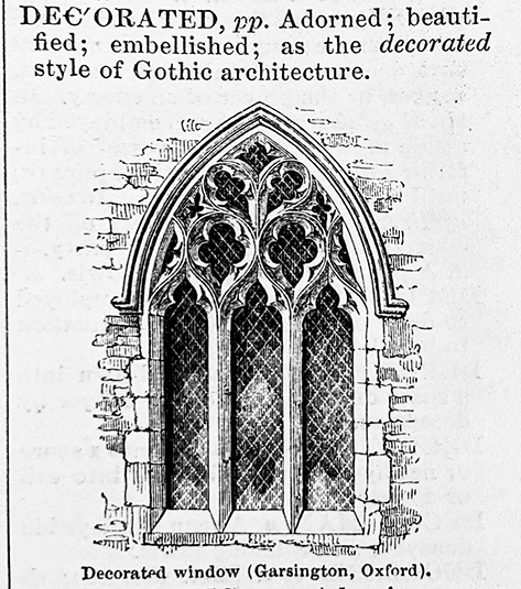
Figure 10.13 “Decorated.” Wood engraving by Orlando Jewitt in Reference OgilvieOgilvie (1850): 1.513.
However, by 1847 (when The Imperial Dictionary began to be published in serial installments) actual printing, now on a steam-powered press, would be done not directly from the wood blocks but from stereotype replicas of whole page formes, a practice that enabled economical reprinting (Reference BlackieBlackie 1897, 30). The hand-printing of Bewick’s books belonged to an older era, now surpassed.
The Imperial Dictionary was a British dictionary, and its thousands of pictures displayed things that interested Victorians on the eve of the Great Exhibition. Somewhat incongruously, the same pictures found an American audience a decade later, as reproduced in the Pictorial Edition of Webster’s American Dictionary of the English Language (Reference Goodrich and Goodrich1859). Following the death of Noah Webster in 1843, rights to his Dictionary were eventually purchased by George and Charles Merriam, provincial printers and booksellers in Springfield, Massachusetts, who secured the cooperation of two of Webster’s sons-in-law, William Wolcott Ellsworth (former governor of Connecticut) and Chauncey A. Goodrich (a Yale professor), in preparing subsequent editions.
In 1848, when the first numbers of The Imperial Dictionary had begun to appear, Goodrich remarked in a letter to Ellsworth that the book “is made attractive by the introduction of 2000 small wood engravings, to illustrate the definitions in science, &c, engravings which are so minute as not to trench on the character or appearance of the book as an ordinary English dictionary, while at the same time they afford great satisfaction” (Reference HancherHancher 2010, 8). Goodrich does not specify the nature of that satisfaction: the illustrations were evidently attractive; were they also instructive? He appreciates that the small wood engravings, unlike full-page copperplates, do not compromise “the appearance of the book as an ordinary English dictionary” – their modest scale doesn’t change the dictionary into an encyclopedia.
A decade later Goodrich would import most of those same illustrations (now re-engraved in the shop of John Andrew, an Englishman who had settled in Boston) into the Pictorial Edition. As if to forestall criticism of this visual turn, Goodrich quoted at length from Locke’s advice in a prefatory note (Reference Goodrich and GoodrichGoodrich 1859, lxxxi).
Hastening to publish the pictures before a rival illustrated dictionary went to press, Goodrich collected them in a supplement at the front of the book, as a kind of visual encyclopedic preface. The sequence is alphabetical: abacus, the counting tool, is the first picture. Categories take their place too within that sequence; for example, under H, “Heraldry” features 117 wood engravings, sub-alphabetized from accosted to wyvern, including of course Blount’s canton and gyron, bend and chevron: altogether an impressive display that dominates three quarto pages. Later editions would distribute the engravings to their places in the text, where they would keep proper company with their lemmas and definitions. And yet the pictorial supplement in the Pictorial Edition proved to be so popular that the G. and C. Merriam Company retained it in later editions, now gathered at the back of the book – a redundant practice that persisted even through 1915. The commercial success of the Pictorial Edition and its many successors established the expectation that any American dictionary of English, whether published by Merriam (now Merriam-Webster) or anyone else, would include many small illustrations.
10.7 New English Dictionary, Oxford English Dictionary
While Goodrich was preparing to publish his illustrated dictionary, Richard Chenevix Trench, dean of Westminster Abbey and author of several popular books about words, published a manifesto implicitly hostile to pictorial lexicography. Deploring a proliferation of nonlexical information in dictionaries such as Bailey’s and even Johnson’s – extraneous information about “the plants, fruits, flowers, precious stones, animals, and the rest” – Trench recommended instead a more austere focus on the meanings of English words and the history of exemplary uses of those words (Reference TrenchTrench 1857, 49). Early dictionaries had ignored their proper limits; they were not (as they should be) “Dictionaries of words only, but of persons, places, things; they are gazetteers, mythologies, scientific encyclopedias, and a hundred things more” (Reference TrenchTrench 1857, 45).
The eventual product of Trench’s proposal was the monumental New English Dictionary on Historical Principles (NED), later the Oxford English Dictionary (OED). James A. H. Murray, the principal editor of the NED, had Trench’s strictures in mind when he wrote the preface to that work: “a Dictionary of the English Language is not a Cyclopædia: the Cyclopædia describes things; the Dictionary explains words, and deals with the description of things only so far as is necessary in order to fix the exact significations and uses of words” (Reference Murray and MurrayMurray 1888, vi). The elastic phrase “so far as is necessary” is appropriately licentious. As Allen Walker Read summarized the problem in 1974, “The distinction between a dictionary and an encyclopaedia is easy to state but difficult to carry out in a practical way: a dictionary explains words, whereas an encyclopaedia explains things. Because words achieve their usefulness by reference to things, however, it is difficult to construct a dictionary without considerable attention to the objects and abstractions designated” (Reference ReadRead 1974, 713–714; see also Hancher 2019).
Neither Trench nor Murray mentions pictures about things, not even to disparage them, and there are no pictures in the NED or OED, even as there were none in Johnson’s Dictionary. But if attention to things matters at all in a dictionary, as it must, attention to the look of things must matter too, as Locke assumed; and pictures can show how things look, more or less. A recognizable picture of a beaver would be no more irrelevant to the word beaver than is the current verbal definition in the OED (which has been carried forward from 1887): “An amphibious rodent, distinguished by its broad, oval, horizontally-flattened, scaly tail, palmated hind feet, coat of soft fur, and hard incisor teeth with which it cuts down trees; remarkable for its skill in constructing huts of mud and wood for its habitation, and dams for preserving its supply of water.” Trench and Murray curtailed the encyclopedic apparatus of the NED, but encyclopedic content was not so easily banished.
Presumably Trench and Murray cared little for the pictures in the Pictorial Edition. However, their opinion was not shared by Herbert Coleridge, the young scholar who was the first editor of the NED. On August 7, 1860, he assessed the Pictorial Edition for the benefit of Daniel G. Mason, a publishing associate of Goodrich’s. He found Webster’s Dictionary in its later editions to be useful “as a general book of reference adapted to the wants of that enormous majority of educated persons who are not linguistic scholars,” faulting only its idiosyncratic etymology. “The pictorial illustrations are an excellent idea,” he added – although he thought it too bad that they were segregated apart from the letterpress definitions. He also specified “that these illustrations should be confined to pieces of machinery, the details of architecture & such like objects, which it is often difficult to explain by words alone, & should not be extended to animals & plants, which in small engravings without colour cannot be adequately represented to the eye.” In other words, the names of cultural and mechanical things like strigil and sistrum could benefit from pictures, but not apium or ibex. This was an odd fractioning of Locke’s broad agenda, though it happened to be consistent with Bailey’s practice. Once again Coleridge made a special case for heraldic terminology, such as “a ‘bend,’ ‘bar,’ ‘pale,’ &c in a coat of arms,” for which “an engraving … is almost a necessary appendage to any description however lucid it may be” (quoted in Reference HancherHancher 2010, 20). But Coleridge died soon after he wrote this letter, and his successors at the NED had to define such heraldic terms without resorting to pictures. (For example, s.v. Bend sb.2 in sense 3: “An ordinary formed by two parallel lines drawn from the dexter chief to the sinister base of the shield, containing the fifth part of the field in breadth, or the third if charged.”)
10.8 The Century Dictionary and Cyclopedia
The heraldic senses of bend, bar, and pale are all duly illustrated with pictures in The Century Dictionary and Cyclopedia (Reference Whitney1889–91), a multi-volume work that was a worthy rival to the NED (see Reference HancherHancher 1996). Edited by Sanskrit scholar William Dwight Whitney and frankly encyclopedic in its reach, the Century did not hesitate to elaborate on a grand scale the pictorial heritage of The Imperial Dictionary, from which it derived. The original six folio volumes (later increased to ten, with supplemental additions) included some six thousand illustrations of things natural and cultural – more than any such work before or since. Printing was managed for the Century Co. by the De Vinne Press in New York, which had many years of experience printing illustrated magazines such as The Century Magazine, the leading monthly, and many illustrated books. William Low De Vinne had become a learned and meticulous expert in fine printing on a commercial scale, known especially for the care he took in reproducing wood engravings, which constituted much of the appeal of The Century Magazine. The years leading up to the publication of The Century Dictionary and Cyclopedia were the last years in which wood engraving would be the dominant medium for book illustration. (Soon thereafter the printing trade shifted to “process” work that used photographic reproduction of line drawings or half-tone reproduction of photographs.) De Vinne remained committed to the aesthetic advantages of the older medium, despite the practical difficulties that it often presented in mass reproduction. Just one of the special techniques he devised was the use of “surfaced” or coated papers, to capture the full detail of an engraving; the large volumes of The Century Dictionary gain much of their heft from the use of such paper. Actual printing was done not from the blocks and standing type but from electrotype replicas, which, like stereotype plates earlier in the century, would be preserved for later reprinting Reference De Vinne(De Vinne 1890, 90–92 and 99).
The selection and commissioning of the six thousand wood engravings was the work of the art director of the Century Co., William Lewis Fraser. According to the firm’s retired president William Webster Ellsworth (a great-grandson of Noah Webster), Fraser’s job was not an easy one. It was
a delicate piece of work when one realizes that each drawing must be absolutely correct, that too much “art” must not be apparent in a reference book, that the editors (and especially the expert in charge of the particular department) must be satisfied, and that one department should not be over-illustrated at the expense of another – and that each expert had no interest whatever in any other department, but simply wanted all the pictures he could get for his own definitions.
Ellsworth’s remarks here have general application. What does it mean for a drawing to be “absolutely correct”? How do aesthetic considerations compete with representational efficiency? And what things should be illustrated rather than others?
Whitney addressed some of these questions in his preface (1: xvi). “The pictorial illustrations have been so selected and executed as to be subordinate to the text, while possessing a considerable degree of independent suggestiveness and artistic value.” That paradoxical formulation asserts a subordinate status for the image – and yet when you open the Century to a page you see the pictures first of all. “Cuts of a distinctly explanatory kind have been freely given as valuable aids to the definitions”; again, the purported subordination. What makes “cuts of a distinctly explanatory kind” different? “To secure technical accuracy, the illustrations have, as a rule, been selected by the specialists in charge of the various departments and have in all cases been examined by them in proofs.” Again, the question of accuracy: how is it assessed? “The work presented is very largely original, cuts having been obtained by purchase only when no better ones could be made at first hand.” Whitney alludes here to the large market in electrotype cuts that flourished in the second half of the nineteenth century; some of the six thousand illustrations would be drawn from that market, but many – most, evidently – would be commissioned by Fraser from artists and engravers. Many of the illustrations in the Century bear the monograms or signatures of the engravers, who might also be the designers. And many were recycled, one way or another, from the final edition of The Imperial Dictionary (Reference Ogilvie and Annandale1882). In some such cases the Century would follow the Imperial in deciding what to illustrate, but use a different design (for example, decompound, decorated). Or it might re-engrave the same image (for example, coracle). Many of the heraldic line drawings appear to have been recycled from the Imperial photographically (for example, demi, displayed).
In 1903 sixteen color plates were added to the front matter of volume 1, which depicted varieties of fish, birds, flowers, tree leaves, “injurious insects,” “North American butterflies,” “eggs of North American birds,” “color-types of the races of men | British Association scale,” “precious stones,” “colors of the spectrum and of pigments,” “flags of the principal nations,” and signal flags and distinctively colored “funnels of trans-Atlantic liners” – all produced to a high standard by the American Lithographic Company.
Was color necessary? That is, could black-and-white images adequately represent the world? The connoisseur Horace Walpole thought not and was often quoted: “Want of colouring is the capital deficience of prints” (Reference WalpoleWalpole 1782, 2). Locke, who as an empiricist favored the “primary qualities” of shape and extension over such “secondary qualities” as color and smell (deemed to be less reliable because unmeasurable and subjective), would disagree. So would advocates of copperplate engraving and, later, wood engraving, who found “color,” technically so called, to be an emergent quality achieved in expertly shaded black-and-white. Still, Walpole’s opinion matched popular taste; and colored prints were widely sought and prized, in one medium after another, throughout the nineteenth century. Eventually chromolithography, when well handled, could do the job. And what better way to explain what the colors carmine or mauve meant than to show them on the page? Words fail.
If color terms justify resorting to pictorial representation as ostensive definition, as in the Century’s plate XIV, which shows a range of colors and their names, the vocabulary of differential skin pigmentation, depicted in plate XII, tells a more complicated and doubtful story. The third edition of the handbook prepared by the British Association for anthropological fieldwork identified ten shades of skin color by name, in sequence ranging from “1. Black, coal-black” and “2. Sooty-black” to “9. Pale-white” and “10. Florid or rosy” (Reference Garson and ReadGarson and Read 1892, 17, plate 3). Whoever designed Plate XII for the Century reversed this order, and also exchanged the sequencing of “Pale white” and “Florid or rosy,” so the resulting order ranged from “Pale White” to “Coal-black.” Unlike the British Association list of color names (which was keyed to a color chart without any annotations), this plate in the Century assigned a different “race” to each of the ten skin colors, ranging from “American” (“Pale White”) through “Italian” (“Brownish White”) and “American Indian” (“Copper-colored”) to “South African” (“Coal-black”). It also illustrated each “race” with a head-and-shoulders portrait of an adult male, all of them dressed in distinctive costume except for the bare-chested “Melanesian,” the “West coast African,” and the “South African.” Presumably the (male) American reader was meant to identify with the representative of the “Pale White” “American” “race,” who looks more querulous than any of the others (see Figure 10.14).

Obviously, this plate is overcharged with ideological signification in excess even of its supposed function, the display of a spectrum of skin colors – which the British Association scale did not key to “race.” Aside from terminological error (although the “American race” was a concept in turn-of-the-century anthropology, the term referred to American Indians, not European settlers and their descendants), there is too much information and too little information. Arbitrary costuming; all adult men, no women, no children. “Each drawing must be absolutely correct,” Ellsworth reported; the goal was “accuracy,” according to Whitney. These drawings fell short of that goal by going too far. To what extent does that general failing affect any or all of the other illustrations in the Century – or those in any other dictionary?
10.9 Webster’s Second, Webster’s Third
The Century Dictionary and Cyclopedia, which had the justification of being a cyclopedia as well as a dictionary, was not alone in supplementing its letterpress with full-page illustrations of a range of encyclopedic things. The supplement to the Pictorial Edition showed that even a proper dictionary might go that route. One of the selling-points of the celebrated second edition of Webster’s New International Dictionary of the English Language (1934, often reprinted and often imitated; cited here as Webster’s Second) were its “Magnificent full-color plates of plants, flowers, butterflies, gems, coins, birds, color charts, etc.” (Advertisement 1936).
When it was time to overhaul Webster’s Second the editor, Philip B. Gove, moved to purge the book of much of its encyclopedic content to make room for a substantially enlarged vocabulary. In an internal memo to staff, reminiscent in tone of Trench’s impatient manifesto, he listed thirty-one different kinds of material that would have to be curtailed, ranging from “the Gazetteer section” (to be omitted) through “names of saints” (omitted), “names of ships” (omitted), and “names of comets” (omitted), to a more ambivalent policy: “The number of black and white illustrations will be reduced by over half” (Reference GoveGove 1985, 108 and 110). No rationale is given for this half measure, nor guidance on how to carry it out. Nor did Gove even mention the fate of the color plates. In fact they survived the new austerity, updated of course – twenty of them, including the most justifiable one of them all, a plate of color charts. (Words alone still could not define color names.) Publicity from Merriam-Webster on the launch of the new edition (here called Webster’s Third) reported that “more than 3,000 clearly drawn black-and-white illustrations offer visual understanding of a wide variety of subjects. In addition, outstanding artists present a collection of twenty magnificent plates in full color with the finest illustrations available anywhere on subjects of keen interest to people today” (Announcing 1961, 2). Three thousand black-and-white illustrations was indeed roughly half the number that had occupied Webster’s Second, so Gove did have his way in that respect, as in others. But there were limits. The color plates, evidently, were still privileged; for example, “Poisonous Plants,” revised from the plate in Webster’s Second.Footnote 6 Decades earlier Gove had severely criticized the eleven full-page copperplates that illustrated a posthumous edition of Bailey’s New Universal Etymological English Dictionary (1755–56), which evidenced “poor, careless, and probably hasty planning” (Reference GoveGove 1939, 317–318). Weaknesses included a disproportionate display of heraldry, poorly coordinated with the text. Nonetheless, any reader of Webster’s Third who might look up the heraldic terms bend, bar, or pale will find them and many others illustrated in neat bearings stamped in the margin, as well as defined, in words.
10.10 A. S. Hornby and Oxford University Press
Seven years after Merriam-Webster published its cornucopia of pictorial imagery in the hefty three volumes of Webster’s Second, a much smaller English dictionary was published in Tokyo by The Institute for Research in Language Teaching, titled Idiomatic and Syntactic English Dictionary (Reference Hornby1942), prepared mainly by A. S. Hornby, who had spent many years teaching English as a foreign language to Japanese students. This compact student’s book printed on Bible paper in a flexible binding, almost pocketable, included 1,406 small, line-drawing illustrations, which were meant to serve a practical purpose, quickly indicating the meaning of a word that would be hard to define in a few simple words. According to Hornby, should a foreign student reach for The Concise Oxford Dictionary (Reference Fowler and Le MesurierFowler and Le Mesurier 1934) – which was then and still is the beginner’s reduction of the OED – to find out what the word lobster means, the definition there would be too complex, involving too many difficult words, to serve the purpose. “The foreign student usually needs only to identify the new word. This new dictionary supplies him with a picture, which in itself is probably enough for his purpose, without the brief definition that accompanies it” (Reference HornbyHornby 1942, v). The logic is Locke’s. The lobster picture in the margin of this book is probably smaller than Locke imagined (see Figures 10.15 and 10.16).
Figure 10.15 Reference HornbyHornby (1942, 740–741).

But it serves a purpose, as do the 1,405 other illustrations.
The contrast that Hornby drew to the pictureless Concise Oxford Dictionary became ironized in retrospect when Oxford University Press photographically published his book under the title A Learner’s Dictionary of Current English (Reference Hornby, Gatenby and Wakefield1948; LDCE), on ordinary paper in a larger format and a sturdier binding that made it look much like the Concise Oxford Dictionary.Footnote 7 This innovation for the Press, incidentally venturing into the illustrated-dictionary business, proved to be a boon for it and for advanced students of English around the world. It was often reprinted (from 1952 under the title The Advanced Learner’s Dictionary of Current English; ALDCE) until 1963, when the second, revised edition appeared, also edited by Hornby. Now in its tenth edition (2020), and downloadable to your cell phone as an app, it features many color illustrations, including a convincing photograph of a lobster (not shown here), by cultural preference cooked (bright red), not raw – which dominates a set of four kinds of shellfish (the lesser ones being oyster, mussel, and clam). The right claw is labeled claw.
Perhaps the most distinctive feature of Hornby’s book originated in the difference between mass nouns and count nouns, which is a grammatical distinction important in English but absent from Japanese. To signal this distinction for the Japanese student Hornby explicitly labeled many nouns or noun senses [C], countable, or [U], uncountable. And when a countable word or sense was illustrated he would often signal that status in the caption also by prefixing an indefinite article or using the plural form of the word: “A butterfly,” “A coat of arms,” “A dictaphone,” “A jar,” “A lobster”; “Beards,” “Cranberries,” “Fire-irons,” “Flasks,” “Pennies.” Barley and Clover, Mistletoe and Parsley are flagged [U], and the captions to their illustration have no articles.Footnote 8
The purpose of using an indefinite article in a caption was to mark countability. However, the device has an unintended effect, serving as a kind of truth-in-captioning notice, a warning that the image shown is not the meaning of the noun in some Platonic, idealized and general perfection – not the idea, the type of the thing named – but rather an image of a particular instance of the thing named. The word butterfly applies to a lot of insects that don’t actually look much alike. An illustration of the word captioned just “Butterfly” might suggest that this is what all butterflies look like, but an illustration captioned “A butterfly” (see Figure 10.17) makes a more limited and more plausible claim: what we see here is what one particular butterfly looks like, or even one particular butterfly of one particular species – in any case, just a token, not the type.

Such modesty in captioning (if one chooses to read it that way) speaks to the limits of pictorial illustration in a dictionary. Occasioned by a grammatical difference between Japanese and English, it vanished from most later editions of ALDCE.
LDCE/ALDCE was only the first, not the last, illustrated dictionary that Oxford University Press would publish. Although in its several editions the OED has continued to ignore pictorial illustration, the market for illustrated dictionaries, already proven in Scotland and the United States, was confirmed by the sustained success of the specialist ALDCE.
According to the preface for The Oxford Illustrated Dictionary (Clarendon Press, 1962), “some years before the war it had become clear that there was a demand for a dictionary which would combine the essential features of an encyclopedia and of a dictionary in the ordinary sense, that is to say, a work which would deal not only with words and phrases, but also with the things for which those words and phrases stand.” (Trench would demur.) Such a book would make “a copious use of illustration.” A series of editorial difficulties delayed publication until 1962. A revised, second edition appeared in 1975, displaying hundreds of black-and-white line drawings, many of them annotated in detail. Despite its evident success (many reprintings) the book did not establish a new standard in illustrated dictionaries. However, Butterfly and Lobster can be seen there, and a panoply of “ordinaries and sub-ordinaries,” including Chevron, Bend, Canton, and Gyron (Coulson et al. 1982, 394 – a full page devoted to illustrating the elements of heraldry).
A more interesting example was DK Illustrated Oxford Dictionary (1998; DKIOD), published jointly by Oxford University Press, Inc. (New York) and DK Publishing, Inc. (London). The British firm DK (formerly Dorling Kindersley) had achieved a solid reputation as an “illustrated reference book publisher” (Reference MenkesMenkes 1991, 14). Their practice was to distribute color illustrations generously on every page, and so they did with DKIOD, which boasted on the dust jacket that “4,500 FULL-COLOR IMAGES provide instant visual definitions and deepen understanding of the text entries.”
“Instant visual definitions” is an intriguing phrase, in part because it imputes instantaneity to a reader’s processing of pictures, at least relative to the time required to process a string of words. Also, “visual definition” here suggests that a picture can “define” the meaning of a word – a task usually assigned to other words. The same phrase – “Over five thousand Illustrations (plain and colored) aid the user by visual definitions” – uncommon in this sense (usually it has to do with optics) – had been used by Funk and Wagnalls to advertise their Standard Dictionary in 1900 (see Reference BromellBromell 1900, [28]).
A prefatory note by DK’s publisher Christopher Davis protests, perhaps too much, that the “pictures” are not merely “decorative” but have been chosen for “their usefulness, their accuracy,” among other qualities. The fact that useful illustrations can also look decorative requires an apology. To assert the utile one must discount the dulci. Johnson, as we saw earlier, had similar misgivings, and Webster also. Comenius was less apologetic about leveraging instruction on children’s instinctive fondness for pictures.Footnote 9
Davis also asserts that “the rationale behind the choice of illustrations has been as rigorous as for word selection.” This is a sensitive point, speaking to the common suspicion that the choice of what to illustrate in a dictionary is either traditional (following the practice of previous dictionaries; for example, aardvark, abacus) or arbitrary (again, aardvark, abacus, because readily illustratable quite early in the alphabetic sequence).Footnote 10 The pages of a book provide a restricted space: everything that could be illustrated in that space can’t fit there. How to choose? (This will become a moot point in internet space.)
Heraldic bend made the cut in DKIOD, as did lobster – much larger and more recognizable than in Hornby’s book, raw (blue-black), and supplied with ten labels naming parts. Some words are given even more elaborate pictorial treatment. For example, butterfly receives a compact definition at the very bottom of the right-hand column of page 114, and then, through a feat of page design, immediately following, an entire page devoted to BUTTERFLY, in words and pictures. A short paragraph at the upper left of that dedicated page gives some basic encyclopedic information about the order, noting that it includes “about 200,000 species”; below that is a diagram showing and labeling “internal anatomy of a butterfly.” To the right of that, occupying a quarter of the page, is a photograph of a side view of “swallowtail butterfly (Papilio species),” labeled with the names of a dozen details. The bottom half of the page shows “examples of other butterflies,” fifteen of them, displayed from above, wings outstretched – which is a conventional but not the only way of imaging a butterfly, as the side-view already mentioned reminds us. The tallying of 200,000 species at the top of the page and the display of instances of (only) fifteen of them suggests that no single illustration, showing whatever perspective, could “accurately” “define” the word butterfly. A similar if less elaborate multiplicity of illustrations attends such words as fish and newt. To grasp such general concepts one needs to see (images of) more than one particular species. And the same logic applies to any single species: to “visually define” the concept “nightingale (Luscinia megarhynchos)” a single image may be a start, but is it enough? A single color photograph showing a single instance of that species handsomely decorates the definition of nightingale (553). If space allowed, would not several such images be better?
10.11 More Pictures
Visual definition in print is a reduced form of “ostensive definition.” Ostensive definition tries to evoke a type concept by gesturing at a token of the type: This is what the word apple means <points to or otherwise draws attention to an apple (or a picture of an apple)>. Does pointing to one apple do the trick? Leonard Reference BloomfieldBloomfield (1933, 140) suggested not:
If someone did not know the meaning of the word apple, we could instruct him by handing him an apple or pointing at an apple, and continuing, as long as he made mistakes, to handle apples and point at them, until he used the word in the conventional way. This is essentially the process by which children learn the use of speech-forms.
We generalize – that is, we learn the general qualities of things – by repeated encounter with particulars. One such encounter would not normally be enough. A single dictionary illustration of a thing, no matter how well managed, will not be enough. Samuel Johnson, wary of “minute particularities,” avoided that route.
Lorraine Daston and Peter Galison have documented the challenges that were faced and evaded by natural historians and then scientists in the seventeenth, eighteenth, and nineteenth centuries as they attempted to “define” botanical and biological realities by imaging them in pictures, trying to minimize the selective agency of the scientist/illustrator in the quest for ideal or at least “objective” representation – an elusive goal and grail. Toward the end of the nineteenth century the inevitable difficulties and frustrations that were encountered in that quest forced a shift in strategy, which resulted not in singular and therefore inadequate pictures but in relevant arrays of images, showing views of many tokens of the type being illustrated – in effect, outsourcing the work of generalization to the audience (Reference Daston and GalisonDaston and Galison 1992, 107; Reference Daston and GalisonDaston and Galison 2007, 183–186). The butterfly page in DKIOD shares that logic.
Pictures take up space in a dictionary, directly competing for that space with words, which can do much in the way of definition. Maybe there is room for one picture of nightingale, but no more than that. To see a panoply of nightingale illustrations in a virtually unlimited space (limited mainly by the patience of the viewer) you would have to leave the printed book and go online and see what Google Images has in store. There you will find many dozens of pictures (mostly photographs) of nightingales, more than enough of them to help you form a general impression of what they look like. (It is of course necessary first to exclude the several pictures of Florence Nightingale.) Because Google Images is a dynamic system, results will change from day to day, but the top-ranked hits will tend to be relevant.
On 27 February 2021, three of the top four nightingale images showed a bird with its mouth open (see Figure 10.18).

Figure 10.18 “Nightingale.” Top four images (all of them photographs) displayed in response to a Google Images search on the word, February 27, 2021. a. Carlos Delgado (CC By-SA 4.0); b.
The three birds are evidently singing, which is a culturally celebrated aspect of this natural species, an aspect that DKIOD registers in its definition (“the male sings melodiously, esp. at night”) but not in its illustration, which shows a taciturn bird.
Many people already do something like this; that is, if they want to know the meaning of a word they will Google it and see (in both senses) what they find. They will not discover the visually defined heraldic meaning of polysemous bend that way, unless they conjoin that search term with heraldry; but gyron will work fine by itself; and so will butterfly, lobster, porrum, leek, strigil, sistrum, and ibex. Because the algorithm that promotes some images over others tends to favor those with more links, aspects other than optimality for the purposes of word illustration can disrupt the results. So it was that a rogue image of a person in a red lobster costume figured among the top results of a search on lobster for a while late in February 2021 (looking, in many respects, like a lobster). As Daston and Galison suggest, viewer discretion is required. For some cultural concepts there will be contamination by invidious bias (Reference NobleNoble 2018). In better cases the instant array of images that Google can summon will provide a helpful resource for gauging what many concrete nouns mean, and even other parts of speech (for example, the verb write). Of course, no single image retrieved from such a search will be perfect for the purpose, even as no single pictorial illustration in a dictionary can be perfect, and, for that matter, no single verbal definition. But in many if not most cases the viewer can quickly “see” what some broadly characteristic tokens of a type look like, and so, to a large extent, what a word means. Comenius and Locke would approve.
11.1 Introduction
In the third decade of the twenty-first century, it is almost anachronous to use the word book to describe a modern dictionary. The lexical content that once was particular to a printed dictionary, with a specific scope and intended audience (a one-volume dictionary for the American college market; an intermediate learner’s dictionary; a specialized lexicon of an ancient language) is now in the parlance of digital publishing a data set, and the word page is no longer necessarily a physical leaf with a number of entries printed on it. The “extra matter” commonly provided with these dictionaries, from the essays and guides in the front to the maps, tables, charts, and sometimes glossaries at the back, may appear as articles in a help section of a website, be offered as a downloadable document, or simply no longer be made available. Even the CD-ROM, which before the advent of online dictionaries made it possible to effectively put a searchable dictionary database on anyone’s home computer, is now obsolete. For general purposes, searching on the web for the meaning of a word has largely replaced the consultation of a printed dictionary.
Yet, while it is highly unlikely there will ever be, say, a Webster’s Fourth New International Dictionary one can hold in one’s hands (briefly, while hefting it onto a bookstand), the printed book format remains viable, particularly for specialized dictionaries – although new publications will typically also be made available as e-books that can be purchased for download or by subscription via a publisher’s online content management system. And so an overview of the considerations for page and book design with reference to printed dictionaries is still relevant. But more than that, it is a necessary beginning to the story of how publishers have answered, and continue to answer, this question: How does one design a dictionary to meet the needs of its users? This chapter tells the arc of that story over the four decades that spanned the end of the twentieth century and the beginning of the twenty-first, with an emphasis on the ways in which digital production and distribution altered the publishing of dictionary content, particularly for online reference works. The approach is journalistic, drawing on the experiences of people involved in the publishing of dictionaries, including those of the author, and on publishers’ internal documentation shared with the author.
Section 11.2 starts from the book itself: the physical dictionary from cover to cover. What drives the decisions about a dictionary’s format, size, and extent? What are the typical components of a printed dictionary, and how are they mapped out for the printer? The section then moves to the page level: What are the elements of an A–Z dictionary page, and how do editorial choices and design considerations influence each other? It concludes with the A–Z dictionary page in transition, in which digital tagging is implemented but the output is still to a print format, covering the difference between format tagging and content tagging, and how design specifications are applied in the digital page composition process.
Section 11.3 is devoted to the dictionary as a digital product: what needs have CD-ROMs, e-books, and online dictionaries met that books have not, and what are the challenges in developing a functional digital product when the core content started life as a printed book? The section begins with an overview of the value to dictionary users of CD-ROMs and e-books. It then describes how the practices and considerations of digital production evolved to be applied to the design of the user experience (UX) for an online interface, including the ease of navigation and the readability of a page as contrasted with print. It presents how factors such as page load time, browsing behavior, and search results affect the user experience, and therefore necessitate adaptations in way content is structured and presented. And finally, the chapter comes full circle, describing how the users themselves are still the focus of design choices, through data-driven decision-making.
11.2 The Printed Dictionary
11.2.1 The Physical Dictionary, Cover to Cover
A dictionary is a reference work. Why state the obvious? Because every reference work is – or should be – produced with a specific user in mind; and how it meets the needs of that user involves not only the content of the work but the format as well. Not so very long ago, “print” was not referred to as a medium of publication as opposed to digital, and to speak of formats was to consider the various sizes and bindings available to meet the tastes and needs of purchasers (and one did not speak of that purchaser as a user). Picture yourself, for a moment, as such a purchaser – not in the present, but in the late twentieth century. In a bookstore with a large reference section, you are presented with a bewildering array of choices in many formats, and in which red or blue covers seem to dominate. How do you decide which book to buy?
You have come to that store with a context: you’re a grandparent, and an embossed hardcover “college” dictionary will make a nice high school graduation present. You’re a student, and you need a dictionary light enough to carry in your backpack, and inexpensive. You’re a businessperson, and you want an all-in-one desk reference. You’re going to travel, and that pocket-sized bilingual dictionary with the vinyl cover will do nicely. Your context helps you begin to narrow the choices, and format is usually the first consideration in that winnowing.
This is when you become a person of great interest to a dictionary publisher, since having settled on a format, you are about to decide whose dictionary you’re going to buy among the ones offering a book in that format. And if you are like the majority of customers (whose behavior was closely tracked by booksellers and publishers alike), you look at the covers and see how many entries each book claims to have, compare prices, and buy the one you think gives best value for money. If they all seem too similar, you opt for the one that has Webster’s or Oxford in the title. Only when you begin to use the dictionary will you discover whether or not it has turned out to be the best one for your purpose.
This buying pattern was the despair of the dictionary publishers who had worked for decades to build reputations that would distinguish their products in what was then a crowded market for reference books. So the aim of their marketing campaigns was for you, the purchaser, to walk into that store already knowing which dictionary you wanted to buy. These campaigns emphasized a dictionary’s USPs – its unique selling points. For there were, indeed, clear differences between the market-leading titles: in the space given to illustrations, in the complexity of their definitions, in the coverage of specialized terms, in the frequency of updates. As claims on dust jackets about the number of entries were replaced by fuzzier claims about “references” and “meanings,” a dictionary that performed favorably in a “flip test” could still become a purchaser’s choice. If your late-twentieth-century self had flipped through the pages of the dictionaries you were considering, you might have decided that the one with more supplemental material such as maps and extra glossaries, or the one with color illustrations, was the one for you. Yet the factors that influenced your choice as an individual wouldn’t necessarily be the same as those of a buyer for a library or an educational institution purchasing classroom sets. Thus, the combination of format, coverage (number and type of entries), cost, defining style, and supplemental features determined the “fit” of dictionary to buyer.
Dictionaries are available in a range of formats, from multi-volume, library-bound hardcovers with sewn bindings and cut thumb indexes to mass-market paperbacks with pages that yellow quickly. Before the advent of online dictionaries, a publisher of a general-purpose dictionary would first of all ensure to offer choices in the most popular formats.Footnote 1 The variety of additional formats offered would then depend upon which niche markets it wanted to reach. A typical approach was to begin with the largest set of content that was published in the largest format – a publisher’s “flagship” dictionary – and then abridge the content to produce a smaller general-purpose dictionary. This was the method used,Footnote 2 for example, for the American Heritage Dictionary, Second College Edition; the first edition of the two-volume Shorter Oxford English Dictionary on Historical Principles; the first and fifth editions of Webster’s Collegiate Dictionary; and the first edition of Random House Webster’s College Dictionary. The abridgement might in turn be further abridged for trade paperback and mass-market formats. A single abridgement could be published in different versions by using the same core “book block” (set of composed pages in a particular size) of A–Z text, changing the title page and cover, and perhaps some of the supplemental material, to suit the target customer.
Once the storing of dictionary content in a database made it much easier to export the data for digital composition, it also became easier and less risky to experiment with new formats. For example, in 2001, the Random House list of published titles included four that used the same Spanish–English data set of 50,000 very short entries: a “pocket” size with a vinyl cover; a “student notebook” hole-punched version to clip into a binder; a boxy “handy” version that had larger type than the pocket version but still easily fit in one hand; and a large-print edition. The overlap of print and digital formats can be seen in the offerings for the 2011 centenary edition of the Concise Oxford English Dictionary which was available as a standard edition with a free promotional booklet; a “state-of-the-art” CD-ROM; a dictionary and CD-ROM set; a luxury edition with thumb-cut tabs; and even an app (Knowles; see note 2 below). Publishing in so many formats was at times more an illustration of the maxim “just because you can, doesn’t mean you should” than a viable strategy for getting more value out of the same content. Someone who purchases a vinyl-covered dictionary of the type sold as “gem” (Collins), “mini” (Oxford), or “pocket” (Random House) is likely to understand that the coverage will be as concise as the book is small. However, that same content when packaged in a larger format can set up false expectations for comprehensiveness. As it was, the proliferation of specialized formats which digital innovation in the means of production made possible was eventually curtailed by digital innovation in the means of distribution. By the close of the first decade of the twenty-first century, the needs that some specialized print formats were designed to address were instead being met by hand-held digital products such as e-reading devices, which allowed the user to increase the size of the text, and dictionary apps for iOS and Android phones, which meant that comprehensiveness no longer had to be sacrificed for portability.Footnote 3
The growth of digital formats may have resulted in a reduction of variety in print formats, but there was always a more practical reason for limiting the range of formats: expense. Producing books in standard trim sizes helps reduce the cost of printing, manufacturing, and shipping. (The trim size is the dimensions of a book block after the final trimming of the pages by the printer, expressed as width by height in inches or height by width in centimeters.) Perhaps predictably, standard sizes vary between the US and other countries. Still, there are recognizable categories: the largest trim sizes are reserved for hardcovers that command a premium price; the mid-range sizes are suitable for both quality paperbacks and smaller hardcovers; and the smallest trim is for mass-market paperbacks of the airport variety. Table 11.1 gives the typical trim sizes and approximate entry counts of seven categories of print dictionary formats.
A comment about entry counts, because the range in the figures in Table 11.1 may be surprising: one cannot trust the numbers that are claimed on the covers of dictionaries. They aren’t untrue (usually), but they can be misleading. Let’s go back to you, the shopper in the bookstore, looking at those claims. You want to know how many words are defined in the dictionaries you are considering, and by word you probably have in mind something in boldface type you can look up alphabetically, and with a complete definition. That word is a headword, and everything underneath it until you get to the next headword is the entry. But look closely, and you’ll see that instead of stating the number of entries, the description is likely to cite how many “references” or “words, phrases, and meanings” the dictionary contains. Even if the claim uses the term “entries,” it doesn’t necessarily mean that’s the number of words with a full definition in the book.
There are many reasons for this, the most fundamental of which is that the organizing principles for entries vary between dictionaries. Some list all the definitions for different parts of speech underneath one headword (a pattern called “nesting”), while others have separate entries for each part of speech. So a word like prime might have three entries, one each for the adjective, verb, and noun, listed as homographs (1prime, 2prime, 3prime); or just one entry, in which all three parts of speech are nested under a single headword. Therefore, two dictionaries with a similar number of defined terms can have markedly different “entry counts.” A further complication is that an entry count might include quite a number of items – something of note that has been entered in the dictionary, usually in boldface, up at the head or down at the bottom of the entry – from which a user might be able to infer a definition. These aren’t things that the average dictionary user would cite if asked to say what a dictionary entry is: they include items such as variant forms, abbreviations, derivatives (such as -ly adverbs and -ness nouns), and “listwords” formed from different prefixes (e.g. overbleach or overcriticize, considered to be self-defining).
The practice of counting almost any boldface form as an entry for the purposes of publicity dates at least to the ninth edition (1983) of Merriam-Webster’s Collegiate DictionaryFootnote 4 (Morse; see note 2 above). Over time, competitors followed suit, making it nearly impossible for the user to know what the true coverage of a dictionary is. As an example, the book jacket for the 1993 edition of the New Shorter Oxford English Dictionary clearly states it has 98,600 headwords and 500,000 definitions. The online catalog page for the 2007 sixth edition, however, says that it “[c]ontains more than 600,000 words, phrases, and definitions” – so how can one know how many headwords have been added? And as we will see in Section 11.2 of this chapter, all those derivatives and partial forms that help inflate the entry count of a printed dictionary ultimately do the dictionary publishers no good when it comes to putting content online.
For the purposes of Table 11.1, then, an entry is a headword. The fact that the same word will be treated as three headwords in one dictionary and one headword in another is the greatest contributing factor to the variation in entry counts between dictionaries of the same type, followed by extent (number of pages) and page design (fit of entries per page).
One might assume that, with so much variation in the size of dictionaries, the physical layout of the books would vary greatly as well. In fact, the ordering of the elements which together make up the block of printed pages is not very different from one dictionary to another. When a manuscript is handed over to a publisher’s production department, it’s accompanied by a description of the elements of the book, variously called an inventory, a page plan, or a book map. The elements are grouped into the front matter (or preliminaries), the body, and the end matter. Dictionaries often have middle matter as well, such as a set of color illustrations or, in the case of learner’s dictionaries, a series of study pages.
The front matter of a reference book will begin with the title page, copyright/imprint page, and table of contents. It will be followed by introductory content, which can be minimal (a quick guide to using the dictionary, a chart showing pronunciations) or expansive (essays on the history of the language, pronunciation patterns, the methodology of the dictionary project, and so on) depending on the size of the work. The block of A–Z entries comes next, followed by supplemental content such as maps, tables, and glossaries. The plan gives the pagination of each element, including blank pages, and notes anything to be printed on the inside covers. Some pages may be deliberately blank, such as the verso (left-hand page) facing a table of contents, which always begins on a recto (right-hand page). The front matter is paginated in lowercase roman numerals, followed by standard numbering for the A–Z and any back matter. Special sections inserted into the middle of the text may have their own pagination.
In planning the extent of a book, editors bear in mind that the number of pages must ideally be multipliable by sixteen, or at least by eight. A set of sixteen pages is referred to as a signature, although originally the signature was the printer’s mark to indicate the first recto of a set of pages laid out on a large sheet of paper, eight pages on each side. The mark helped printers follow the correct sequence in composing the pages and then folding the sheets so they would be bound in the correct order.
Figure 11.1 shows a simple page plan as an inventory (a list) for a dictionary developed for second-language learners of English at the most basic level. The same book block was used for the title that was sold in trade bookstores and the one that was co-branded with a popular course for learners. One may note the challenge of fitting pages to the appropriate number of signatures: this book’s contents had previously been published in a slightly larger format, but once the A–Z content had been formatted for the smaller trim size (a process called reflowing), another signature was required to accommodate the text. The A–Z did not fill all additional sixteen pages, with the result that, in several places in the page plan, a verso blank page facing a new section was implemented where it would not have been used in a book for which space was at a premium.

In Figure 11.2, the same page plan is rendered as a book map. A book map specifies every page in the book in greater detail than in the inventory, so for the purposes of illustration, only the first two signatures are shown in this example. For each page, the book compositor can see whether it is a recto or a verso, whether the page number will be printed or not, and, if so, whether as a roman numeral or a number. A separate row gives the sequence of physical pages (regardless of the numbering) to enable tracking of the signatures. Each row maps a half-signature (eight pages) in the final book.

The page plan helps the publisher to keep within the budget; adding signatures costs more money and changes the profitability of the book. For a number of years, college-sized dictionaries did not exceed 1,600 pages, because doing so would have forced the publisher to charge more than $25 for the dictionary, a psychological barrier in the market that no one wanted to be the first to break. This fact complicated the process of printing updates between major editions: for an editorial team that was loath to remove any supplemental information to gain the space to accommodate new words, the only option was to keep the A–Z content within the same number of signatures and shoehorn the new words into it. The relative ease or difficulty of doing this, then as now, depends on the editorial policy of the dictionary with regard to entry structure (which drives page design decisions) and on the flexibility of the publisher’s production methods.
11.2.2 Editorial Policy and Entry Structure: Navigating the Dictionary Page
If the raison d’etre of a dictionary is to explain words to people, then it ought to follow that the words should be easy to find in that dictionary, and navigating an entry for a word should be easy too – a principle called usability. This may seem completely obvious, but while some design features intended to facilitate lookup are now common to nearly all printed dictionaries (the headword and its related forms printed in large, boldface type; the two- or three-column layout, which is easier for the eye to scan; the guidewords at the top of a page, which indicate the first and last words defined on that page), the presentation of other elements varies according to the editorial policies of dictionary publishers. This means that users must become accustomed to the way their chosen dictionary displays such elements as different parts of speech, compounds, derivatives, and phrasal verbs, as well as supplemental information such as usage notes. Not even alphabetical order is quite as straightforward as one would think.
Let’s first consider the factor that has the greatest impact on usability, which is the answer each publisher gives to the question of what sort of word will be treated as a headword. We’ve seen (in Section 11.1.1, with the example of prime) that the choice of whether to nest all the parts of speech under one headword or split them out as three homographs can affect entry counts; the choice of nesting or splitting can also affect how easy it is to identify the separate clusters of meanings associated with different parts of speech. This is illustrated in Figures 11.3, 11.4, and 11.5, which show the entries for the word moderate in three one-volume “college” dictionaries published for the US market (RHWCD 2001, MWCD 2004, and Reference PickettAHCD 2007). In each illustration, the head and foot of the entry are highlighted.
mod•er•ate (adj., n. modʹǝr it, modʹrit; v. -ǝ rātʹ), adj., n., v., -at•ed,
-at•ing. – adj. 1. kept or keeping within reasonable limits; not ex-
treme, excessive, or intense: a moderate price. 2. of medium quality,
extent, or amount: a moderate income. 3. mediocre or fair: moderate
talent. 4. calm or mild, as of the weather. 5. of or pertaining to mo-
derates, as in politics or religion. – n. a person who is moderate in
opinion or opposed to extreme views and actions, as in politics. – v.t.
7. to reduce the excessiveness of; make less violent, severe, intense,
or rigorous: to moderate one’s criticism. 8. to preside over or at (a
public forum, meeting, discussion, etc.) – v.i. 9. to become less vio-
lent, severe, intense, or rigorous. 10. to act as moderator; preside.
[1350–1400; ME <L. moderātus, ptp. of moderārī to restrain, control,
v. der. from base of modestus; see modest, -ate1] –modʹer•ate•ly,
adv. –modʹer•ate•ness, n. – Syn. moderate, temperate, reasonable
imply the avoidance of excess, as in action, thought, or feeling. mod-
erate describes something that is within reasonable limits: a moderate
amount of exercise. temperate stresses caution, control, or self-
restraint, esp. with reference to the appetites or emotions: a temperate
discussion. reasonable suggests a limit imposed by reason or good
sense: a reasonable request.
Figure 11.3 Entry moderate in Random House Webster’s College Dictionary Reference Nichols(RHWCD), 2001 update. Head and foot of entry highlighted.
mod•er•ate (mŏdʹǝr-ĭt) adj. 1. Being within reasonable limits;
not excessive or extreme: a moderate price. 2. Not violent or sub-
ject to extremes; mild or calm; temperate: a moderate climate. 3a.
Of medium or average quantity or extent. b. Of limited or aver-
age quality; mediocre. 4. Opposed to radical or extreme views or
measures, esp. in politics or religion. ❖ n. One who holds or
champions moderate views or opinions. ❖ v. ((mŏdʹǝ-rātʹ) -at•
ed, -at•ing, -ates – tr. 1. To lessen the violence, severity, or ex-
tremeness of. 2. To preside over. – intr. 1. To become less vio-
lent, severe, or extreme; abate. 2. To act as a moderator. [ME
moderat < Lat. moderātus, p. part. of moderārī, to moderate. See
med- in App.] – modʹer•ate•ly adv. – modʹer•ate•ness n.
– modʹer•aʹ•tion n.
Figure 11.4 Entry moderate in The American Heritage College Dictionary (ACHD), Fourth Edition, Reference Pickett2007 update. Head and foot of entry highlighted.
1mod•er•ate \‘mä-d(ǝ-)rǝt\ adj [ME, fr. L moderatus, fr. pp. of moderare
to moderate; akin to L modus measure] (15c) 1 a : avoiding extremes
of behavior or expression : observing reasonable limits < a ~ drinker >
b : calm, temperate 2 a : tending toward the mean or average
amount or dimension b : having average or less than average quality
: mediocre 3 : professing or characterized by political or social be-
liefs that are not extreme 4 : limited in scope or effect 5 : not expen-
sive : reasonable or low in price 6 of a color : of medium lightness and
medium chroma – mod•er•ate•ly adv. – mod•er•ate•ness n
2mod•er•ate \‘mä-dǝ-ˌrāt\ vb -at•ed; -at•ing vt (15c) 1 : to lessen the
intensity or extremeness of <the sun moderated the chill> 2 : to pre-
side over or act as chairman of ~ vi 1 : to act as a moderator 2 :
to become less violent, severe, or intense < the wind began to ~ > – mod-
er•a•tion \ˌmä-dǝ-‘rā-shǝn\ n
3mod•er•ate \‘mä-d(ǝ-)rǝt\ n (1794) : one who holds moderate views or
who belongs to a group favoring a moderate course or program
Figure 11.5 Entries for moderate in Merriam-Webster’s Collegiate Dictionary (MWCD), Eleventh Edition, 2004 update. Head and foot of entries highlighted.
In both RHWCD (Figure 11.3) and AHCD (Figure 11.4), the adjective, noun, and verb (transitive and intransitive senses) are nested under one headword in a run-in style (i.e. in a continuously flowing paragraph of text) in the body of the entry. The beginning of each new set of meanings under a different part of speech is marked by a dash (RHWCD) or a symbol (AHCD) and the use of italic font for the part of speech (adj., n., v.). Particularly in the case of RHWCD, this treatment makes the discrete entries for the different parts of speech harder to locate. In contrast, it is much easier to identify the separate sets of meanings in MWCD because each part of speech is listed as a separate homograph headword.
Figure 11.5 shows how the policy of separate listings allows MWCD to display more clearly the information that applies to one or two, but not all, of the homographs of moderate. This is information that typically appears at the head of the entry (pronunciations, variant forms, the spellings of inflected forms for verb tenses and plurals of nouns) or at the foot (derivatives, etymologies). In MWCD one can clearly see that the adjective and the verb date from the same period, but the noun has a date of 1794; that the verb is pronounced differently from the adjective and the noun; and that the adjective and the verb have different derivative forms (although listing moderation merely as a derivative is a space-saving choice that impoverishes coverage, as this word has at least two distinct senses and merits its own entry – a choice implemented by the editors of RHWCD).
In contrast, the entries in AHCD and RHWCD take more work to decode, even though they provide most of the information presented in the MWCD entries. The string of abbreviations at the head of the entry in RHWCD is to be read as: “The adjective and noun are pronounced /modʹǝr it/ or /modʹrit/; the verb is pronounced /mod-ǝ rātʹ/. This word is an adjective, noun, and verb; the past tense and past participle are spelled moderated and the present participle is spelled moderating. Now here comes the information about the adjective.” In AHCD, the information about the pronunciation and the inflected forms is given directly before the verb senses, which avoids the degree of complication seen in RHWCD; however, the placement of the main pronunciation at the head of the entry without any comment should mean it applies to all of the parts of speech in the entry, when in fact it doesn’t.
If locating the different parts of speech of a given word is more difficult when they are nested, at least the dictionary user can find them all in one spot because they are all spelled the same. Complexity of a greater degree is introduced when the editorial policy is to nest compounds formed from a given word under the entry for that word, instead of defining a compound at its own place of entry where it would logically fall in alphabetical order. The Chambers dictionaries were perhaps the most well-known for this practice (e.g. Chambers 1908): if you wanted to look up the word background, for instance, you would not find it as a headword listed between backgammon and backsheesh, but rather nested with dozens of other compounds and derivatives under the entry for back, from back-band to backwoods. The practice reached an apotheosis in the work of A. S. Hornby, who pioneered learner’s dictionaries at Oxford University Press. Where Chambers listed all the compounds in one alphabetical list, mixing parts of speech, Hornby introduced more layers of complexity by first listing the combining form as its own homograph headword, then clustering subcategories of compounds according to which of the senses at other headwords of back were employed in the compounds (e.g. Reference Hornby, Cowie and Windsor LewisOALD3 1974).
Meticulous though this approach was, it proved too complex for all but the most intrepid of advanced students to navigate, and OALD eventually followed other learner’s dictionaries in giving compounds their own place of entry, listed in strict alphabetical order that is indifferent to whether a compound is closed (backlog), hyphenated (back-pedal), or open (back road). However, learner’s dictionaries and most native-speaker dictionaries still nest the definitions of phrasal verbs (e.g. back away, back down, back off) under the entry for the base form of the verb (i.e. at the verb entry back), because it is often not clear to a dictionary user why, say, back out when it means ‘renege on an agreement’ is a unit of meaning that might warrant its own entry, but back out in the phrase back out of the garage is just the verb plus an adverbial phrase indicating the direction of the backing. People will look for both meanings at back, so that’s where they still tend to be listed. (A notable exception is MWCD, which gives verbs such as back out their own entries – but, oddly, nests back into under the main verb.) Both nesting and splitting have their proponents and detractors; if you have a favorite dictionary, you’ve chosen sides, perhaps without knowing it. Whichever method your dictionary follows, it’s likely you’ve come to appreciate the guide in the front matter, which explains the ordering principles and the elements of the entry structure in your dictionary.Footnote 5
Debates over the merits of nesting as an ordering principle aside, one thing is certain: it saves space on a page. More information can be packed into a single, run-in entry than into three entries, each of which must begin on a new line with extra line spacing above the headword. In the world of print dictionaries, the need to save space dictates editorial decisions: which new words to add and which older ones to delete; which ones to trim so the definition won’t run onto a new line; which compounds to reduce to listword status to avoid losing them from the dictionary completely; whether to forgo the pronunciation guide in the page footer. Reference LandauLandau (2001, 113) perfectly captures the lexicographer’s frustration: “Almost every criticism made of dictionaries comes down at bottom to the lexicographer’s need to save space. The elements of style that so baffle and infuriate some readers are not maintained for playful or malicious reasons or from the factotum’s unthinking observance of traditional practice. They save space.”
There is simply no such thing as pure lexicography unalloyed by considerations of how the content will appear in the chosen medium of delivery, whatever the format. At the turn of the millennium, although CD-ROMs were by then an available format and the earliest online dictionaries had debuted, print was still the chief format, and so the challenges for dictionary design and production remained the competing considerations of readability (balancing type size and line spacing), copy fitting (avoiding short lines at the bottom or top of a column or page), and controlling length (avoiding the need for additional pages).Footnote 6 Fortunately, digital production methods pioneered in the 1980s had by then made updating printed dictionaries easier for any teams whose content was housed in a database, greatly reducing the amount of back-and-forth between the production team and the typesetters that characterized the print-only production process.
11.2.3 The Dictionary in Transition from Print to Digital Production
The term typesetting harks back to the earliest days of printing, when individual letters and characters were cast into pieces of metal type that would be set by hand into lines to compose a page. By the 1980s, typesetters were using electronic systems in the composition of pages. Many different systems were manufactured at the time; the earliest versions could only accept input typed into terminals, while later ones accepted input from magnetic tapes or disks. A compositor follows a page designer’s style sheet, which specifies the way that every element should look on the page. For a dictionary, this includes the width of the columns, margins, and gutter (the space between columns); the font, type size, character and line spacing, and number of lines per column; and the treatment and location of page numbers, guide words, and illustrations. Dictionaries are beasts to compose, with their mix of fonts (sans-serif for headwords and other “entries” to make them stand out; more readable serif fonts for the rest of the text), special characters and symbols (especially in pronunciations and etymologies), and page features such as listwords and usage notes – not to mention all the charts and tables in the extra matter. In a print-based production workflow, copyediting and proofreading composed dictionary pages requires pass after painstaking pass on galley proofs (printouts on oversized sheets of paper with wide margins big enough for editorial comments). Each pass has the potential to cause text to reflow once the changes are input, causing fresh page-fitting problems, and each pass adds to the cost of production.
Small wonder, then, that reference publishers, whose products required periodic updating and for whom the process was complex and expensive, were among the earliest to implement digital workflows, creating electronic databases by converting typesetting tapes or disks from the finished works, and using editing software to check content in and out of the database for editing. Once digitized and held in a relational database, the data could be “evergreen” – maintained and updated by the editors in the database itself, eliminating the need for typesetters to rekey the entire dictionary from manuscript each time.Footnote 7 This is how the Random House database was created, for instance: magnetic typesetting tapes from the 1987 second edition of the Random House Unabridged Dictionary were converted to form the core of what the publisher trademarked as the “Random House Living Dictionary Project.” In his preface to the 1991 edition of RHWCD, which was the first major work to benefit from the database, Editor in Chief Robert Costello described the impact of the digital workflow:
The traditional lexicographical process is laborious and time-consuming. […] Computer technology adapted specifically for the Random House Dictionary Project now eliminates much of that prolonged labor – it permits us to go directly from citations through writing and editing to composed pages.
For data to be stored, retrieved, and edited in a database, it must be coded. At its most basic, coding consists of tags that identify the elements in the content, governed by a set of rules for the structural relationships of those elements in the data. For example, the tags will identify both an individual element, such as a variant spelling, and the sections of the entry, such as the head; the rules will say that this variant spelling can be contained in the head of the entry but cannot be located somewhere else. The tagging is done using a markup language, which for dictionary databases is now usually XML (extensible markup language), a more streamlined subset of SGML (standard generalized markup language, the language used for the Random House database).Footnote 8 The set of logical rules is a DTD (document type definition) or a schema, depending on the markup language used. When a markup language is applied properly, it is said to be “well-formed.” This means that it follows the rules consistently so that the data can be output reliably, whatever the format for that output (print or digital). The critical difference between well-formed, structured tagging using a markup language and the various methods of unstructured format coding that were formerly used by typesetters is that format coding only says what an element should look like, whereas a markup language says what an element is. This is called semantic tagging.
If you’ve ever applied a style when you created a document in word processing software, you have already experienced this difference. If you want to create a heading in your text, you highlight the text that you want to style, and then you choose the font, type size, and color, and perhaps the spacing above and below the heading. You are specifying the format of this text. If you go through that process every time you create a new heading in your document, all you are doing is formatting; it’s tedious, and as you repeat the steps you might also make a mistake. But if instead, after you’ve formatted your first header, you highlight it and choose the option to create a style from it and name it Heading A, then the next time you want to create a heading you can highlight the text and choose your Heading A style from the menu, and it will be formatted for you. This is because you have taught the software that the element “Heading A” has specific attributes.
Underneath what you see as the text in your word processor, the content is tagged. If you looked at this metadata (information about the content, rather than the content itself) you would see these tags, which are words or abbreviations enclosed in angle brackets that identify the beginning and end of the content they apply to. To indicate that a part of speech in a dictionary entry should be set in italic, format coding might look like this: <i>noun</i> (the forward slash indicates the end tag). Semantic tags marking the element as a part of speech might look like this: <pos>noun</pos>.
Table 11.2 gives an example of tagged data that follows a schema, in a simplified view of the metadata for the entry for database in the Cambridge Advanced Learner’s Dictionary. It highlights the beginning and end tags for the elements in the hierarchy to which the part of speech belongs, showing what each set contains in what’s known as a tree view, which makes it easier to see the parent, sibling, and child relationships. In this schema, the part of speech and the grammar associated with it (in this case, indicating that the noun is a countable one) are sibling elements inside the set of parent tags called <posgram>. The UK and US pronunciations, in their <pron> tags, are siblings of <posgram> inside the set of parent tags called <pos-info>, which mark the beginning and end of the information at the head of the entry for this part of speech. Each sense of a word has its own sense block with child elements (in this case, just one sense), and together the <pos-block> and the <sense-block> are children of the headword <hw>, which in turn is a child of the <entry>. The tags also contain metadata for additional information, such as the unique ID numbers for the entry, sense, and examples; the URLs for when the content is output to the website; and the location of the audio files for the pronunciations.

Why does marking up dictionary content in this way matter? First of all, because semantic tagging in combination with a schema is what allows a data search query to retrieve the context of the tagged content, not just the tagged content itself. In contrast, format coding is dumb: it isn’t part of a larger structure of the type that a schema provides, so a search cannot retrieve all the data associated with it. For instance, a query for all entries with “noun” inside <pos> tags would retrieve a list that included the noun database because the schema knows that <pos> is a child of that entry. However, a query for all instances of “noun” inside italic tags would not retrieve all the entries that are nouns, but rather would simply say how many times that part of speech appears inside italic tags in the database (assuming that every instance is coded as italic). Semantic tags are what allow lexicographers to use the search capabilities of a database to retrieve sets of entries to edit – for example, all the words that share a trademark label, to ensure consistency of treatment.
Second, format tagging is inflexible: if your tags say that something is to be set in italic, it must always be italic, whereas well-formed semantic tagging makes it possible for the same dictionary content to be formatted in different ways for different types of output. This is done using digital style sheets. Just as in print production, a style sheet provides the rules for how the content will appear, except that in digital production, programming scripts parse the data (making sure the schema hasn’t been violated, so that elements appear where they are supposed to) and apply the style rules. The style sheet scripts effectively say, “When you see these tags in these contexts, output the content inside them this way.”
It is difficult to overstate the significance for dictionary publishers of the flexibility afforded by digital production. We’ve seen that it became much easier and less expensive to experiment with a wider range of publication formats to meet customers’ needs, including CD-ROMs, and to update content more frequently. But the greatest impact would come with the shift to online publication, which the tagging of data made possible.
11.3 The Dictionary as a Digital Product
Digital production processes now prevail whether the end format is print or digital. Data tagged in well-formed XML can be imported into page composition software (such as InDesign and Quark) for printed products; it can be converted into e-publication formats (either open-source, such as .EPUB, or proprietary, such as Kindle’s .MOBI); and it can be converted to the markup or programming languages used by developers for CD-ROMs, apps, and websites. The way that styles are applied to the data varies by format, but the process still boils down to parsing XML and applying styles to generate the output. However, the various digital formats meet different user needs just as the various print formats do; and just as size limits the content for a print product, technology limits the features of a digital one.
11.3.1 CD-ROMs and e-Publications
Because dictionaries are not novels to be read through in sequence from the first to last page, but rather are practical reference works to be consulted again and again, a digital dictionary ought to be more than just a fancy page-turner. It should serve a purpose that a book does not, chiefly by allowing users to search for content in ways that are not possible with a book. For more than two decades from the early 1990s to the mid-2010s, CD-ROMs did just that.
Bundled with their print counterparts or sold as standalone products, dictionaries on CD-ROM allowed users to hear audio pronunciations, perform wildcard searches (e.g. *ing would retrieve every headword that ended with -ing), and enlarge the view onscreen of detailed supplemental material such as maps and charts. The more sophisticated products allowed users to double-click on any word in a definition to jump to the entry for that word, and to perform more elaborate searches. In the CD-ROM version of Webster’s Third New International Dictionary (2000), users could choose from thirteen different searches, such as for rhymes, homophones, and anagrams of a word, or for all the words that had a particular usage label (e.g. slang). CD-ROMs allowed dictionary users to manipulate the content in their favorite reference works to customize it for their own use. Atkins and Reference Rundell and FontenelleRundell (2008, 238–246) discussed the features and benefits of what they (in 2008) called an “e-dictionary” from a functional design perspective, offering recommendations for, and caveats about, the further development of such dictionaries on CD-ROM.
Yet by 2020, few computers with CD-ROM drives were being manufactured, and publishers had largely stopped issuing the software patches necessary for older disks to continue working on newer operating systems. In 1993, the Random House Unabridged Dictionary CD-ROM had been a finalist for the Macuser Editor’s Choice Award for “Best New Data-Resource/Edutainment Program.” In 2014, Cambridge Dictionaries published what would be the last editions of its dictionaries issued in print and on CD-ROM. It is regrettable that CD-ROMs became obsolete so quickly because they allowed a greater range of search types than is typically available on a website, and a convenient way for users to store the results of their own searches.
The years of the CD-ROM’s heyday also saw the advent of e-books. Files in an e-publication format are often referred to as “flat” files because they replicate the printed pages of a book. They can preserve the illustrations and typography of the original work, and the charts, graphs, and tables from the extra matter as well. Publishers often use .EPUB (the format most widely compatible with various e-reading devices) to make sample pages of books available via their online catalogs and commercial bookselling websites. E-publication formats have made it possible for historical works that have long been out of print to be available more widely, both online and via e-reading devices which allow you to change the text size or to highlight, annotate, and bookmark pages. For the user of a contemporary dictionary, however, about the only advantages of an e-reader are that it’s portable (unlike a CD-ROM that must run on a desktop computer) and more lightweight than even a mass-market paperback. Browsing is arguably more difficult than in a physical book, and searching for a word will highlight every time that word occurs in the text of the book – after which you must navigate from one instance to the next in sequence until you locate the actual entry.
11.3.2 The Online Dictionary
It did not take long after the World Wide Web was made available royalty-free to the public in 1993 for reference content to be made available online. In marked contrast to the CD-ROMs of the time, the early dictionary websites weren’t about to win any design awards. Content was displayed with minimal formatting, and search was rudimentary, returning a null result if the user did not type the exact spelling of the word into the search bar. The term user journey, describing the path a user takes through a series of web pages to achieve a purpose (such as retrieving information), was in use by web developers, but the concept of the user experience (UX) as something that could be good or bad was in its infancy. In order for the online format to work successfully for users, designers needed to make the menus and navigation intuitive, and the interface easier to read.
This became possible with the development of cascading style sheets (CSS) for web content, as designers of the user interface (UI) and UX replaced page designers and compositors. The markup language used for the web, HTML (hypertext markup language), began as a subset of SGML tags that were used to mark up text for display on the web. A standard set of tags was needed so that browsers could read any website. Data tagged in SGML (and eventually XML) can be converted fairly easily to HTML; and as with other forms of digital production, the way the content appears online can be specified via scripted style sheets – in this case, CSS. The content is displayed via web browsers, which parse the input of the HTML-tagged data and the CSS.
If a CSS has too many layers in its logic – if it cascades too much – it can increase the time it takes the browser to apply the CSS to the HTML data, making it take longer for the page of an online dictionary to load and adversely affecting the user experience. Thus, in a reprise of “just because you can, doesn’t mean you should,” once dictionary publishers moved their content online, they found that maintaining the granularity of their print-based style sheets was unwise because of the time it took to apply the conditional logic of complex schema. Their elaborate serif fonts had to be replaced by a narrow choice of sans-serif ones that met web accessibility standards, their proprietary pronunciation symbols by Unicode characters. The display of dictionary entries online perforce became more streamlined, with fewer styles.
It turned out that page load time was just one of many factors affecting the user experience that dictionary publishers had to account for as they adapted the design of their content for online use. Another significant factor is the difference in browsing behavior. The visual cues that aid lookup for the user of a printed dictionary are designed to capture the attention of someone who is browsing through physical pages to find a word. In contrast, a user who types a word into a search bar and doesn’t get a “hit” won’t be able to scan the neighboring words or pages to see whether the word is listed a little differently (for example, if the user looked up baby-sitter and the dictionary lists it as babysitter). So online dictionaries usually display suggestions for words through an autofill or drop-down as people type a word into the search bar. Many also have a browse feature on the results page (where the entry for the searched-for term is displayed) that shows the words that come directly before and after the term.
A browse feature will only show headwords, however; what if someone searches for a phrase or compound that was nested under a headword in the print dictionary from which the online content originated (such as back into under back)? Typing the phrase into the search bar will yield no hits, and most users will interpret this as meaning that it cannot be found in the dictionary. To mitigate this, the data for online display may be modified so that compounds and phrases are given their own web pages – effectively making them headwords – as well as leaving them at their original entries, so that users can find the information no matter which page they land on. Giving a term its own entry page gives it a URL (unique resource locator) – an address on the web. A search engine cannot match a user’s query to a result from a website without this address. With the transition to online content, dictionary publishers found that not just nested definitions, but all of the abbreviations, derivative forms and inflections, listwords, and so on that had been crammed into their print dictionaries were now invisible to search engines. It wasn’t enough simply to spell out previously truncated forms: they needed to provide full definitions and entry pages for these former print “entries.”
Providing information about alternative spellings and inflected forms in the metadata for entries is another way to guide users to content that is in fact in the dictionary when they enter a search term and get a null result. Metadata enables a spellcheck feature – essentially, a search algorithm – to guess what a user might have wanted to look up. For instance, on the Cambridge Dictionary website, a user who types in an inflected form of a verb (sleeps) will be taken to the entry page for the verb’s base form (sleep), because the spellchecker reads the inflected form in the non-visible metadata in the head of the entry. A user who misspells a word (babesiter) or spells it differently from the dictionary’s entry (baby-sitter) will be taken to a landing page with suggestions for entries the user might have intended, with babysitter at the top of the list, but also the plural babysitters followed by baby shower, cat sitter, and on to decreasingly likely matches.
11.3.3 Designing for the Future
The tactics of creating new pages and adding to the metadata are two answers to the question of how dictionary publishers can ensure that users find what they are looking for in an online product. The question has not changed since the days of print-only publishing, but the answers are very different (see de Schryver, Chapter 31, this volume). Consideration of the user’s experience of a dictionary website as a digital product – the ease of navigation between and within data sets and entries via menus and hyperlinks, the search functionality, the help features – is now built into the publishers’ content development process and informs the way that data is structured, sometimes prompting changes to the schema itself.
Of course, there are tradeoffs for the user, too. Few online dictionaries are digitally native products, and the legacy of decisions made to save space on a printed page can still be evident in the unevenness of the coverage between older and newer entries. Truly useful information in features such as usage notes, charts, tables, and illustrations may be unavailable to online users because of how complex it is to render them on a website. And for the free dictionaries dependent on search engine traffic, an accumulation of page design adaptations made in response to Google algorithm changes has resulted in pages that require the user to scroll through stacks of sometimes disjointed content.
Increasingly, data from dictionary website users themselves – whether from tracking their page lookup patterns on the site, or by their active participation in surveys and other research – will inform the solutions found by collaborative teams of lexical content developers, marketers, web designers, search engine optimization specialists, and programmers to such challenges. As of this writing, the format that shows great promise is a hybrid online/offline app that marries the customized search and personalization capabilities of the CD-ROM to the portability of the e-reader.
12.1 Introduction
Dictionaries are not to be found everywhere in book history, because literacy and lexicography are not inseparable. So, for instance, there were no dictionaries of Hebrew before about 900 AD: not only were there none when the foundational sacred texts of Judaism were written down, but also, in a marked contrast to the practices of some other highly literate traditions, none were created by the makers of the Talmud. Those learned men thought about the meanings of Biblical words, but they did not see lexicographical texts as the best medium for their lexicological inquiries (see Reference MamanMaman 2019, 182–186). We may ask why they did not. Such a question – a question about why, and when, and where, lexicography was or was not undertaken – is a book-historical question, in other words a question about the history and modes of making and reading books. So are many questions about lexicographical method, which has often responded to the changing opportunities and constraints of the dictionary as book.
Questions about dictionaries in book history call for an inclusive conception of “dictionary,” which permits a discussion of all the modes of lexicography, and for an inclusive conception of “book history,” which permits a discussion of technologies of the intellect including printed books and manuscripts of every sort, and also the memory and spoken word by which texts may be stored and regenerated.
12.2 Two Questions about Lexicography with Book-Historical Answers
An obvious first question about dictionaries in book history is “when and where was lexicography first undertaken?” The answer is the late fourth millennium BC, in ancient Mesopotamia, at Uruk, then the largest city in the world. There, at the very beginnings of human literacy, the first scribes produced administrative documents and also lexical lists. The latter, which were part of the training of apprentice scribes, are preserved as clay tablets, each with cuneiform characters impressed on it with a stylus. The full text of each list comprises about 120 entries. The lists are thematically defined: the one which is extant in the greatest number of exemplars (no fewer than 201 of them), known as Lu A, gives the names of professions or occupations, starting with NAMEŠDA “ruler,” NAM2 KAB “vizier,” and NAM2 DI “advisor” (Reference VeldhuisVeldhuis 2019, 16–19; for images, see CDLI 2001–, publication Lexical 000002). Each entry is a single Sumerian word, with no explanation: the point of making them must have been for the apprentice to practice impressing the characters, and then to read them aloud to an instructor.
Lexicography begins at Uruk. But it would be hard to claim that dictionaries as such begin there: Lu A is a lexical list, but it is not a dictionary in the sense in which we normally use the word. That sense has in fact been current for five or six centuries. It is first attested in the entry diccionarius or dixionarius in an important late medieval Latin dictionary called Medulla grammatice (“The marrow of grammar,” or, in effect, “Foundations of Latin literacy”). The user of the Medulla who asked “what is a diccionarius?” would, depending on the manuscript he or she consulted, find the answer “quidam liber” (“it is a certain book”), or “a boke,” or “anglice Dixionare” (“it is what is called dixionare in English”).Footnote 1 The sort of book called diccionarius or dixionare was a dictionary in the current sense of the word. So, the questions “when and where was lexicography first undertaken?” and “when and where is the English word dictionary first recorded?” both have book-historical answers, which concern the making and naming of books by writers and readers.
12.3 Dictionaries as Books to be Studied at Length
A complete clay tablet on which all the entries of the Mesopotamian wordlist Lu A was inscribed would be half a dictionary, the other half of which would come into existence when the cuneiform inscriptions were given their spoken equivalents by being read aloud. Some later Mesopotamian wordlists – “later,” in this context, refers to the early second millennium BC – likewise had this hybrid quality, for they record Sumerian forms without explanation, but date from a period when Sumerian was no longer a spoken language (Reference VeldhuisVeldhuis 2019, 15–16). The scribe who wrote the Sumerian forms would have given them spoken equivalents in another language, Akkadian.
Lexicography went hand in hand with the spoken word in other cultures. For instance, the most ancient extant wordlist of Tamil is a text called the Uriyiyal, part of a larger work on poetic composition and grammar called the Tolkāppiyam, which may date from the first half of the first millennium AD (see Reference ChevillardChevillard 2019, 80–82). Its content is what one might expect from a pioneering wordlist – it provides the meanings of 120 words appropriate for use in poetry – but its form is more surprising: it is in verse and can be recited in eleven minutes. A complete recitation of the whole Tolkāppiyam lasts for about five and a half hours, and the work has indeed been published as an audio recording. Versified dictionaries for recitation or memorization have a long history in South Asia, where the great classic is the Sanskrit dictionary known as the Amarakośa, compiled in the same era as the Tolkāppiyam.Footnote 2 It too is a text for poets, “meant primarily to help poets in composition, being an integral part of their education,” and meant to be memorized (Reference Vogel and GondaVogel 1979, 304–305).
The early manuscript tradition of the Amarakośa, like that of the Tolkāppiyam, used palm leaves, gathered into fascicles, as a writing medium. Palm-leaf manuscripts served their readers very well, but since the leaves are two or three inches wide (Reference TitleyTitley 1963, 86), they could never provide a page on which a long list of items could be scanned. So, this medium for the written dictionary text called for a particular lexicographical style, in which words and their explanations follow each other in the flow of the verse, and there is no formal separation between headwords and equivalents. In the words of the early English Sanskritist Henry Colebrooke, “a considerable degree of knowledge of the language becomes requisite to discriminate the words from their interpretations” as one reads the Amarakośa (Reference ColebrookeColebrooke 1808, 1; see also Reference DeokarDeokar 2019, 130–131).
The edition in which these words appeared was printed at the press of William Carey at Serampore, a remarkable meeting-place of intellectual traditions (for which see Reference FraserFraser 2008, 17–19). It had an alphabetical counterpart, a Sanskrit dictionary prepared by pandits at Fort William College, Kolkata, under the supervision of Raghumani Bhattacharya (Reference WilsonWilson 1819, i). The pandits’ dictionary remained in manuscript, but it was in its turn the basis of Horace Hayman Wilson’s Dictionary Sanscrit and English (Reference Wilson1819), printed in Kolkata at a counterpart to Carey’s establishment. There, the fruits of more than a thousand years of Sanskrit lexicography were pressed, and put into a bottle devised in the course of more than a thousand years of Greek and Latin lexicography, namely the alphabetical printed dictionary. In the introduction to the Dictionary, Sanscrit and English, Wilson surveyed the topical macrostructure of the Amarakośa, and of many other Sanskrit dictionaries, with some asperity (i–ii):
The inconveniences of this arrangement are obvious: it is not always easy in the first instance to know in what division of the work, the word we are in quest of is to be found; when this is ascertained, the discovery of the stanza or line in which it occurs, is an occupation of some time and trouble, and when in imagination we have reached the goal, and attained the situation where the object of our search should be, the amalgamation of Sanscrit vocables, by the laws of Sandhi [… adds another difficulty].
Wilson was clearly missing something. He could see that traditional Sanskrit dictionaries were not designed for ease of consultation, but he could not see why. In fact, although he was doing his best – “he was profoundly respectful of Indian learning and literature” (Reference Courtright and MatthewCourtright 2004) – he was missing something very important indeed.Footnote 3 The contrast between the Amarakośa and his ideal of a dictionary is an example of what is, to my mind, the most fundamental contrast in the whole of lexicography, that between the dictionaries which are intended for ready reference and those which are not. This contrast is a question of what readers do: it is a book-historical question.
Why would a dictionary not be intended for ready reference? Perhaps because it was intended, not to save readers the trouble of remembering, but to give them a system for remembering. The pandit who was thoroughly familiar with the Amarakośa would have a mind well stocked with Sanskrit lexical learning. He might, to be sure, refresh his memory by consulting a manuscript, or extend its reach by consulting one of the eighty commentaries (Reference Vogel and GondaVogel 1979, 313–318) on the original work, but the prolonged initial encounter with the Amarakośa would be at the heart of all his future study. This is still true, as the literary scholar Deven Patel reports:
I read the Amarakosha with Dr. Ram Karan Sharma […] along with a commentary. I recorded those sessions because studying this work with a pandit really opens up the lexicon for you. Professor Sharma would quote numerous sources where a particular word from the Amarakosha occurs since he had thousands of memorized verses at the tip of his tongue. A student like me could, therefore, not only study (and memorize) the individual verses of the Amarakosha, which is set up like a thesaurus, but also have access to a diversity of references from poems, philosophical works, scientific texts, etc. Sadly, I didn’t memorize the Amarakosha. Most traditionally trained scholars have that work memorized from start to finish.Footnote 4
Most topical dictionaries – that is, onomasiological ones which begin with conceptual classes and provide names for their members, rather than semasiological ones which begin with words and provide explanations of what they refer to (see Wild, Chapter 3, this volume) – have something of the relationship between dictionary text and reader’s memory which is to be seen here. Topical order has, to be sure, been used to facilitate rapid reference (Reference Rouse, Rouse, Benson, Constable and LanhamRouse and Rouse 1982, 204), and conversely, alphabetical order has been used to facilitate memorization (Reference VatriVatri 2015, 769–770). But on the whole, the adept reader of a topical dictionary is the one who can at least remember her or his way around the concepts.
Dictionaries which called for this sort of adeptness were present in all five of the most ancient lexicographical traditions. We have already noticed the South Asian tradition which includes Tamil and Sanskrit, and the Mesopotamian tradition. An Egyptian writing-board, originally of wood covered with plaster, on which are written repeated lists of the names of kings, gods, and places, survives from the second half of the third millennium BC (Reference BrovarskiBrovarski 1987, 27–48 and 50–52; see also Reference FederFeder 2019, 37–38). This may, like some of the Mesopotamian lists, have been a model for an apprentice scribe to copy. The Chinese wordlist Jíjiù piān, written by Shǐ Yóu in the first century BC, to be studied by persons hoping to be appointed to government office, was more extensive, presenting 2016 characters in thirty-two topical sections (Reference BottéroBottéro 2019, 52). “The founding father of ancient lexicography” in the Greco-Roman world, Aristophanes of Byzantium, who worked in the late third century BC, likewise appears to have produced a dictionary, now only extant in fragments transmitted by later authors, “comprising a sequence of chapters organized by semantic fields and themes, and encyclopedic in nature” (Reference FerriFerri 2019d, 87).
In all of these cases, the reader’s familiarity with a topically arranged wordlist was a gateway both to lexical knowledge and to knowledge of the world. It is striking that in cultures in which wordlists took such different material forms – Mesopotamian clay tablets, Egyptian writing boards, South Asian palm-leaf manuscripts, the early Chinese books made up of strips of wood or bamboo, Greek papyrus rolls – the engagement of apprentice literati with the written word should have been so similar. One thing which these media have in common, to be sure, is that they were less well suited to rapid consultation than the codex. This point will be developed in the next section of this chapter.
But the availability of the codex as a medium for dictionaries did not sweep old traditions of lexicography into oblivion. Early modern Latin dictionaries for children, which were published in codex form, were often topically arranged. They might, like the Amarakośa or the Jíjiù piān, be in verse, an example being the much-reprinted Rudimenta cosmographica of the Transylvanian humanist and reformer Johannes Honterus. An extract gives its flavor, and perhaps that of other versified wordlists:
We note the absence of explanations or translations. Once again, the invisible, but audible, counterpart to the printed text would be the vernacular translation which the teacher would help the student to develop, as teachers had been helping students to develop well-informed engagement with difficult wordlists since the heyday of scribal apprenticeship at Uruk.
More informative as free-standing books than the Rudimenta cosmographica were topical wordlists with explanations, such as John Withals’ Shorte Dictionarie for Yonge Begynners, first published in 1553 (Reference Starnes and WittStarnes 1954, 167–183). Only in 1599 was an edition of Withals’ dictionary printed with a table of contents, and this is a matter of changing practices of dictionary use rather than of the belated rectification of an oversight: until then, getting used to the sequence of the chapters had been part of the experience of internalizing the dictionary. Still more informative were illustrated topical wordlists in the tradition which began with Jan Amos Comenius’ Orbis sensualium pictus of 1658, a work rich in encyclopedic information, which continued to be republished for more than three centuries (Reference ConsidineConsidine 2019a, 295–296). The preface to the first English translation of the Orbis sensualium pictus, of 1659, advised (sigs. A7v–A8r) that the child using it should learn the text by heart after becoming thoroughly familiar with the arrangement of the chapters: the memorization of words followed the development of an understanding of the classification of concepts. Comenius’ work, and other topical wordlists in eighteenth- and nineteenth-century Europe, including Roget’s Thesaurus, had an affinity with the Amarakośa, as some Europeans realized (Reference RogetRoget 1852, 16 note; Reference Van HalVan Hal 2019, 645).
Any classification of concepts is bound to have debatable points. The Amarakośa, for instance, places words to do with heaven and words to do with hell in the same section, but some of its commentators found this juxtaposition questionable, and some later lexicographers chose to avoid it (Reference DeokarDeokar 2019, 136–137). So, it is not surprising that topical macrostructure was only one of many non-alphabetical possibilities. The profusion of these possibilities surprised me as I was compiling the long index entry macrostructure, other for the Cambridge World History of Lexicography (it appears at Reference ConsidineConsidine 2019d, 944), because I had supposed that dictionary macrostructures were always oriented, more or less effectively, toward ease of reference. But in fact, that is hardly true of topical macrostructure unless it is supported by a good table of contents and perhaps an alphabetical index, and it is evidently untrue of cases like those of the early Sanskrit lexicographer Śaśvarta, who arranged words in his versified lexicon of homonyms in reverse order of the length of their definitions, from those which occupied a full verse of thirty-two syllables to those which occupied only a quarter-verse of eight syllables (Reference Vogel and GondaVogel 1979, 305 and 318–319). His aim was surely to make an elegant verbal artifact.
Attitudes to ease of reference are a book-historical matter because they belong to the history of reading. In the case of dictionaries like the Amarakośa, these attitudes arise from the status of the dictionary as a text to be internalized, a text which lives as much in the memory as in written media. This status has another book-historical consequence. Texts which live in the memories of different readers do not have the fixity and singleness of more writerly texts. The Mesopotamian lexical corpus was made up of a number of lists, and that number might vary at different times and in different places, as might the contents of different recensions of the same list. The Sanskrit corpus was made up of the Amarakośa and a varying body of commentaries and later dictionaries. Surely this is why there is no definitive edition of the Amarakośa (see Reference DeokarDeokar 2019, 133). There is no definitive edition of the Mahābhārata either, and this, Robert Fraser argues (Reference Fraser2008, 49), “in no way reflects a failure of scholarship, but a radical inappropriateness in this context of the very notion of ‘the text’ as something which can be standardised, even in the most liberally disposed variorum edition.” Rather than “text,” he proposes the word “repertoire” for entities like the Mahābhārata, following the lead of the Egyptologist Carol Reference AndrewsAndrews (1985, 11) in her introduction to a translation of the spells collectively known in print editions as The Book of the Dead, and of the anthropologist Karin Reference BarberBarber (1991, 23–24 etc.), in her study of the Yoruba oral genre called oriki. We might refer to the ancient Mesopotamian lexical repertoire (with Lu A as a favorite scribal performance drawn from that repertoire), and we might refer to the Amarakośa as a lexicographical repertoire rather than as a dictionary which somehow resists editing. Barber’s use of “repertoire” with reference to an oral poetic genre, and Fraser’s application of the word to the Mahābhārata, a poetic repertoire transmitted in manuscript and in oral performance, bring us back to the spoken dimension of the Amarakośa, and to its double relationship with poetry, being both expressed in meter and meant for the instruction of poets.
A last remark on Horace Hayman Wilson: of course, he could conceive of structures of knowledge which had in the first place to become thoroughly familiar to the learner and could thereafter be drawn on by recollection or could become the scaffolding for further inquiry. The image of scaffolding is that of John Leyden, under whom Wilson served upon his arrival in Kolkata in 1809, and whose “favourite interjection,” according to Sir Walter Reference ScottScott (1813, xliv), was, with reference to learning, “Dash it, man, never mind, if you have the scaffolding ready, you can run up the masonry when you please.” But Wilson was not used to seeing dictionaries in that way, which is why he was such an unsympathetic reader of the Amarakośa, and why indeed he saw Raghumani Bhattacharya’s alphabetized redaction of a selection of traditional Sanskrit dictionaries as “the only compilation in the Sanscrit language to which the name of Dictionary could with propriety be applied” (Reference WilsonWilson 1819, i). We now turn to the developments in the history of the book which gave Wilson his model of what a dictionary should be.
12.4 Dictionaries as Books for Rapid Reference
Like Samuel Johnson, Wilson evidently believed that a real dictionary was “A book containing the words of any language in alphabetical order, with explanations of their meaning” (Reference JohnsonJohnson 1755, s.v. dictionary). In one of Johnson’s citations (Reference BrowneBrowne 1646, 41), dictionary actually seems to mean something like “mental lexicon,” while in another (Reference WattsWatts 1725, 49) it is explained no further than as “a collection of words.” Perhaps this gave him pause after he had written his definition, for he threw in the near-synonyms “a lexicon; a vocabulary; a word-book” at its end, as if unsure that he had quite covered every possible sense of dictionary. But for Johnson and Wilson alike, the prototypical dictionary was an alphabetical book.
This was, ultimately, because they were the heirs of an ancient tradition of managing sheets of parchment and papyrus. Between the first and fifth centuries AD, the codex, in other words the leaflet or book as we know it, in which sheets of a flexible writing material are folded to produce pages, became the normal form in which longer texts were circulated in the Greco-Roman world, replacing the roll, in which sheets are joined to make a single long strip which can be rolled up for storage and unrolled for reading. A reason for this was that it is much easier to find a given point by leafing through a codex than by scrolling, and then it is easy to mark it by inserting a suitable object between the leaves. So, Christians liked the technology of the codex, because they liked to look passages up in the Gospels, and other readers liked it too, because they found that it made the consultation of reference books easier (Reference HarrisHarris 1989, 294–297). The great legal code of the emperor Justinian I, compiled between 527 and 533, was one culmination of the circulation of information in codex form in Greco-Roman antiquity.
Another such culmination is the Lexicon of Hesychius of Alexandria, a fully alphabetized dictionary of difficult words in Greek, probably compiled shortly before the reign of Justinian (Reference ValenteValente 2019, 250–252). It was, on its appearance, probably the most extensive dictionary in the world. No doubt it was compiled with the expectation that it would be circulated in codex form, and the same is probably true of some, and maybe true of all, of the large alphabetical dictionaries of Greek which preceded it (Reference FerriFerri 2019, 102–103). The Lexicon was not a dictionary in which, to recall Colebrooke’s remark about the Amarakośa, “a considerable degree of knowledge of the language becomes requisite to discriminate the words from their interpretations,” because its text was fragmented into a great number of individual entries, about 51,000 in all, with a regular structure in which headword was followed by interpretation. This fragmentation supported consultation of the text by a reader interested in finding one particular word, whereas the continuous text of the Amarakośa supported continuous reading. Consulting individual entries efficiently was only possible because of the physical form of the Lexicon: rolling and unrolling one scroll after another in the consultation of multiple entries in such a large dictionary would have been intolerably slow and awkward for the user. The dictionary entry as we know it is a product of the technology of the codex.
The labor which Hesychius expended in alphabetizing entries, thus maximizing the efficiency of consultation, was called for because the codex form created a certain level of efficiency in the first place. Alphabetical order had been devised, and was used in the arrangement of dictionaries, before there were codices, and the Christian books which were so important among the first codices were not alphabetized, but alphabetization and the codex rapidly developed a symbiotic relationship, of which the Lexicon of Hesychius is a fine example, and it is surely not a coincidence that full alphabetization can be traced back to the second century AD, slightly postdating the origins of the codex (Reference 711DalyDaly 1967, esp. 30 and 33).
Within the structure of the entry, there was potential for considerable variation in length. When a single entry runs over several pages, it is hard to navigate without sophisticated apparatus such as sense numbering, but the page size of parchment codices in the Greco-Roman world was very different from that of palm-leaf manuscripts in South Asia (for instance, the pages of the fourth-century Codex Sinaiticus of the Bible are 381 × 345 mm), so that even a very long entry was unlikely to go beyond a second page, and most entries could be seen in full on a single page. Hesychius’ entries tended in fact to be less than forty words in length, but his successors would go further.
By the way, the Chinese dictionary Jíyùn, of the eleventh century, has 53,525 entries (Reference Teng and BiggerstaffTeng and Biggerstaff 1979, 147), so it is on a very similar scale to the Lexicon. It, too, would always have been circulated in a codex form, the so-called butterfly binding, which differs structurally from the western Eurasian codex but permits the same sort of page-turning by a reader looking up a particular passage; this binding style was an innovation of the ninth and tenth centuries, developed to make the consultation of reference books easier (Reference Tsuen-HsuinTsuen-Hsuin 1985, 229–231).
There is some distance, in book-historical terms, between the first handwritten codex of Hesychius of Alexandria and the sort of printed dictionaries of Latin, Greek, and the major Western European vernaculars – not least English – which gave Horace Hayman Wilson his vision of the dictionary. But although the route is long, it is fairly clear.
The initial diffusion across Europe of the physical technologies of preparing parchment leaves and binding them in codices was straightforward enough: the Bible was circulated as a codex, and so the codex went everywhere in Latin and Greek Christendom. The concept of the wordlist, and the intellectual technology of alphabetization, likewise accompanied Latin and Greek traditions of literacy. But whereas there were large monolingual lexica of Greek in antiquity, which continued to be copied and improved during the Byzantine millennium, ancient monolingual lexica of Latin were more specialized: Hesychius of Alexandria did not have a Latin counterpart. So, the first Latin wordlists produced in the early middle ages did something new.
These lists were, in fact, products of the annotation of books in Latin.Footnote 6 When a reader of a Latin text met a word which called for explanation, he might write an equivalent, or gloss, near it on the page, in Latin or a vernacular. Glossing was widely practiced (a quarter of the extant corpus of Old English is glossarial), even when it changed the appearance of a very beautiful manuscript: the Latin gospel-book now called the Lindisfarne Gospels has Old English glosses written between its lines. Such glosses could be copied from the books in which they had been written, to make free-standing collections, or glossaries. Although the list of words in a glossary could simply follow the order in which they occurred in the glossed manuscript, individual words could most easily be recovered from an alphabetized list – and the ideal of ease of recovery, and the technology of alphabetization, had been inherited from the world of Hesychius.
What had to be rediscovered as medieval Latin lexicography developed was the refined subtechnology of full alphabetization. A very short wordlist which only includes five words beginning with A hardly needs to alphabetize them beyond the first letter: whether abacus or azimuth is put first, both can be seen at a glance. A longer wordlist which has a hundred words beginning with A will help its readers if it puts all the words beginning with Ab together, but it may not need to alphabetize them further, and so on: the longer the glossary, the fuller the alphabetization which is called for. But the process of alphabetization is laborious, and because it calls for the copying and recopying of lists, it multiplies the amount of money which must be spent on writing materials; neither papyrus nor parchment could ever be very cheaply produced. The cost of writing materials becomes particularly high if each entry is written on a separate slip for sorting, because then only one side of the slip can be used, and a margin must be left around every entry so that the slip can be handled. It is not surprising that there is no hard evidence for this practice before the sixteenth century, when relatively cheap paper became available.Footnote 7
The full alphabetization of the more than 30,000 entries of the wordlist called Liber glossarum, compiled in seventh-century Visigothic Spain, is therefore striking. Does it betray the use of slips, or is it the result of the gradual refinement, in the course of a century of reworking (Reference GrondeuxGrondeux 2016, 4), of the alphabetization of raw materials? It certainly says something about the vigor of book production in its milieu, and about the intelligence with which excitingly big books from that milieu – the “codex of exceeding size” of Isidore’s Etymologiae, the thirteen-kilogram manuscripts of the Liber glossarum – were made accessible to readers.Footnote 8 As late as the eleventh century, by contrast, the Lombard grammarian Papias stated in the preface to his dictionary, the Elementarium, which was based on the Liber glossarum, that although he had sought to alphabetize the first three letters of every word, he had been unable to alphabetize accurately and consistently beyond the third letter – and Papias was, as the book historians Richard and Mary Rouse have shown, ahead of his contemporaries.Footnote 9 Like the makers of the Liber glossarum, and unlike Hesychius, he wrote some long entries, adorned with encyclopedic information, and suited to the large pages (up to 410 × 300 mm: see Reference Daly and DalyDaly and Daly 1964, 234) of the manuscripts in which the Elementarium was transmitted.
It was only in the thirteenth century that the Genoese friar Giovanni Balbi established full alphabetization as a macrostructural norm, by the example of his Catholicon, a dictionary of about 15,000 main entries, with about as many subentries (for its alphabetization, see Reference Daly and DalyDaly and Daly 1964, 237). This was a response to a wider book-historical development which began in the twelfth century, and which Rouse and Rouse have characterized (Reference Rouse, Rouse, Benson, Constable and Lanham1982, 202, and see 210–225) as “the transition from memory to page layout, as a means of locating material in the codex”: the completion, in other words, of the discovery of the potential of the codex form for the rapid retrieval of information.
Once again, it should be remembered that rapid retrieval was not everyone’s ideal. A major source for the Catholicon had been a dictionary called the Derivationes of Hugutio, in which more than 26,000 individual words were brought together in fewer than 3,000 derivational families. The reader of the Derivationes (and of the predecessor which pioneered its derivational macrostructure, the Panormia of Osbern Pinnock) had to think about the derivational relationships of the word which he wanted to look up. Hugutio and Osbern were not neglecting the principle that the convenience of the reader should be served by alphabetical arrangement; they were following the principle that the understanding of the reader should be served by derivational arrangement. In some later medieval manuscripts of the Derivationes, a concession was made to readers’ desire for ready reference, in the form of an alphabetical index.
Features of page layout (see Nichols, Chapter 11, this volume) which came to supplement alphabetization as navigational aids for readers of lexicographical codices in Latin Christendom included line-breaks, so that each entry started on a new line; the emphasis of the first word of each entry by the enlargement or coloring of its initial letter; and the marking of alphabetical blocks of entries so that the reader could at a glance see, for instance, where ab- ended and ac- began. None of these aids to legibility is present in the extant manuscript of the Lexicon of Hesychius, in which the text is written in a single block without line breaks (a page is reproduced in Reference Speranzi and BianconiSperanzi 2014, 141). Some of them were imagined by Papias, but they are not present in the earliest manuscripts of the Elementarium: in practice, they originate, like the widespread use of alphabetization, in twelfth-century Latin book culture (Reference Rouse, Rouse, Benson, Constable and LanhamRouse and Rouse 1982, 203 and 207–209), and became part of the sophisticated array of bibliographic codes available to high medieval scribes.
The full alphabetization of the Catholicon as transmitted in manuscript was preserved in the first printed editions and came to be seen as an essential feature of large printed dictionaries. The bibliographical codes which made its entry structure clear were also preserved (with the exception of coloring to mark headwords, which fell out of use early in the history of the printed dictionary, to return in some children’s dictionaries of the late twentieth century). But the list of clearly defined alphabetized entries was not the only possible macrostructure for an early printed dictionary. A very important humanistic Latin dictionary of the fifteenth century, the Cornu copiae of Niccolò Perotti (first edition 1489), was presented as a commentary upon the poems of Martial, so that groups of related words were presented in the order of their occurrence in the received text of these poems. Just as the ideal reader of the Derivationes of Hugutio never forgot about the derivational relationships of a given word, the ideal reader of the Cornu copiae never forgot about its roots in classical literary usage. The very large commentary flourished as a lexicographical form into the sixteenth century (Reference BudéBudé 1529 and Reference DoletDolet 1536–1538 are examples); these works were, like the Derivationes, provided with alphabetical indexes. Although there was no printed edition of the Derivationes, large derivationally arranged dictionaries, of Latin, Greek, and the vernaculars, were published throughout the sixteenth and seventeenth centuries. A late example is the first edition of the Dictionnaire de l’Académie françoise (1694), which was derivationally arranged to the extent of treating the word construire s.v. structure, and treating couvent s.v. venir; in the 1740s, Samuel Johnson was still wondering whether to arrange his English dictionary on this principle (Reference ConsidineConsidine 2014, 55 and 124).
By the eighteenth century, however, the default form of the printed dictionary which seemed so natural to Horace Hayman Wilson had been established. The critical event in this process was the publication in 1502 of the Dictionarium of Ambrogio Calepino. This work drew heavily for its content on the Cornu copiae, but its structure was that of the Catholicon (without the grammatical material with which the latter began): a single fully alphabetized sequence of typographically well-defined entries. The title caught on: the first English book called Dictionary (Reference ElyotElyot 1538) was an abridged translation of Calepino’s Dictionarium, and a key Latin dictionary of the sixteenth century, the Dictionarium, seu Latinae linguae thesaurus of Robert Reference EstienneEstienne (1531), was specifically designed as a successor to its namesake.
The macrostructure and mise-en-page of the Dictionarium were as influential as its title, and a comparison of randomly selected openings of Calepino 1502 and Reference WilsonWilson 1819 is instructive. Both are laid out in double columns, with the entries arranged alphabetically and defined by hanging indents. In both, the headword may be followed by grammatical information before an explanation; the latter may include encyclopedic information (provided quite generously by Calepino), citations from lexicographical or other sources, and brief notes on derivatives which do not call for separate treatment. The dictionary genre as Wilson understood it was, in book-historical terms, a product of the book culture of the Greek-speaking part of the Roman Empire, elaborated in medieval Latin Christendom, and brought close to perfection by the very beginning of the sixteenth century.
In the centuries after Calepino, book-historical developments did of course affect lexicography. The availability of cheap paper made it increasingly feasible for lexicographers to store and order information on uniform citation slips. Rising literacy rates and falling book production costs, particularly after the development of the machine press, made a market for small, cheap dictionaries, which came to be produced in enormous numbers. At the other end of the market, factors including fascicular publication made libraries and even individuals able and willing to buy very large multi-volume dictionaries in the nineteenth and twentieth centuries, making the publication of dictionaries like the Deutsches Wörterbuch (1852–1971) and the New English Dictionary (1884–1928) feasible. But the effect of these developments was simply to refine and expand the possibilities which had been established in the millennium or so from Hesychius to Calepino.
12.5 Dictionaries as Books for the Most Rapid Reference?
This chapter has proposed a basic book-historical dichotomy between, on the one hand, dictionaries like the Amarakośa, with continuous, loosely structured text, designed for reflective reading or memorization, and on the other, dictionaries like the Lexicon of Hesychius, fragmented into discrete entries, designed for rapid, focused consultation. This dichotomy continues to be relevant in an age of electronic lexicography, as a quick glance at two salient themes may suggest.
First, the possibility of very rapid access to a given entry is one of the most familiar features of electronic lexicography. This has since the 1990s stirred up “teachers’ suspicions that e-dictionary consultation is too fast and too easy for deep learning to take place” (Reference 739NesiNesi 2012, 368); such suspicions would no doubt have been felt, mutatis mutandis, by teachers who watched the young using the Catholicon of Giovanni Balbi in preference to the Derivationes of Hugutio, or using an alphabetical dictionary of Sanskrit in preference to a dictionary in the tradition of the Amarakośa. In the modern case, however, searching for an entry in an electronic dictionary is not really very much faster than searching for it in a printed dictionary. It is not surprising that, having referred to “teachers’ suspicions,” Hilary Nesi goes on (Reference 739Nesi2012, 368) to cite studies which indicate that whether electronic or print dictionaries are used for quick reference, the learning outcome appears to be much the same.
But, of course, rapid access to a given entry is not always a feature of electronic dictionaries. To take a contrasting case, Urban Dictionary is not so much structured by entries as by individual posts, each of which has headword, explanation, and one or more made-up examples. At the time of writing, for example, a search for snowflake calls up six posts, dated from 2005 to 2020: three, including the highest-ranked, are variations on ‘unduly sensitive person’; two are variations on ‘flake of snow’ (the object being to pretend unawareness of the derogatory application of snowflake by the insensitive old to the sensitive young); one memorializes a pet dog called Snowflake. The spelling variant snoflake, compounds such as snowflake privilege, and other related lexical items are the subjects of separate posts. This structure invites browsing from post to post as opposed to rapid consultation.
As for entry count and entry length, it goes without saying that the constraints of space, which have usually been a pressing concern for lexicographers working toward publication in codex form, are less of a concern in electronic lexicography. But as Sven Tarp has pointed out (Reference Tarp2012, 113), enormous reference works have been prepared in codex form. He cites Chinese encyclopedias as examples, but one might also cite dictionaries. As early as Hesychius and the Jíyùn, dictionaries were registering more than 50 000 entries, and in the twentieth century, the twenty-six-volume Japanese Daijiten, published from 1934 to 1936, had “a claimed count of 700 000 entries,” and the Korean Pyojun Gug-eo Daesajeon presented “about 480 000 words” in a print edition of 1999 and “about 510 000 words” in an electronic edition of 2008 (Reference Lurie, Kwon and PhanLurie, Kwon, and Phan 2019, 344 and 355). The proportionally small increase in size from the printed edition of the latter to the online edition is suggestive: enlarging a huge dictionary with tens of thousands of entries for words so rare that hardly anyone will ever look them up may not be the best use of the person-hours for which a project manager can budget.
There is, moreover, a limit to what a reader can take in. John Simpson’s essay “Why is the OED so small?” (Reference Simpson, Vanvolsem and Lepschy2008) gives an account of work on the online edition of the OED, which attends both to the way in which entries in this edition of the dictionary tend to be longer and more informative than those in previous editions, and to the importance of compression, to “keep the dictionary under control” (117). Part of this is a matter of setting inclusion criteria. But part is a matter of drafting: Simpson gives the characteristic advice, “Once you have written a definition, read it again several times to check that it flows, in terms of style, and aligns with the facts that you have, and then make it slightly shorter” (128). He remarks that “A large entry soon becomes unwieldy for the reader, and loses its focus” (126). As Michael Rundell has observed, storage space in a database is one thing, but “perceptual space,” in other words “the dictionary user’s capacity to perceive and process lexicographical data,” is another.Footnote 10
Robert Lew points out (Reference Lew2014a, § 2.2) that as well as storage space and perceptual space, electronic lexicography must take account of presentation space: what will fit on a normal screen? Reading on a tablet or a smartphone, as many dictionary users do, is, in terms of presentation space, much more like reading a palm-leaf manuscript than the sort of large parchment codex which accommodated the first long dictionary entries, and a larger desktop display still does not lay text out as generously as the open pages of the print editions of the OED. Entries for high-frequency verbs such as make, put, and run were already long and complex in the printed OED, and once revised by Peter Gilliver, they extended to 273, 368, and 509 senses respectively in the online dictionary (Reference 719GilliverGilliver 2013, 21 note 17). Reading that sort of lexicographical tour de force by scrolling through it on a screen hardly does it justice.
However, not all readers of the OED want the whole of a long entry, and the same is true for the longest of the entries in much less elaborate dictionaries. Electronic dictionary consultation is often a process in which only fragments of an entry are seen at any moment, dynamically rather than statically displayed. “The (potentially) dynamic presentation in electronic dictionaries redefines classical lexicographic notions,” remarks Reference LewLew (2014a, § 2.2.2). The really interesting way in which electronic publication leads to formal lexicographical innovation may be the disintegration of the dictionary entry as a visible unit, except in so far as dictionaries continue to be published in the codex form in which the entry as we know it evolved. What we see as “classical lexicographic notions” such as the entry, or the alphabetized wordlist, have always been tied to a particular phase of the development of dictionaries in book history.
13.1 Introduction
What is the stuff of dictionaries? And why does thinking about that stuff matter? These will be the paramount questions of this chapter.Footnote 1
As lexicographer Katherine Connor Martin has pointed out, the physical print dictionary is “a stubborn specter in both the media and the popular imagination, as a search engine image query for the word dictionary affirms”: it’s books, books, and still more books (Reference MartinMartin 2021, 216). This chapter begins by drawing attention to the wider array of material incarnations dictionaries have taken – the tablets and scrolls that preceded books, the websites and apps that have superseded them. Next, it considers the materialities necessary to making and using those various forms: the evolving variety of tools available to amateur and professional lexicographers; the implements of interaction deployed by dictionary readers; the traces of production, circulation, and reception that exist in private collections and informal or institutional archives. Finally, I’ll describe some non-textual uses of dictionaries; just as dictionaries aren’t only books, they aren’t only consulted for their content but rather mobilized to a range of physical, aesthetic, symbolic ends.
Necessarily somewhat anecdotal and miscellaneous in structure, the lexicographical materials covered in this chapter bear the biases of my own interest and experience, tending toward English language lexicography, dictionaries made or held in the United States, and women and other under-appreciated compilers. This chapter is meant to offer a loose and overlapping taxonomy that may be helpful in mapping the many material objects that interactively animate the dictionary genre and how those objects get used.
13.2 Forms and Formats
13.2.1 Tablets, Scrolls, Manuscripts
As noted by John Considine (Chapter 12, this volume), some of the earliest dictionaries took the form of clay tablets, writing boards, palm-leaf manuscripts, papyrus rolls, or strips of wood and bamboo. The Louvre holds one such dictionary, a Neo-Assyrian terracotta tablet from 668–627 bce featuring a cuneiform Sumerian–Akkadian wordlist. When the tablet was part of King Ashurbanipal’s vast library, it signaled his power and erudition. And, like many older dictionaries, it is likely a material incarnation of an “oral-memorial text,” one that would have been composed, memorized, disseminated, received, and reincarnated over time, often in the company of human complements – teachers to translate, readers to impose an internalized thematic scheme for navigating the list (Considine, Chapter 12, this volume; Reference McKenzie, Finkelstein and McCleeryMcKenzie 1984, 205). Hence there might have been many “editions” of this dictionary in the form of other clay tablets but also, and importantly, in the form of human memories socially circulated and proliferated.
13.2.2 Books, Paratexts, Ephemera
For many, the material object that will come to mind as a dictionary is a book … and a hefty one at that: “The Big Book” was how makers of the 1961 Webster’s Third New International Dictionary of the English Language referred to their project; it weighed thirteen-and-a-half pounds and measured four inches thick, which size was actually a technological and editorial triumph in diminution: Webster’s Second had weighed eighteen pounds and measured nearly six inches thick, the physical limit of a single-volume binding in 1934 (Reference MortonMorton 1994, 59 and 153).
Dictionaries had of course taken the form of books for more than twenty centuries by the time of Webster’s Third, and, over that period, they’d been big, small, plain, fancy, manuscript, print, freestanding, paratextual, and everything in between.
It is notable that some traditions of lexicography began in books but not as books. A reader might write the meaning of a difficult word above or beside original text “as a help to his own memory, and a friendly service to those who might handle the book after him” (Reference MurrayMurray 1900, 7). Eventually “it occurred to some industrious reader that it would be a useful exercise of his industry, to collect out of all the manuscripts to which he had access, all the glosses that they contained, and combine them in a list” (Reference MurrayMurray 1900, 8). Such lists often constituted slender manuscripts. The Leiden Glossary, for example, presents 250 entries on sixteen small folio vellum leaves measuring 10 × 6 inches (25 × 15 centimeters); it survives bound with religious and grammatical texts “added to it at any time during or after the 13th century,” though the glossary itself was drafted at some point in the 800s by at least two scribes (Reference HesselsHessels 1906, vii–x and xiv).
Similarly modest ad hoc lexicons have received far less attention than the Leiden Glossary, though they have been plentiful from that time to this. People compiled handwritten wordlists, for example, long after the advent of typewriters and computers. American missionary Eliza Grew Jones’ English–Thai dictionary (1833), for instance, remains in manuscript at Harvard University because Thai type hadn’t yet been cast; playwright Lillian Hellman made a half-hearted attempt at an informal French dictionary while learning the language in the1930s, penciling it into a petite spiral bound notebook now held at the University of Texas; singer-songwriter Nick Cave artfully scrawled dictionary entries of unfamiliar or enticing words in notebooks from his childhood in the 1960s onward, now in the Australian Performing Arts Collection; dictionary collector Madeline Kripke’s personal catalog of unusual words was acquired by Indiana University after her death in 2020 along with her exquisite collection of dictionaries, dictionary ephemera, and Tijuana bibles. Other small dictionaries have made it to publication and modest to ambitious distribution. For example, the 1936 Zuni Dictionary is a ditto-printed thirty-four-page glossary complied by (and ostensibly for) eighth-, ninth-, and tenth-graders of New Mexico’s Zuni Day School. In the 1980s, the New York Metropolitan Transportation Authority published a slender pamphlet of pickpocket slang to distribute to passengers braving the subway during a peak in transit crime (Reference FeinmanFeinman 2012).
It is, then, fair to say that many dictionaries have manifested as bookish, rather than books “proper.” In fact, in early modern England, there was some trepidation about so-called freestanding dictionaries. John Florio, for example, worried that his World of Wordes (1598), a bilingual dictionary of Italian and English, was too lexically focused. Unlike many language guides of the time, including those written by Florio himself, this dictionary was unaccompanied by dialogues or grammatical information – it was, as Florio and his friend Barnaby Barnes put it, “sexe-imperfectnesse” because its womanly words were offered without the context of manly sentences (Reference FlorioFlorio 1598, a4v, b4r).
Even after freestanding dictionaries became something of a norm, lexicographical thought continued to take paratextual forms: marginalia penned on printed pages, wordlists paired with grammars, glossaries appended to lectures or literary works. One such paratextual dictionary, the “Fop-Dictionary” of terms to do with women’s fashion, is included in Mary Evelyn’s Mundus Muliebris (1690); the lexicon is sandwiched between a poem advising young men in marital pursuits and a recipe for the cosmetic “Pig or Puppi-dog Water.” Lucy Grierson’s “English–Gipsy Index” (1886–1887) appeared as something of a footnote scattered across various pages in two separate issues of The Indian Antiquary: A Journal of Oriental Research.
Dictionaries that constitute entire books are rarely themselves without paratextual material. In addition to entries arranged alphabetically or thematically, there may be copyright pages, dedications, prefaces and introductions, linguistic histories and pronunciation guides, illustrated or tabular inserts, appendices and indexes, dustjackets. At some points in the life of the genre, paratexts have offered necessary instruction to readers unfamiliar with dictionaries. An early monolingual English language dictionary, Robert Cawdrey’s Table Alphabeticall (1604), rather exhaustively directs readers in making use of alphabetical arrangement: first “thou must learne the Alphabet, to wit, the order of the Letters as they stand, perfectly without booke, and where euery Letter standeth: as (b) neere the beginning, (n) about the middest, and (t) toward the end”; then “if the word, which thou art desirous to finde, begin with (a) then looke in the beginning of this Table, but if with (v) looke towards the end. Again, if thy word begin with (ca) looke in the beginning of the Letter (c) but if with (cu) then looke toward the end of that Letter. And so of all the rest, &c.” (Reference CawdreyCawdrey 1604, A4v). Samuel Johnson’s Dictionary of the English Language (Reference Johnson1755) includes no such guide to the alphabet, though its A-to-Z contents are preceded by a preface, a lengthy history of the English language, and a grammar, all customary features of the English dictionary genre by the mid-eighteenth century.
Notably many dictionary paratexts functionally do little more than fulfill generic expectations. For instance, it is widely known among dictionary makers and scholars that “Front-matter articles are seldom read by dictionary users” (Reference LandauLandau 1984, 116). And yet, to be without such material could compromise a dictionary’s status as a dictionary. (Even digital dictionaries “require” paratexts. Blogs, social media feeds, video and audio features, interactive elements, and encyclopedic entry fodder, these may be entirely unnecessary, even confusing, to everyday users, but they are necessary for search engine optimization and securing online presence.)
Just as paratexts shape dictionaries, so too do various “internal” design decisions: alphabetical arrangement, line breaks, emphasized headwords, marked alphabetical blocks, columns, color printing, finding tabs, thumb indexes (a.k.a., as cut-in indexes), illustrations, interactive elements. These aspects of material design receive a great deal of attention from dictionary makers, particularly when they help make the most of finite space on print (and digital) pages. But these aspects of design are important for readers too, because they afford efficiency and ease in consultation in addition to enhancing the aesthetic desirability of a given dictionary (Considine, Chapter 12, this volume; Reference LandauLandau 1984, 265–267).
“External” design decisions can affect marketability also. In seventeenth-century England, dictionaries were prestige items but with minimal exterior pretentions; however, in the eighteenth century, book expectations had begun to favor decorated and decorative dictionaries, as illustrated by Johnson’s Dictionary, sold in plain boards but given bespoke bindings by affluent buyers (Reference Adams, McConchie and TyrkköAdams 2018b, 11). Luxe paper (with color printing) and fancy bindings (in multiple or miniature volumes, in leather and tooled with gold) could render impressive volumes still more visually striking and physically sumptuous. Big dictionaries were never out of fashion from the eighteenth century to the twentieth, but, by the mid-eighteenth century, there was “a rising vogue in octavo and miniature dictionaries […] small enough to deposit in one’s pocket or purse” (Reference Adams, McConchie and TyrkköAdams 2018b, 11).
What, in the form of a book, we readily call “a dictionary” is often a friskier set of objects – not one book but many, not “just” books but whole product constellations. Not only are many dictionaries single works published in multiple volumes, in the late nineteenth and early twentieth centuries, serial publication was a popular means of funding long-term ambitious projects as well as making them affordable and accessible to buyers (Considine, Chapter 12, this volume). Georgiana F. Jackson couldn’t have finished her Shropshire Word-Book (Reference Jackson1879), for example, without the meager profits made in its three-part serial publication. Dictionaries often also exist as book sets. Jennifer M. Wood’s “Deadly Dictionaries” (2011), for example, are seven complementary lexicons, among them Pride: A Dictionary for the Vain, Sloth: A Dictionary for the Lazy, and Lust: A Dictionary for the Insatiable. Major dictionary publishers often build book sets – and indeed whole “product portfolios” extending into digital formats – by working from a “core dictionary” to produce bilingual and multilingual dictionaries, collegiate or children’s dictionaries, usage guides and etymological dictionaries, and so on. Moreover, most print dictionaries are texts that exist in multiple copies, each “an individual object with characteristic features that distinguish it from all other copies of the same edition” (Reference WagnerWagner 2010, 1). All of these circumstances signal that it is not only possible but often appropriate to speak of any given dictionary as a set of material objects rather than a single one.
If dictionary formats that predate the book largely activated human memory, then books activate peculiarly bookish embodied experiences. Some of these are lovingly conjured by Ammon Shea in Reading the OED (Reference Shea2008): “I read my first dictionary, Webster’s New International (aka Webster’s Second), published in 1934, almost ten years ago. I can close my eyes and remember exactly the way the pages smelled, their delicately yellowish tint, and the way they would easily tear if I turned one too eagerly. After several months, many headaches, and a great deal of coffee, I’d made it from a to zyzzogeton (a large South American leaf hopper). My head was so full of words that I often had trouble forming simple sentences out loud, and my speech became a curious jumble of obscure words and improper syntax. It felt wonderful” (Reference SheaShea 2008, xi–xii). Here, Shea reminds us that the act of reading a book, while intellectual, is also intensely physical – affecting sight, smell, touch, pain, emotion, aesthetics, even speech.
13.2.3 Databases, Disks, Websites
Often understood as “virtual” or “immaterial,” the digital is, in fact, another manifestation of material culture – one “deeply reliant upon established infrastructures of the built environment and articulated within human practice as a material entity with which to engage” (Reference Carroll, Walford and WaltonCarroll et al. 2020, 5). Digital dictionary formats appeared in the 1960s. While working on what would become the Random House Dictionary of the English Language (Reference Stein1966), Laurence Urdang “recognised that the text of a dictionary entry consisted of a finite set of recurrent and clearly delineated components (headword, part-of-speech label, pronunciation, definition, and so on) which were well adapted to configuring as a database” (Reference Rundell, Jakubíček, Vojtěch and OgilvieRundell et al. 2020, 18–19). The dictionary-as-database would quickly become an in-house norm while the dictionary-as-book remained the prevailing public form. Sidney I. Landau’s Dictionaries: The Art and Craft of Lexicography (Reference Landau1984), for instance, posits that “the development of cheaper and better computers has profound implications for the preparation of dictionaries, if not for the distribution of their contents”: “printed dictionaries are not likely to be obsolete in the foreseeable future” he concludes (Reference LandauLandau 1984, 272). But it wasn’t long before publishers who had invested in making their dictionaries machine-readable for in-house use marketed digital dictionaries to the public. The Oxford English Dictionary, for example, was converted to machine-readable text in 1982 and sold as a CD-ROM in 1989. Many mainstream publishers sold CD, DVD, and hard disk dictionaries alongside dictionary books.
Dictionaries have also taken the form of so-called “handheld dictionaries,” two common formats being the “pocket electronic dictionary,” a smartphone-sized device with LCD screen, miniature keyboard, and a preloaded database, and the “reading pen,” a chunky-highlighter-sized device which uses OCR or text-to-speech technology to recognize words and offer text or audio definitions from, again, a preloaded database (Reference de Schryverde Schryver 2003, 173; Reference Hargraves and OgilvieHargraves 2020, 211). Popular in monolingual, bilingual, and multilingual editions, these dictionaries “probably had their greatest market penetration in Asia,” peaking in the 1990s (Reference Hargraves and OgilvieHargraves 2020, 212). The American Heritage College Dictionary, Third Edition (1997) was available in pen form as the “Quicktionary II Reading Pen,” advertised as “‘assistive technology’ to people with reading difficulties and students of English-As-A-Second Language.” When first proposed in the early 1990s, handheld dictionaries might have seemed “wild[ly] high-tech,” but they came with many of the same material problems as books: finite storage and “no effective means of updating, meaning that their content was likely to become dated” fairly quickly (Reference de Schryverde Schryver 2003, 173–174; Reference Hargraves and OgilvieHargraves 2020, 212).
The first dictionary websites appeared in the 1990s. One of the oldest websites, let alone dictionary websites, was Robert Todd Carroll’s The Skeptic’s Dictionary (skepdic.com), a “collection of strange beliefs, amusing deceptions, and dangerous delusions,” launched in 1994 with the tagline, “The only thing infinite is our capacity for self-deception”; its “abracadabra to zombis [sic]” content was complemented by familiar biblio-paratexts – a user’s guide, a preface and introduction, contextualizing essays – as well as emergent online-paratexts – an FAQ, a shop, a handful of “Skeptical Links.” In 1996, Merriam-Webster was among the first mainstream English dictionaries to launch a public website and was notable for granting free access to two of its most lucrative products, Merriam-Webster’s Collegiate Dictionary and Merriam-Webster’s Collegiate Thesaurus (Reference MorseMorse 2001, 392, and Chapter 29, this volume). Company president and publisher John Morse noted that “offering this content on the Web had its risks. Yet within the company, expressions of alarm were few” because it was “strongly suspected that the site could be an effective way of promoting the Merriam-Webster name and brand” – meaning, the web-dictionary would generate book-dictionary sales as well as institutional subscriptions to an enhanced fee-based web-dictionary and intermediary licenses for the database-dictionary (to brands like America Online) (Reference MorseMorse 2001, 392–393 and 398–399). Morse may have welcomed the digital future, but material incarnations of Merriam-Webster dictionaries of the time reflect a scattershot sense of format: Merriam’s 2004 “Premium Gift Set” included a slipcased leather-bound edition of Merriam-Webster’s Collegiate Dictionary, Eleventh Edition alongside the Merriam-Webster’s Collegiate Thesaurus, a Win/Mac CD-ROM, and a one-year subscription to www.Merriam-WebsterCollegiate.com.
Websites are often complemented by apps downloadable to mobile phones or desktops. Brand-savvy users might deliberately seek out “and perhaps pay for them as they would a physical dictionary,” with the expectation that a brand name assures some quality of content and/or continuity of user experience, but many such apps have been developed by third parties: “For example, a single developer, Mobisystems (www.mobisystems.com/dictionaries), offers branded dictionary apps for Collins, Oxford University Press, American Heritage, and Webster’s New World” (Reference MartinMartin 2021, 218).
Online aggregated and licensed dictionaries have emerged as the future of mainstream lexicography, a norm by the early twenty-first century that is both prominent among users and lucrative for publishers. Aggregated dictionaries provide “access to multiple named lexical references” at once, as in Dictionary.com, where results for a single headword will display entries from a variety of dictionaries including Collins, Random House, American Heritage (Reference MartinMartin 2021, 218). Aggregated dictionaries look more or less like dictionary websites, whereas licensed dictionaries often underwrite a different kind of user interaction with lexicographical information. Licensed dictionary content “display[s] in response to a query by a search engine or metasearch site”; it may even appear in nonreference contexts, for example, in the course of using “e-readers, educational applications, or word games,” users might have the option of selecting a word to see its meaning (Reference MartinMartin 2021, 218–219). In such cases, results may or may not name the original dictionary publisher and may or may not give users a sense of original dictionary context, let alone display complete entries (Reference MartinMartin 2021, 218). Where dictionary-books and dictionary-websites more or less maintain the integrity of dictionary as a discrete object, dictionaries-aggregated and dictionaries-licensed often parcel out dictionary pieces, fragments that may function differently when isolated from the whole.
Digital dictionaries have changed not only the physical appearance and form of lexicography, but they have orchestrated a different material experience of it. Audio pronunciations, animations, videos, quizzes, polls, blogs, and engagement opportunities ranging from indications of approval (as on Urban Dictionary, where users can give a definition a thumbs up or thumbs down) or affection (as on Wordnik, where users can love or unlove definitions, even “adopt” words) to contribution of “user-generated content” (as on Wiktionary, where entries are crowd sourced and edited) these all stage aural, visual, tactile, emotional, and intellectual experiences for users, sometimes by blurring the line between creation and use. While not entirely without precedent in print technology, the influence these engagements will have on the future of lexicography is yet unknown (see de Schryver, Chapter 31, this volume).
13.2.4 Bodies and Beyond
Dictionaries can also take human form, at least they are said to. A handful of English idioms apply the word dictionary to two types of people: sleeping dictionaries, pillow dictionaries, and long-haired dictionaries are people who teach their language to outsiders in the context of romantic or sexual relationships; walking dictionaries and talking dictionaries, on the other hand, are people who understand themselves as “compilations” of (encyclopedic) lexical information to be (indiscriminately, annoyingly) dispensed to others (Reference RussellRussell 2018, 1–6). These terms harken back to oral-memorial traditions of lexicography, where lists of words and meanings live in human memory and interaction more so than written artifacts.
Parts of dictionaries, specifically dictionary entries, have a wide range of material incarnations – not just as licensed or aggregated digital dictionary fragments but appearing on or as everything from posters and advertisements to T-shirts, mugs, buttons, beermats, napkins, menus, on-screen graphics, and more. At a sleek marketing event, CEO Tim Cook might speak about Apple’s latest services while standing before a projection of a definition of service as “the action of helping someone”; the city of Mannheim might tout its dictionary publishers, language programs, and linguistic and literary institutes by branding its trams with a definition of Mannheim as “Hauptstadt der deutschen Sprache,” capital of the German language; homeowners might decorate the walls of a guest bathroom with a comical definition of Gäste-WC as “separater Sitzungsraum für die Gäste dieses Hauses,” that is, “private meeting room for guests of this house”; a movie or television show might begin with a still of a dictionary entry of its name: Sabotage, Mad Men, Sicario (Reference Klosa-Kückelhaus and LottaKlosa-Kückelhaus and Stähr 2020, 93–95; Reference Klosa-Kückelhaus and LottaKlosa-Kückelhaus and Stähr 2019, 26; Reference TempleTemple 2019). Whether such entries borrow from professionally compiled dictionaries or invent definitions wholesale, they harness the authority that has accrued to the genre in order to claim an identity, conjure an atmosphere, broadcast a belief. They also, and importantly, perform the genre of the dictionary; they do dictionary work and therefore deserve attention as dictionary objects.
13.3 Tools and Traces
When attending to dictionaries as material objects, it’s tempting to focus on finished products – the stuff intended by the maker and released unto the public. But finished stuff is only momentarily so: it spends a lot of time being made and is, then and thereafter, mutable, modifiable. So here I’d like to consider some of the stuff necessary to making, using, and remembering dictionaries because this stuff signals the important fact that dictionary objects are neither stable nor autonomous; they are physically fit to – made and altered and quite literally re-collected by – humans in particular habitats.
13.3.1 People, Tools, Workspaces
Like most things, dictionaries are “compound material objects,” meaning they are “composed or constituted of other material objects”; hence, we do well to ask how and with what materials they were made (Reference BrownBrown 2005, 1–2). The raw materials required to make a dictionary aren’t necessarily fancy. Johnson famously worked on a broken chair in a cramped attic, tearing up books and scribbling on scraps; when he had the money, he hired a handful of humans to help with the work. These basic materials – domestic space, run-of-the-mill furniture, basic writing tools, other sources, and extra hands – have served many a lexicographer, amateur and professional.
Of course, larger projects – the massive and massively famous ones – have required more of everything: more bodies, more spaces, more technologies. The OED is a paragon of lots-of-stuff lexicography: Conceived by a society and initially staffed by otherwise-employed scholars, the OED’s first edition would ultimately require (approximately) six editors, sixty-five paid staff, an equal number of volunteer subeditors, twenty-five volunteer proofreaders, and 240 volunteer readers, not to mention miscellaneous consultants and Oxford University Press employees to assist in various aspects of editing, publishing, and promoting the dictionary (OED.com 2023). The making of the OED has also required a lot of space; in the course of four decades, Editor John Simpson worked in five places – a “cottage,” a grand Georgian building, a “temporary lodging house,” a pair of “transitional corridors,” and a ground-floor office at Oxford University Press (Reference SimpsonSimpson 2013). Moreover, the many tools developed and deployed throughout the project have been cutting edge, in the nineteenth century (citation slips and custom-built pigeonholes for sorting them, penny post and a pillar box specially installed outside the Murray residence, hand-set metal type and printing presses that cranked out thousands of pages per hour) as now (computers, big data, bespoke software for automated editing and analysis, and various online interfaces for remote editing and public delivery) (Federation of British Industry 1925; Reference Rundell, Jakubíček, Vojtěch and OgilvieRundell et al. 2020).
Sometimes technology invented for lexicography can have broader application. For example, William Dwight Whitney wanted the pages of the Century Dictionary (1889–1891) to present information “at once condensed and legible,” so Whitney contracted experienced type designer and “leading commercial printer of his day” Theodore Low De Vinne (Reference MetcalfMetcalf 1996, 24). De Vinne ultimately crafted a “strong” and “manly” design that was successful in and beyond The Century: “The type in the Century was in a direct line of evolution that led a few years later to the typeface” used in the Century Magazine in 1896 and was “soon developed into a family of faces for American Type Founders Company” before inspiring “the now-familiar Century Schoolbook, slightly bolder, more regular, and even more legible than the original Century” (Reference MetcalfMetcalf 1996, 18 and 20).
Over time, large-scale lexicography’s expansion of digital tools had tended to prompt the contraction of dedicated staff and space. As early as 1985, lexicographer Barbara Ann Kipfer was foretelling the effects of computerization: “Dictionary houses will be able to have projects written, proofread, and typeset with the help of lexicographers who can work at home with computers” connected to a shared database (Reference KipferKipfer 1985, 237). Kipfer’s “electronic lexicographer’s cottage” recalls a long tradition of domestic dictionary-making: “in a material sense, the professional lexicographer often has been an armchair lexicographer because private residences have been the primary scene of lexicographical work at all points prior to the last decade of the nineteenth century,” and, “Even in the twenty-first century, large-scale lexicography often enough happens in homes,” which provide “a ready workspace as well as a ready workforce” (Reference KipferKipfer 1985, 244; Reference RussellRussell 2018, 132–133).
13.3.2 Annotations, Alterations, Reading Aides
Dictionaries aren’t just made – they’re used. In the course of use, they survive certain losses, gains, and part replacements while they also accrue extensions and complements (Reference BrownBrown 2005, 1–2). These alterations and accessories shape both the physical and intellectual life of dictionaries as they exist through space and time.
Annotations are one such technology of use, marking object ownership, facilitating information engagement, inspiring related knowledge production. Many dictionaries bear the names of their users or makers on inside covers or early pages, for example. One of Indiana University’s copies of Noah Reference WebsterWebster’s 1828 American Dictionary of the English Language bears his signature as well as a note in Webster’s hand attesting that it was “presented by the Author” to William W. Woolsey. When Woolsey later regifted the dictionary, he added an inscription below the original: “Presented by Jn. W. Woolsey to his friend N. Chauncey.” Inscriptions can therefore helpfully signal who owned dictionaries as well as who gifted and received them.
Some dictionaries bear more extensive annotations. Lexicographers, for example, occasionally use volumes of their own work to record corrections, edits, and additions for subsequent “enlarged” or “corrected” editions. Samuel Johnson used a copy of his two-volume 1755 first edition Dictionary to prepare the 1773 fourth edition. He and his amanuenses rebound the print pages into three volumes, allowing them not only to mark pages but to interleave notes and citations, including slips of paper that had been used in preparing the first edition. This so-called “Sneyd-Gimbel copy,” now at Yale University, was not only useful to Johnson’s lexicographical team: it has proven invaluable to scholars in piecing together historical lexicographical praxis. In The Making of Johnson’s Dictionary (1996), Allen Reddick relies heavily on annotated print materials like the Sneyd-Gimbel as “the only extensive evidence in existence of Johnson’s processes of composing and revising his Dictionary, [which] allows us for the first time to discover, record, and analyze the stages in the long evolution of the great work” (Reference ReddickReddick 1996, 6).
Readers, too, annotate their dictionaries. There are more than two dozen known annotated or interleaved copies of various editions of Johnson’s Dictionary. They include markings of various sorts – revised definitions, new entries or senses, corrected or added etymologies, labels for obsolescent meanings; and these annotations document the lexicographical participations of an array of individuals – Johnson’s friends, his biographer, prominent politicians, clergymen, scholars, novelists, poets, and fellow lexicographers, to name a few (Reference 709ConsidineConsidine 2021; Reference IamartinoIamartino 2017, 59). Largely illuminating as to the practices of celebrated literary authors, respected dictionary makers, or notable dictionary users, annotations are an underexploited area of research that might yet expand how the field understands everyday engagements of past dictionary users.
Annotations are not always directly lexicographical. A copy of Francis Grose’s third edition of A Classical Dictionary of the Vulgar Tongue (Reference Grose1796) at the University of Illinois at Urbana-Champaign bears record of bawdy jokes roughly alphabetized in proximity to print entries. At B, where Grose offers definition on babes in the wood, babble, back biter, backed, and back up, the annotator offers “B. A countryman looking in a music shop window let a fxxt [fart]. A gent passing said is that B♭ or B# The reply was ‘I don’t know what you mean by B♭ or B# I know I’m besxxt [beshat]’.” Another edition (1785) of Grose, from Madeline Kripke’s private collection, now housed at Indiana University, is “carefully interleaved” with a variety of Victorian-era cut-and-pasted visual material such as a “full-page picture of a woman in a forest […] fallen onto her back with a man looking up her dress, illustrating the term to fall arsy varsey (falling head over heels)” (Reference GreenGreen 2020; Reference KriegerKrieger 2013). These kinds of annotation and extra-illustration show some of the ways that readers engage creatively and aesthetically with dictionaries, using them as impetus to other methods and focal points of documentation.
Where annotations and illustrations often shed light on how readers engage intellectually and materially with dictionary content, accessories show how readers engage physically with dictionary objects as they access content. Early technologies of literacy have often required then inspired bespoke furnishings; for example, sloped desks for scribes were reproduced as sloped rests for readers, and, by the late eighteenth and early nineteenth centuries, such objects were mass marketed in explicit connection to lexicographical objects – print dictionaries that needed to be “at the same time protected from harm” and “get-at-a-able” (Northern Christian Advocate 1903). The earliest “dictionary holders” were far from simple affairs. The “Holloway Reading Stand” of the 1890s, for example, provided multiple podiums for holding open books as well as shelves for closed volumes; arms, levers, and screws allowed readers to fit the whole contraption around themselves as they reclined in an armchair or chaise lounge (see Figure 13.1). A Chicago stationer’s 1908–1909 general catalog advertised no fewer than six different dictionary stands: the Flanagan, the New Harvard, the Kalamazoo, the Kalamazoo Special, the Columbia, and Noyes’ No. 19. Variously made from cold rolled steel, polished oak, antiqued bronze, these items were priced between $3.40 and $16.70. In the 1950s, Merriam-Webster collaborated with Queen City Products to manufacture “The Merriam-Webster Dictionary Table,” a wheeled walnut stand with shelf that sold for $29.50; the stand was advertised alongside Webster’s New International, Webster’s Third and other products into the 1960s. Stands and rests indicate a moment in which dictionaries were household items – both useful enough to keep at the ready and beautiful enough to put on display.

Figure 13.1 The Holloway Reading Stand as illustrated in a Holloway Company catalog circa 1892.
Where stands with shelves complemented big dictionaries, magnifying glasses complemented miniature or miniaturized dictionaries. The Smallest English Dictionary in the World (1908) was sold in lockets of tin, brass, or sterling; the locket’s magnifying glass window affords a glimpse of the matchbook-sized dictionary within and aids in reading the tiny font of its 384 pages. The most celebrated lexicographical magnifying glass might be the one included in the Compact Edition of the Oxford English Dictionary. Famously unwieldy, the OED had initially appeared as 125 fascicles or ten volumes and was later reissued as twelve volumes and a supplement. The Compact Edition photographically reduces those thirteen reissued volumes to two by fitting four pages on one. A small drawer included in the slipcasing furnished readers with a Bausch & Lomb reading glass. Similar micrographic productions with magnifying glasses were made for the 1989 twenty-volume second edition in 1991. Magnifying glasses suggest the interplay of accessibility and novelty in dictionary accessories, consumption made conspicuous by conceits of less requiring more.
13.3.3 Archives and Collections
The stuff of dictionaries doesn’t just live in published form, it resides in archives and collections. These amass dictionaries “desirable for their age, scarcity, historical significance, value, beauty, and/or evidence of association with some important person,” but they also serve as repositories of otherwise invisible dictionary material (Reference Holzenberg, Eliot and RoseHolzenberg 2020, 815).
Private, corporate, and academic dictionary collections often preserve ephemera attesting to stages, processes, and pragmatics of dictionary-making, for instance: the confectionary wrappers and theater programs used to record OED citations, the original letter in which the Merriam brothers speculate on the benefits of acquiring Webster’s American Dictionary of the English Language (Reference Webster1828), the correspondence between Shropshire Word-Book (Reference Jackson1879) editor Georgina F. Jackson and subscriber F. C. Brooke, Esq., concerning everything from Jackson’s health to Brooke’s plans for an expensive Moroccan binding for his copy (Reference JacksonJackson 1879; Reference McCullochMcCulloch 2013, 186; Reference SokolowskiSokolowski 2019). These kinds of ephemera have been illuminating as to dictionary participants, procedures, personalities, and timelines. They also signal that the field’s perception of historical praxis is largely skewed toward projects generously resourced and diligently archived.
Collections also preserve ephemera related to dictionary reception and criticism. Merriam-Webster editor Philip Gove amassed an exhaustive collection of reviews of the controversial Webster’s Third (Reference Gove1961), for instance; his personal papers, housed at the University of Wyoming, include 414 newspaper clippings, letters, and manuscripts reviewing the dictionary positively, negatively, and everywhere in between. Some are annotated by Gove himself, others by miscellaneous Merriam-Webster staff, and the entire collection is accompanied by a hefty set of index cards in which Gove taxonomizes the critiques leveled, as well as his own justifications for his editorial style. The whole testifies to a rhetor and editor at work – a professional seeking to educate the public on his choices at the same time he makes sense of them for his own praxis. But it likewise bears witness to a wide and varied public negotiation of what a dictionary is or should be. Merriam-Webster’s corporate archives similarly devote a great deal of space to reception-related ephemera. Two separate banks of filing cabinets contain letters received from the public: compliments, critiques, queries, suggestions, non sequiturs, and more – all meticulously alphabetized by letter writer’s surname. These materials are illuminating as to reader interests and experiences. Anne Bello has used them to counter accounts of “public hostility” toward Webster’s Third which is nearly absent in correspondence that, instead, evidences readers’ “nuanced and complicated […] beliefs about language and English education” (Reference BelloBello 2013).
Archives are not only of historical interest in understanding how dictionaries were made, used, or critiqued; they can be of value in day-to-day dictionary-making. Longtime OED Archivist Beverley McCulloch, for example, reports that many among the “multitude of enquiries” she receives come from “dictionary editors themselves, requiring further evidence”: “Retained in the archive are not only the slips that were selected for inclusion in the [first edition of the] dictionary but also those that were discarded,” and these can be helpful to editors revising and updating entries (Reference McCullochMcCulloch 2013, 192–193).
13.4 Uses and Abuses
Having addressed the materials associated with more or less conventional lexicographical engagements – people creating, consulting, or commemorating dictionaries and their contents – I’d like to turn to more unconventional engagements. Both “dictionaries and dictionary entries have a life outside lexicography: there are many people who ‘play around’ with what dictionaries offer” – with their look, their content, their physical form, their symbolic and ideological associations or potentials (Reference Klosa-Kückelhaus and LottaKlosa-Kückelhaus and Stähr 2020, 95; Reference Watson, Eliot and RoseWatson 2020, 645 and 647). There are a great many non-textual uses of dictionaries, moments when they’re deployed without recourse to their content and yet do work in the world.
13.4.1 Decoration and Declaration
Dictionaries lend themselves to decoration as well as declaration: Their mere presence can telegraph messages about education, class, cultural refinement, linguistic authority. This is enabled in part by the fact that dictionaries are pretty. Some are intentionally made to be: mid-fifteenth century technological advances having “made decoration of run-of-the-mill books possible,” attractive and expensive dictionaries “blossomed in the eighteenth century and persisted through the twentieth,” with lavish bindings signaling both object and owner to be worthy of respect (Reference Adams, McConchie and TyrkköAdams 2018b, 6, 9 and 11; Reference Watson, Eliot and RoseWatson 2020, 654–655). Beyond book formats, dictionaries and their content can be fashioned aesthetically – as jewelry; on t-shirts, bowties, or socks; as wall decals; on pillows or shower curtains. Dictionary pages can be bought in bulk at online retailers, as can paintings and drawings printed on dictionary page backgrounds.
Plain or fancy, dictionaries on a shelf can serve as “household ornaments” to eloquently signify the social status and intellectual proclivities or attainments of their owners: a “big dictionary” can imply a college graduate, “a reader in search of nuance,” a like-minded human (Reference Adams, McConchie and TyrkköAdams 2018b, 3). The twenty-first-century phenomenon of “shelfies” – planned portraits of bookshelves or incidental appearances of them in the background of video chats – evidence this use of dictionaries. For example, in the quarantimes of 2020, when “people [were] inadvertently exposing their reading habits” by “speaking on television in front of their home libraries,” various news outlets and social media streams took note of actress Cate Blanchett’s twenty-volume OED (Reference BeckermanBeckerman 2020). Dictionaries likewise serve as “institutional ornaments,” accorded the rare pedestal in libraries, carried in the opening processional of the Scripps National Spelling Bee and “presented” by Merriam-Webster’s Editor-at-Large Peter Sokolowski to Official Pronouncer Jacques A. Bially as a symbol that, without the dictionary, neither “the Bee [n]or our language [would] exist like we know it” (Scripps 2019).
In addition to making assertions of self, dictionaries can be overtures of friendship or patronage, commemorations of or invitations to certain kinds of social or ideological alignments. Early English dictionaries often celebrated the prestige or achievements of persons to whom they were dedicated, while simultaneously currying favor or employment for dictionary makers; “such books were intended to impress in public arenas” (Reference Watson, Eliot and RoseWatson 2020, 655). John Florio’s Qveen Anna’s New World of Words (1611) not only honored the new queen’s “championship of art and wisdom,” it commemorated Florio’s own preferment as “one of the Gentlemen of hir Royall Priuie Chamber,” a station he sought by dedicating the first edition of the same dictionary to one of Anna’s favorites, the politically savvy Lucy Russell, Countess of Bedford (Reference RussellRussell 2018, 39, 57). Indeed, in early modern England, dictionaries might be thought proper “accoutrements of a princess” or learned peer given that a great many were dedicated to them (Reference Watson, Eliot and RoseWatson 2020, 652). Rejecting a dictionary could work similarly – as symbolic rejection of ideologies or affiliations, as in Vanity Fair where protagonist Becky Sharp announces her disavowal of convention by tossing a copy of Johnson’s Dictionary out a window (Thackeray 1847–1848).
Dictionaries continued to be given “as gifts on special occasions,” to both convey “something of the giver’s status” and commemorate something of the receiver’s accomplishments (Reference Adams, McConchie and TyrkköAdams 2018b, 4). By the nineteenth-century, dictionaries were mass-produced specifically as special occasion gifts, frequently given in connection to major transitions in education. Online bookstores are awash with dictionaries in perfect condition, save annotations attesting to such intentions, descriptions reading something like “as new, apart from gift inscription on title page.” In the 1970s and 1980s, some mainstream dictionaries began catering to the practice of dictionary gifting by including pages expressly meant for inscription; for instance, the 1983 Merriam-Webster’s Collegiate Dictionary, Ninth Edition affords its buyer a stoically bordered page with ruled lines for specifying who the edition was “Presented to,” “By,” and on what “Date.” The idea of the dictionary-as-gift in fact became central to Merriam-Webster marketing around this time; they profiled their “typical best customer as an educated, upscale female who is purchasing the book as [a] gift” (Reference FitzgeraldFitzgerald 1984, 37).
Dictionaries were handsome enough gifts that they were occasionally used as (cross)promotional materials. In the early decades of the twentieth-century, Webster School Shoes included a Webster Dictionary “free with every pair of school shoes from size 11 and up.” In 1969, Milwaukee’s Marine National Exchange Bank promised new customers a copy of Random House’s American College Dictionary: “Open a new checking account or savings account and this authoritative reference book is yours” (Milwaukee Star, August 23, 1969). In 1989, MGM sold VHS copies of Stanley & Iris, a film about a love affair that blossoms in the midst of literacy lessons, with a slipcovered second collegiate American Heritage Dictionary bearing the film’s title, tagline, and contact information for the National Literacy Hotline.
Michael Adams has predicted that the social cachet of dictionaries will diminish with their disappearance as physical objects, but there is surely prestige to be had in digital dictionary following, retweeting, and subtweeting (Reference Adams, McConchie and TyrkköAdams 2018b, 12). For example, “Twitter’s most popular art bot” from 2007 to 2014 was Adam Parrish’s @everyword, a daily headword tweet pulled from an unknown dictionary (Reference DeweyDewey 2014). Merriam-Webster became fashionable to follow in the 2010s when Content and Social Media Manager Lauren Naturale cultivated a Twitter persona hailed in the press as “cheeky,” “sassy,” “savage,” “shady af”; it increased the dictionary’s following from 80 thousand in January 2016 to 445 thousand in May 2017 (Reference BromwichBromwich 2018).
13.4.2 Heft and Height
A dictionary that’s a big book (maybe more than one) can be a handy object – conveniently near and variously useful: “as anyone who grew up in twentieth-century America knows, many a dictionary stopped a door or flattened autumn leaves between waxed paper. Earlier in the year, flowers dried within their pages. At Thanksgiving, children unable to reach their turkey sat atop the big Webster’s or Random House” (Reference Adams, McConchie and TyrkköAdams 2018b, 3). In other words, a dictionary’s bulk is both unique and ubiquitous, capable of addressing any variety of household tasks that require heft or height. In architecture and design, dictionaries are cited as exemplary implements of “adhocism,” resources at hand individually improvised to solve a physical problem (Reference JencksJencks 1972).
Examples of this use abound. American food writer M. F. K. Fisher, for example, was using dictionaries to both physically and metaphorically boost her professional aspirations around 1905: “As a little girl, she pestered whoever was in the kitchen to let her stand on a pile of dictionaries and stir cake batters, beat eggs, and measure flour and sugar. […] By the age of ten Mary Frances claimed that she no longer needed the pile of dictionaries to reach her wooden spoon into her pot on the stove – and that, most importantly, she was a capable cook” (Reference ZimmermanZimmerman 2011, 26–27). Capitalizing on this commonplace use of the dictionary, a 1959 Merriam-Webster advertisement encourages readers to “give the gift of words” because “an up-to-date Merriam-Webster dictionary” is useful “for every member of the family … even the baby!,” which sentence trails off at a picture of a baby sitting on a dictionary while eating. In the twenty-first century, dictionaries elevate routers and laptops, other tech helpful in looking things up.
13.4.3 Storage and Concealment
There is a rich history of people storing or hiding things in dictionaries. Their pages are convenient places for allsorts. In her survey of more than 350 federalist era American dictionaries, Lisa Berglund found 46 percent contained foreign objects: “botanical insertions” like flowers and leaves; quotation clippings; fabric scraps, yarn, and ribbon; clipped or drawn artwork; pins; notes; ads; recipes; dead bugs (Reference BerglundBerglund 2017). Traces not of reading but of things valued or forgotten, these dictionary-entombed objects are largely random, occasionally poignant. A handwritten letter found in an 1807 copy of Johnson’s Dictionary of the English Language in Miniature, for example, preserves a New York doctor’s apologies for being unable to settle a debt, appropriate given Johnson’s own chronic fiscal insolvency (Reference PopekPopek 2004, 65).
People have also contrived to make roomier storage within print dictionaries by modifying them – roughly hand-hollowing pages or meticulously bonding, cutting, and coating pages to create compartments capable of storing or concealing larger objects. Secretstoragebooks.com specializes in these kinds of handcrafted book safes and currently sells six different dictionary models. Many such hollowed dictionaries on the North American market today are specifically designed to fit handguns and clips.
Other false or faux dictionaries masquerade as rather than modify books. More and less convincing in their appearance, these storage boxes can be made of cardboard or metal, some have magnetic or locking closures, and most bear familiarly unremarkable dictionary titles. The “Stalwart 82–14762 Metal Diversion Dictionary Book Safe,” for example, is made of steel, secured with a key lock, measures 2 × 5.6 × 9 inches (5 × 14 × 23 cm) inside, and purports, in silver font on a navy cover, to be The New English Dictionary (the title under which the OED was initially published). In fact, a great many dictionary booksafes have this title, which likewise appears in a great many arrest records and court reports: in Tennessee, “[deputies] continued search of the defendant’s vehicle. In the backseat, a ‘new English dictionary’ was found that contained nude photographs”; in Oklahoma, “While trying [to] elude Deps, she ran over a fence and hit a tree. […] In the vehicle, we found meth, pills, weed hidden in a [New English] dictionary”; in Connecticut, “Inside [a ‘New English Dictionary’] lockbox, police found money, paraphernalia to use the pills and materials to package them for sale, according to the police report” (NBC Connecticut 2016; State v Carter 2011; Tulsa County Reference SheriffSheriff 2018). Real or fake, dictionaries used to store or conceal objects attest to a certain ubiquity and unremarkability that has accrued to the genre at the same time they echo early modern instances in which dictionaries held criminal cant rather than criminal contraband.
13.4.4 Promise and Play
Dictionaries can also play a role in ceremonies of swearing and endeavors of chance – divine, random, or amusing.
Using dictionaries for oath-taking is perhaps more widely imagined and reviled than practiced. For example, in Mark Twain’s Adventures of Huckleberry Finn (Reference Twain1885), a deceitful Huck happily obliges a friend by swearing to tell the truth on a book once he sees “it warn’t nothing but a dictionary” (Reference TwainTwain 1885, 224). In an example from real life, swearing on a dictionary was a faux pax notable enough for newspaper headlines. In 1937, the New Zealand Pahiatua Herald ran a story about a witness who, while swearing to tell the truth, held a “little leather-covered volume in his right hand” and “would have kissed it” had not an orderly held a firm grip – a fact that “heightened the amusement of the clerk of the court,” who later “discovered that the witness had been sworn on a dictionary of medical terms […] placed on the rail of the witness box in mistake for the Bible” (Pahiatua Herald 1937). Watergate whistleblower Martha Mitchell, whose accounts of Republican corruption had repeatedly been dismissed as gossip, brought her own bible when called to give testimony; “I wouldn’t want to have to swear on a dictionary,” she quipped to reporters (Reference CurtisCurtis 1973). These instances are a pointed contrast to everyday dictionary consultation, which, as Rosamund Moon has noted, requires an “act of faith,” of “believing […] dictionaries both authoritative and beyond subjectivity” (Reference Moon, Knowles and MalmkjaerMoon 1989, 59–60).
Some dictionaries are themselves “oracle books” or “dream books” – a genre “as old as publishing itself” but particularly popular in the late nineteenth century among readers who wished to understand the meaning of their dreams or perform rituals to “ensure dreaming about a particular subject” (Reference PerkinsPerkins 1999, 103–104). The Three Witches or the Combination Dream Dictionary (1891) was “the most widely used dream book in Harlem,” and, though it was “originally published to interpret dreams,” it was later used for picking gambling numbers (Reference GeenenGeenan 2006, 57; Reference OliverOliver 1978, 127). Dictionaries not expressly designed for fortune telling can also play such a role. The Grateful Dead, The Commodores, and The Pixies are just a handful of bands who purport to have selected their names at random from dictionaries. Again, some dictionaries play to this use. Nestled below the search bar on the OED’s landing page is the query, “Lost for Words?”; clicking it generates a handful of randomly selected headwords with links to full entries. Urban Dictionary’s random button, Wiktionary’s and Vocabulary.com’s “Random Word,” and Wordnik’s “I always feel lucky” work similarly.
Dictionaries, print or digital, are also instrumental to playing various games of skill and cunning. In the early twentieth century, such games were popular in educational contexts and often explicitly focused on building physical consultative skills. “Arranging lists of words alphabetically,” cultivating “‘place knowledge’ of each letter,” “finding words in the dictionary beginning with certain letters,” “rapid locating of words on either side of [a randomly opened] page” – such exercises were “given the form of a game” – often pitting individuals or teams against one another – and said to “result in alertness and, after some time, in considerable speed” in dictionary use (Reference Elson and RunkelElson and Runkel 1917, 236; Reference StewartStewart 1919, 281). The trope of the dictionary as educational entertainment appears in a number of Merriam-Webster advertisements throughout the twentieth century, including a 1918 promotional booklet for Webster’s Second detailing both drills and games, the whole given the jaunty title “What fun to play Merriam-Dictionary Games!” (I note that Figure 13.2’s parties seem anything but amused.) A 1961 press release for Webster’s Third deployed similar tactics, picturing a smiling family at dinner with an open dictionary: “Making a daily game of learning new words at dinner time can be an excellent means of improving the whole family’s skill in expressing themselves” reads the copy, adding “a good dictionary [ought to be] positioned for daily use in an easily accessible spot, such as a stand near a dining room window.” What better stand than the Merriam-Webster Dictionary Table, featured in the photograph?

Figure 13.2 G. & C. Merriam Company advertisement, 1918. Rubenstein Rare Book & Manuscript Library, Duke University.
What’s sometimes called “the dictionary game” stages less pious lexicographical participations. A “real” definition taken from a dictionary is mixed with ones made up by players, and points are awarded both to correct guesses and convincing fabrications. Commercial editions of this game – Balderdash, Flummoxed, Derivation, Dictionary Dabble – dispense with actual dictionaries and instead provide cards with words and definitions. Versions of dictionary games exist in various formats: radio and television shows, video games, websites. Only rarely do they derive from or credit professionally edited dictionaries, though Countdown is a notable exception here; the long-running BBC program claims the Oxford Dictionary of English as its official dictionary, regularly features lexicographers (thirty-eight over the course of forty years), and awards print dictionaries to winners. Many online dictionaries attract and entertain users with their own host of games, and some dictionaries license their content to game apps.
13.4.5 Destruction and Invention
The height of non-textual dictionary use is destruction, which intentional act can accomplish any number of ends: cultural, political, intellectual, aesthetic.
Burning and banning dictionaries, for instance, has been an effective tool in broader efforts to suppress languages, knowledges, and cultures. For example, at a time when absolute monarchism was becoming unfashionable in England, John Reference CowellCowell’s 1607 law dictionary, The Interpreter, featured a handful of royalist entries that conceptually situated the parliament as serving the king, the king as above the law. In 1610, the dictionary was banned by order of the king (James I being eager to appease parliament) and publicly burned by order of the House of Commons (Reference LevackLevack 2008).
Shy of destruction, dictionary boycotts, petitions, and protests tend to stage dramatic disavowals of entire dictionaries in the service of drawing attention to singular entries, senses, or synonyms that readers want altered (Reference RussellRussell 2021, 242). For example, in 1993, Thai bookstores boycotted the Longman Dictionary of English Language and Culture because it described Bangkok “as a place where there are a lot of prostitutes” (Reference RussellRussell 2021, 239–240). In public outcries like this one, concerted refusal of dictionaries can serve to highlight widespread patterns of discrimination or prejudice, patterns dictionaries could avoid exaggerating, advancing, or simply reproducing. In a meaningful sense, this sort of existential threat to dictionaries can be lexicographically generative, “attun[ing] us to the ways in which firmly established (and largely unquestioned) dictionary practices produce definitions that enshrine damaging stereotypes of certain social groups” and urging dictionary makers to more “fully, ethically, reflexively, and relationally theorize” how dictionary-making should deal with the fact that it inevitably advances cultural, political, and personal biases (Reference RussellRussell 2021, 237 and 245).
Dictionaries tend to meet with generative destruction in art as well. Print dictionaries – once ubiquitous, now quaint, and always-already out-of-date – are cheap chunks of raw material to the crafter, artist, and book alterer alike. Pages and parts can be parceled out and recycled or repurposed, as in the presently popular practice of printing images on dictionary pages, as in Fig. 13.3. Whole volumes can be reimagined as sculpture, as in Heidi Kirkpatrick’s She’s an Open Book (2012) which “sections, folds, and secures at the spine” pages that fan open “seemingly with the assistance of a woman’s arms pictured on the inside covers” (Reference RussellRussell 2020, 124). Art that harvests, abridges, or hodge-podges lexicographical material is valuable evidence not just that people recognize the material potentials of dictionary objects, but that they find “think[ing] with and through lexicography” to be informational, entertaining, accessible, consequential (Reference RussellRussell 2020, 136 and 140).

Figure 13.3 Elsie Von Craft after John James Audubon 2023.
13.5 Conclusion
In mapping the material of dictionaries – the stuff that comprises various dictionary formats, the stuff needed for making and using dictionaries, the stuff that dictionary objects can be used to accomplish – I hope to have drawn attention to them as distributed and democratized objects. We are accustomed to thinking of dictionary contents expansively, as full of words and meanings available for all kinds of purposes. Dictionaries as material objects are just as expansive, available for all kinds of purposes – good, bad, ugly, beautiful, expected, and completely unexpected.


